Dev Weekly Newsletter
August 22nd, 2025
Including a brief video presentation featuring:
Important Announcements of the Week:
➞ OUR DEVELOPER RESOURCES WEBSITE: NEW LOOK, SAME CONTENT!
A couple of your Dev. Leads decided our Dev Resources Homepage was overdue for a small makeover, which is why it may appear slightly different to you this week. But do not worry, all of the same content and resources are still here, and we plan to add more improvements in the coming weeks! If you have any edits or elements you'd like to see implemented, feel free to make suggestions!
➞ IN CASE YOU MISSED IT: NEW FREELANCE DEV. QC CHECKLIST - EASIER ACCESS
Several months back, we developed a new and improved Quality Control (QC) Checklist for our valued Freelance Developers to use before submitting projects, or as a helpful guide as you progress in your work. All items should reflect our current website building process and contains links to many relevant and useful resources to assist you should you get stuck or forget an element of our SOP. If you think there is anything that should be modified or added, please reach out to a Dev Lead and let us know! CLICK HERE TO ACCESS THE CHECKLIST IN-BROWSER!
*** If you need clarification or assistance with any of the above announcements, feel free to reach out to your Dev Leads. ***
Weekly Tips From Your Leads


Nick
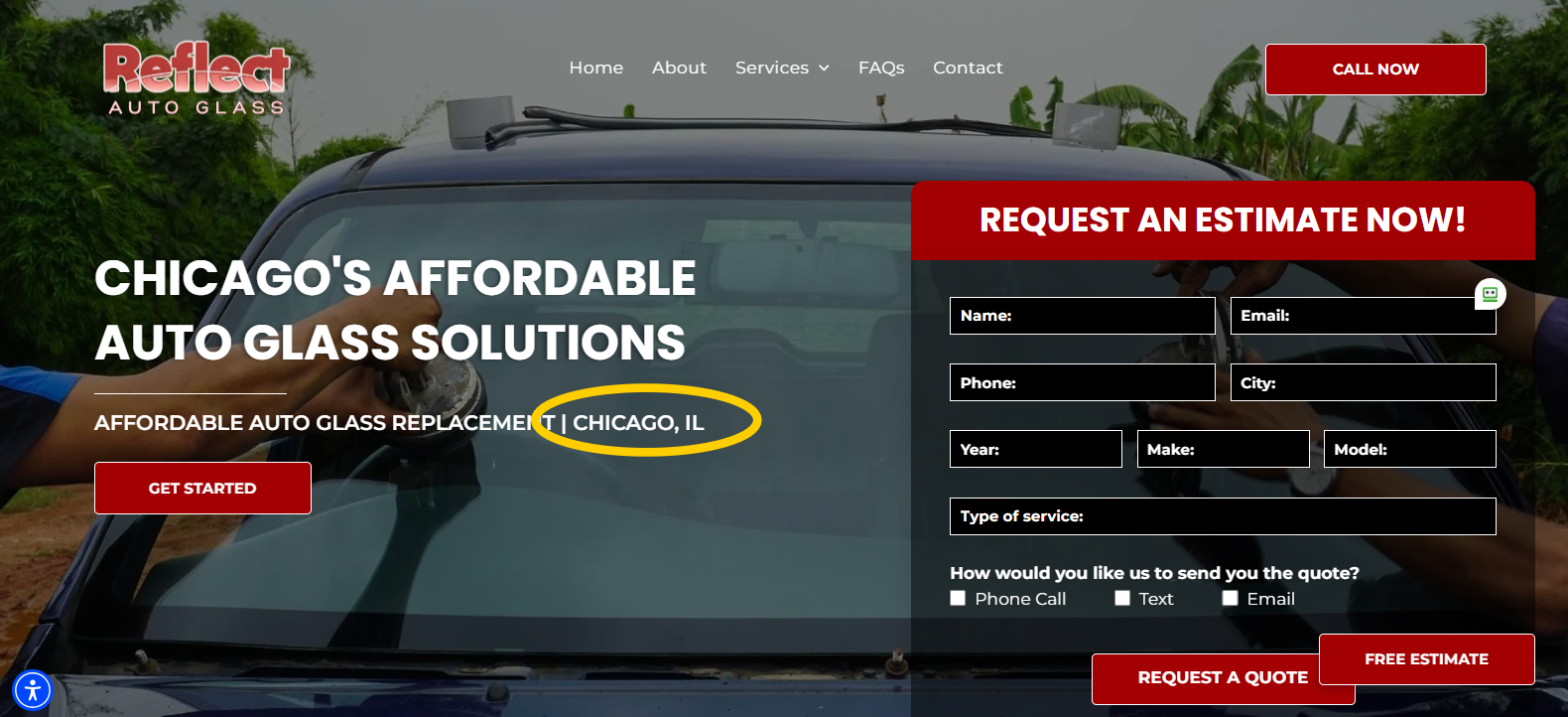
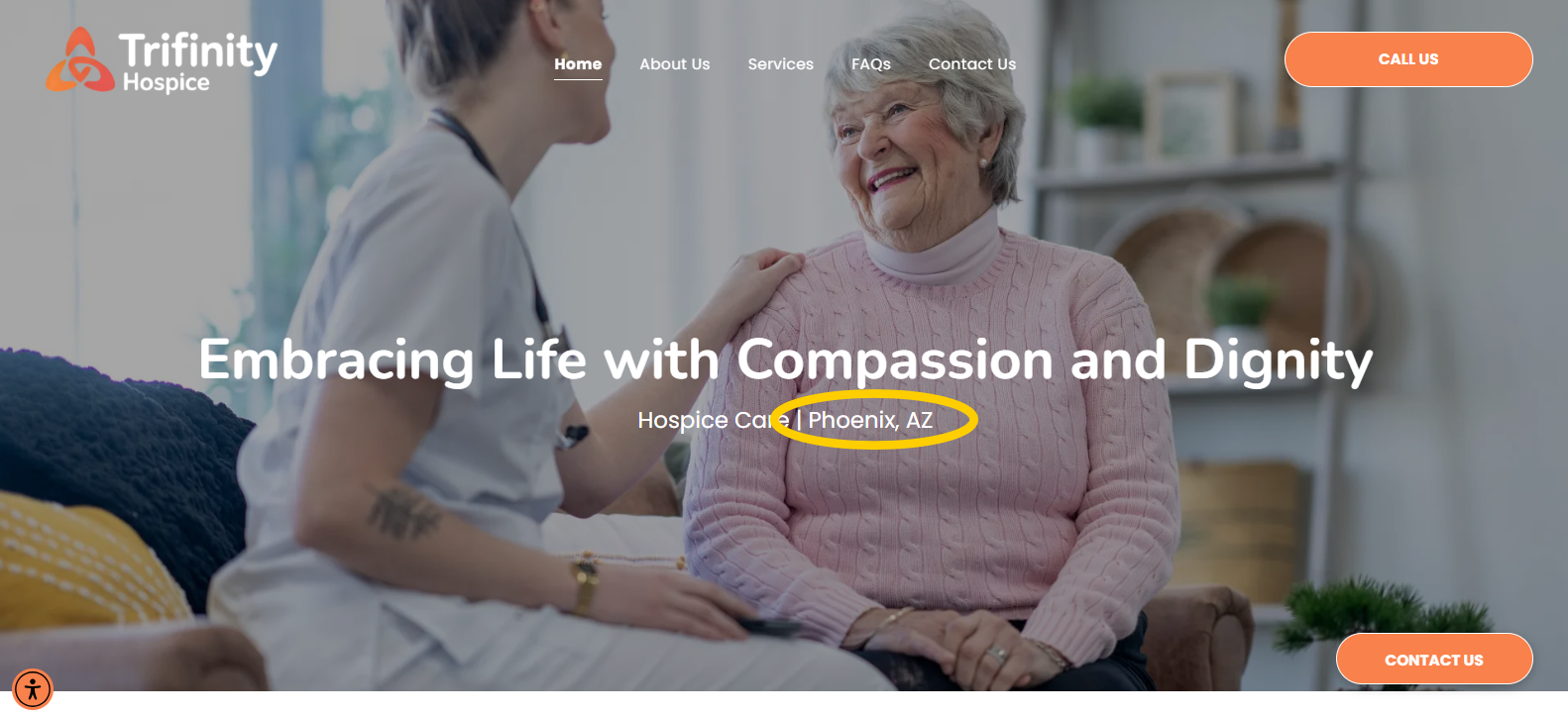
If you're creating a website for a well-known city (e.g., Brooklyn, Houston, Chicago, Los Angeles, Seattle), there's no need to include the state abbreviation in your Hero Banner Subheader, or anywhere else outside of the SEO meta titles, for that matter. Most people, especially locals, are already familiar with the state, so adding the abbreviation can feel unnecessary.
A solid Hero Banner Subheader should
highlight your company's products or services along with its location. So, next time you’re building a website for a popular city, keep this in mind!


Carissa
Check Out This New Tool: Magic Blur

- Check out this new tool to quickly turn busy images into smooth backgrounds so your content shines. It’s
super easy to use and
perfect for galleries or section backgrounds.

Joe
Diversify Your
CALL-TO-ACTIONS (CTA) for A Better User Experience
When designing your website, it’s important to have a variety of call-to-action (CTA) buttons that guide users to the right actions. Here are some key buttons to include:
- Pop-up button: A contact form pop-up for easy communication without leaving the page.
- Click-to-call button: A convenient button that allows users to instantly call with just one click.
- Review section button: Directs users to your review section, encouraging feedback and building trust.
- Contact FORM button: A button that routes users to your contact form widget section for further support.
- FAQ SECTION button: Guides users to the FAQ section, helping them find answers quickly.
Also, ensure your button titles are relevant to the context and varied. You don't want all of your buttons to go to the same place or say the same things.
For example, a
"Get a Quote" button wouldn’t be suitable on a doctor’s website, but "Schedule Appointment" might. Using accurate and action-oriented text helps create a
smooth and
logical user experience, making it easier for visitors to navigate and take the right steps.

John
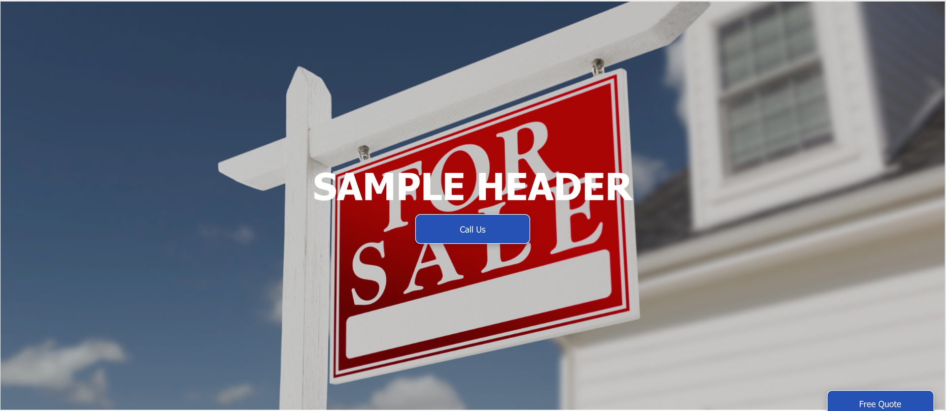
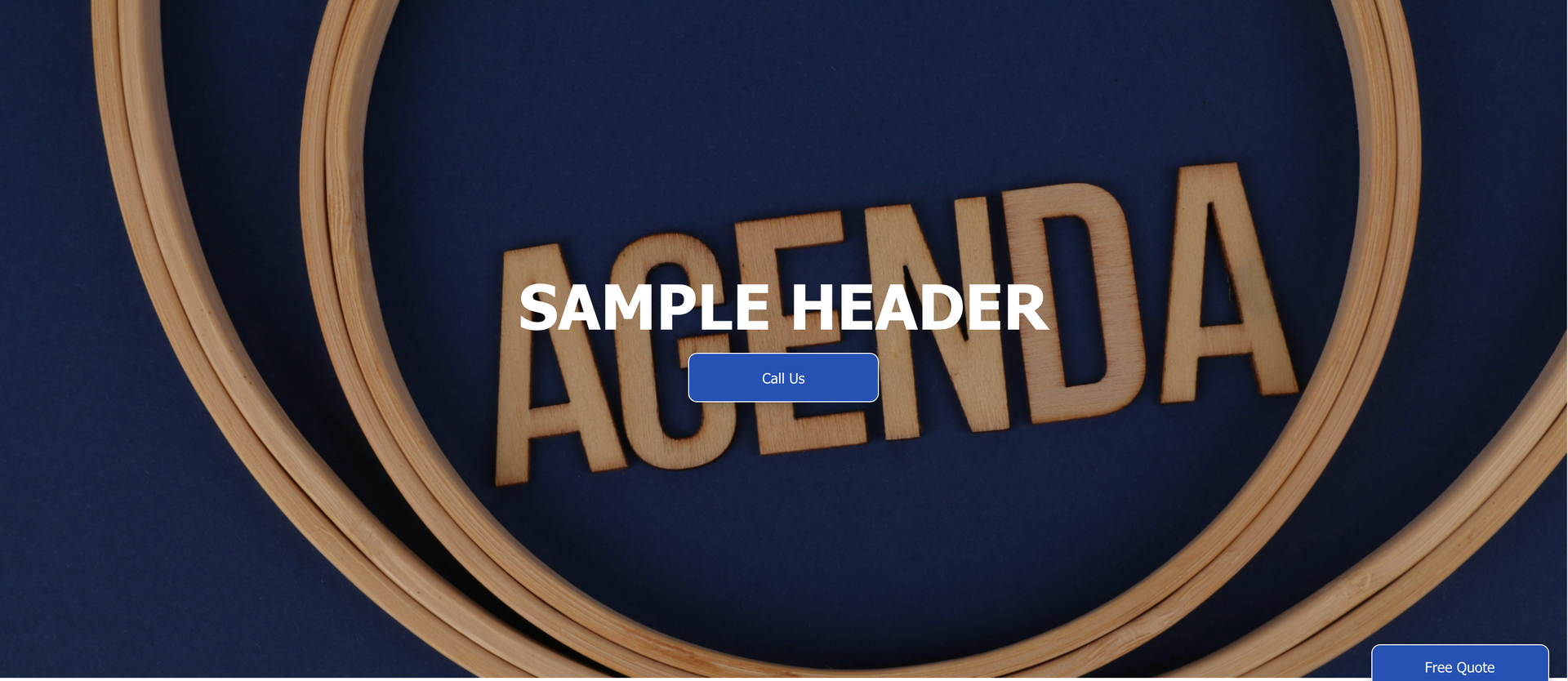
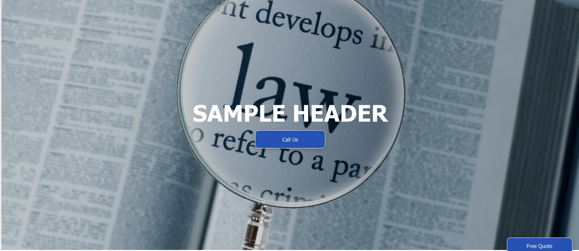
WHY YOU SHOULD AVOID USING Banner Photos with Text
When choosing images for the slideshow on your Hero Banner, or when using any image as a background, it's best to avoid ones that already contain text. Adding your own text on top can create visual clutter and make the content harder to read.
Instead, opt for clean, text-free images that provide a clearer backdrop and allow the header title to stand out more effectively. Below are a few examples illustrating the impact of banners with text: