

Dev Weekly Newsletter
11/22/24
Featuring
Weekly Tips From Your Leads!

Emma
When connecting your dynamic pages to their respective collections, there are some small details that often go overlooked. One of these is the opacity of the overlay on your dynamic Hero Banner image. When this element is connected dynamically, the overlay that you customized for the home page does NOT carry over. Therefore, after it is connected, you should readjust this to meet your needs. However, let it be a reminder that the preferred darkness of an image or video overlay (for your entire site) is about 35%, give or take a bit depending on the media itself.


This difference in opacity is often subtle, so the above images have been exaggerated to better demonstrate the point. The image on the left is set at 50%, which is often the default in Duda. The image on the right is set at 25%, which is usually the lowest acceptable setting.

Nick
On the mobile version of your site, be sure to fix any images that appear to be smushed or obscured by spacing constraints. We want to be sure that users get the full experience across all devices, especially on mobile since that is the most common way that users interact with a website.
Fear not! There is a quite simple solution to this phenomenon. Simply add a spacer widget and adjust it according to your respective image! Be sure to check the desktop version after adding this particular widget to the mobile version to ensure that the image size was not negatively affected by this widget. One other tip: be sure to take care of this before making any duplicates of the home page to save yourself from having to implement these edits on each dynamic page you add.

Nature's Symphony
Smushed images on the mobile version prohibit the user from seeing the full image on display. Luckily there is an easy fix.

Faces of Humanity
Simply add a spacer widget and adjust it so that you can see the full image on display! Side note: if you take care of this before creating duplicate home pages, it will save you (and your dev leads) so much time!

Sophie
The Content Creator bot is meant to make your job easier; it not only creates content for your site's home page but also for dynamic pages.
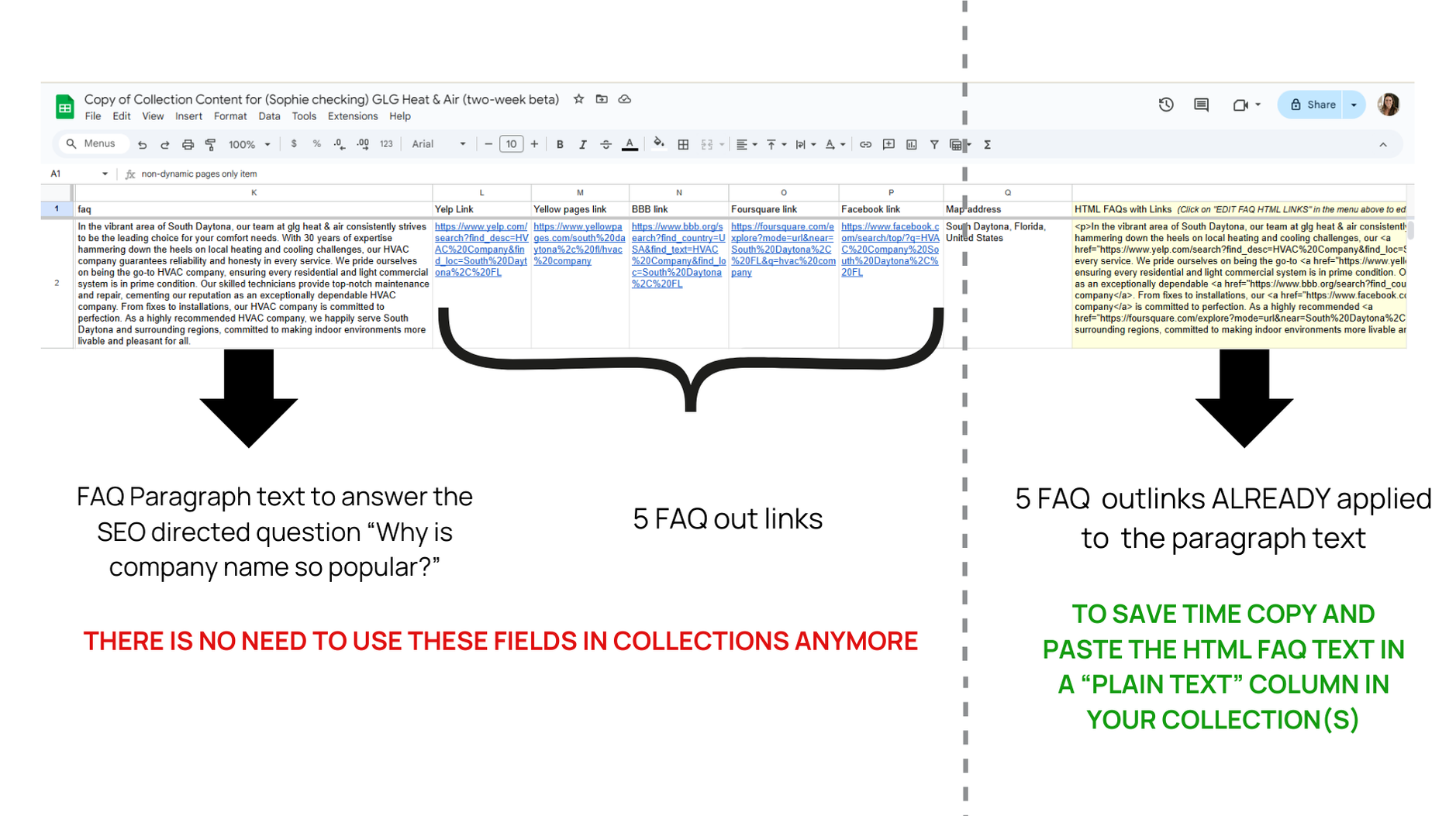
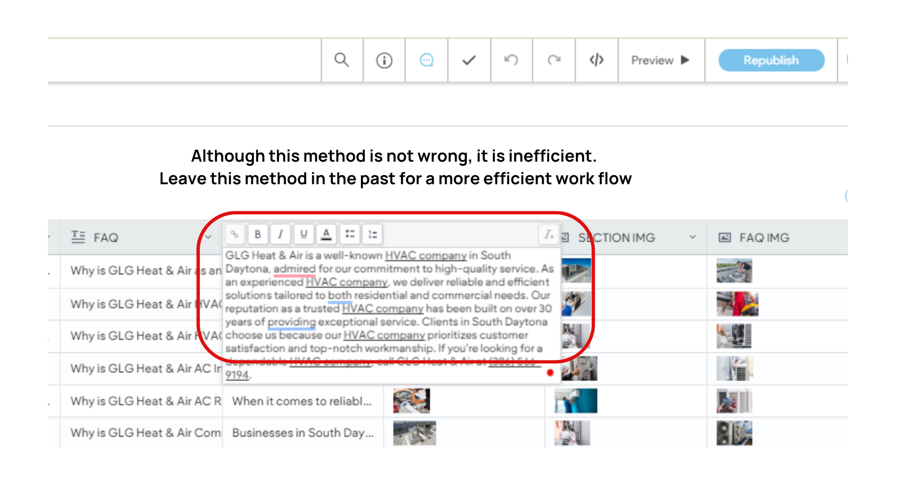
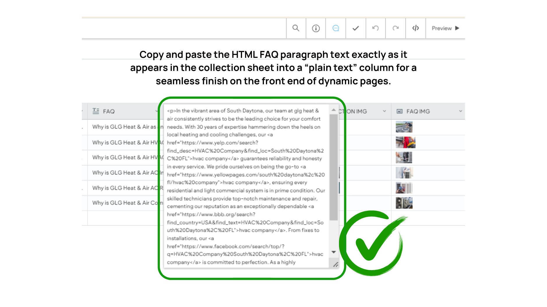
One of the newest features of the AI automated collection sheets is embedding the 5 SEO outlinks directly into the FAQ paragraph text for you. This makes building collections a much faster, more steam-lined process.
I have noticed many developers have not applied this new advancement yet when building collections. Review the screenshots and notes below to get a better understanding of how and why to use the HTML FAQ text when making collections. Try it for yourself the next time you get an assignment needing a collection!

Carissa
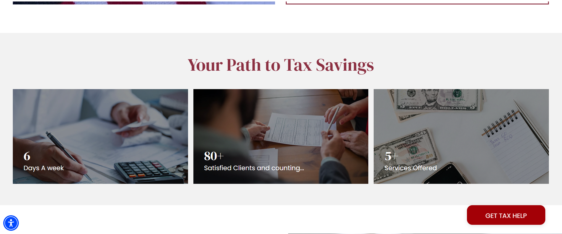
GALLERIES! A gallery widget can be an eye-catching tool to draw your viewer's attention with bold and engaging images. A couple of ways I use a gallery are by showing the different services, highlighting key features, and presenting client photos, which will add variety to your site's layout. Images hold more power than most words do, so choosing images that align with the company's brand and vision will help communicate to their clients in a more memorable way. Down below, I present a gallery of galleries, all created by talented freelancers here at Simple.biz!
Shout out to the developers who helped me with this week's tip. Here are several different ways you can use a gallery to display your content. Please enjoy the examples featured:


Joe
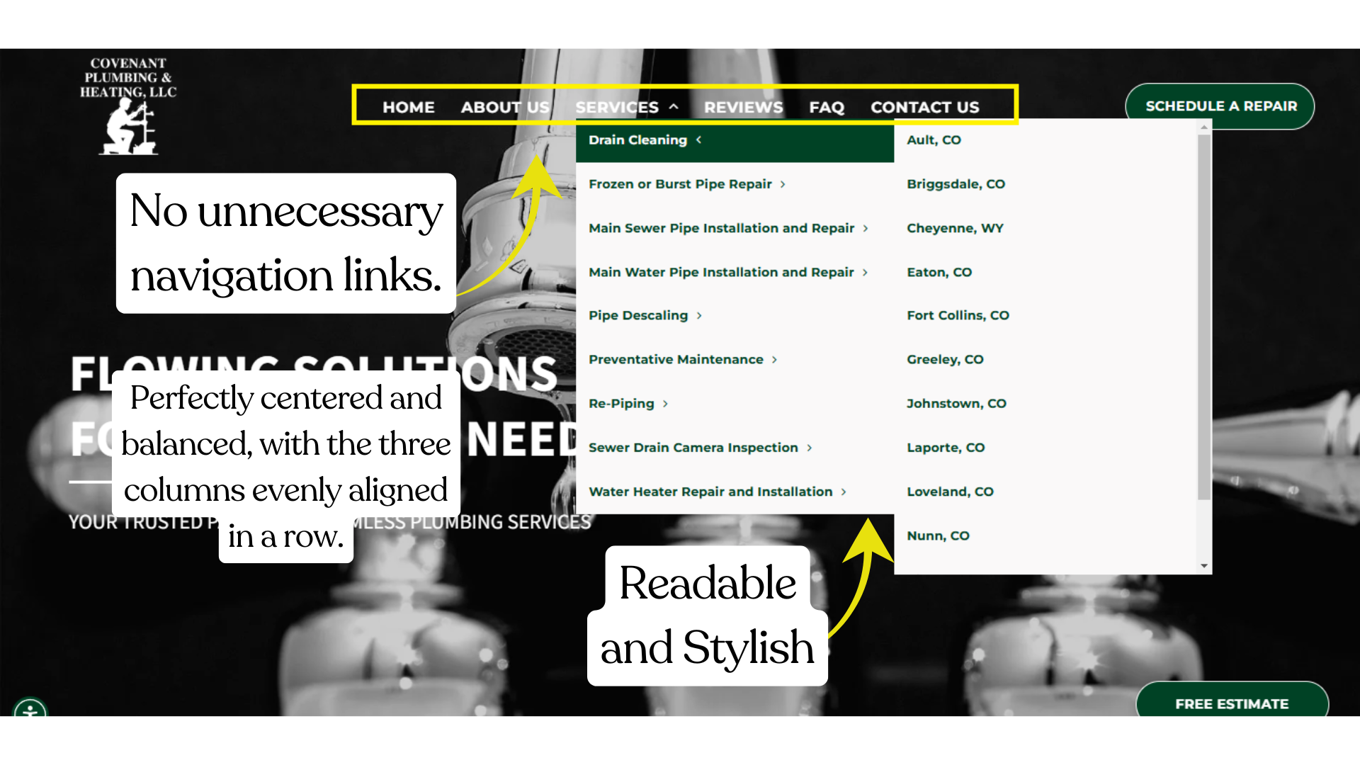
What Makes a Good Navigation Menu?
A functional navigation bar is the backbone of any website’s user experience. It helps users find what they need quickly and efficiently, improving engagement and retention.
Key Elements of a Good Navigation Bar
Clarity:
Use concise labels like
Home,
Services, or
About.
Avoid lengthy phrases like “Learn About Us” or “Contact Us Today.”
Consistency: Keep the navigation layout
consistent across all versions.
Prioritization:
The most important links should come first (e.g.,
Home,
Services) to guide users effectively.
The flow should be smooth, moving logically from top to bottom. Place less critical but still essential items, such as FAQ and Contact Us, at the end of the navigation to serve as final resources.
Responsiveness: Ensure the nav works seamlessly on mobile devices.
Bonus Tip: Stick to 5–7 menu items for simplicity, and use drop-downs sparingly to avoid overwhelming users.
A well-thought-out navigation bar ensures users can explore your site effortlessly, enhancing both usability and satisfaction!
Below is a photo demonstrating all these practices in action.
Notice how the header and subheader colors are designed to enhance both readability and style simultaneously.

Site of the Week Winner
Thanks So Much to All of Our Amazing Devs!
This Week's Honorable Mentions:
Congratulations, Ryan McDermott for:
Pro-Precision Electrical
Congratulations, Thea Keith for: