
Dev Weekly Newsletter
12/06/24
Featuring
Important Announcements of the Week:
➞ HOME PAGE LENGTH:
While the minimum, or required number, of sections on your Home Page continues to be 10 (ten), the new maximum number of sections is 13 (thirteen). We will make special exceptions for exceptional cases; this applies to standard single and double sites.
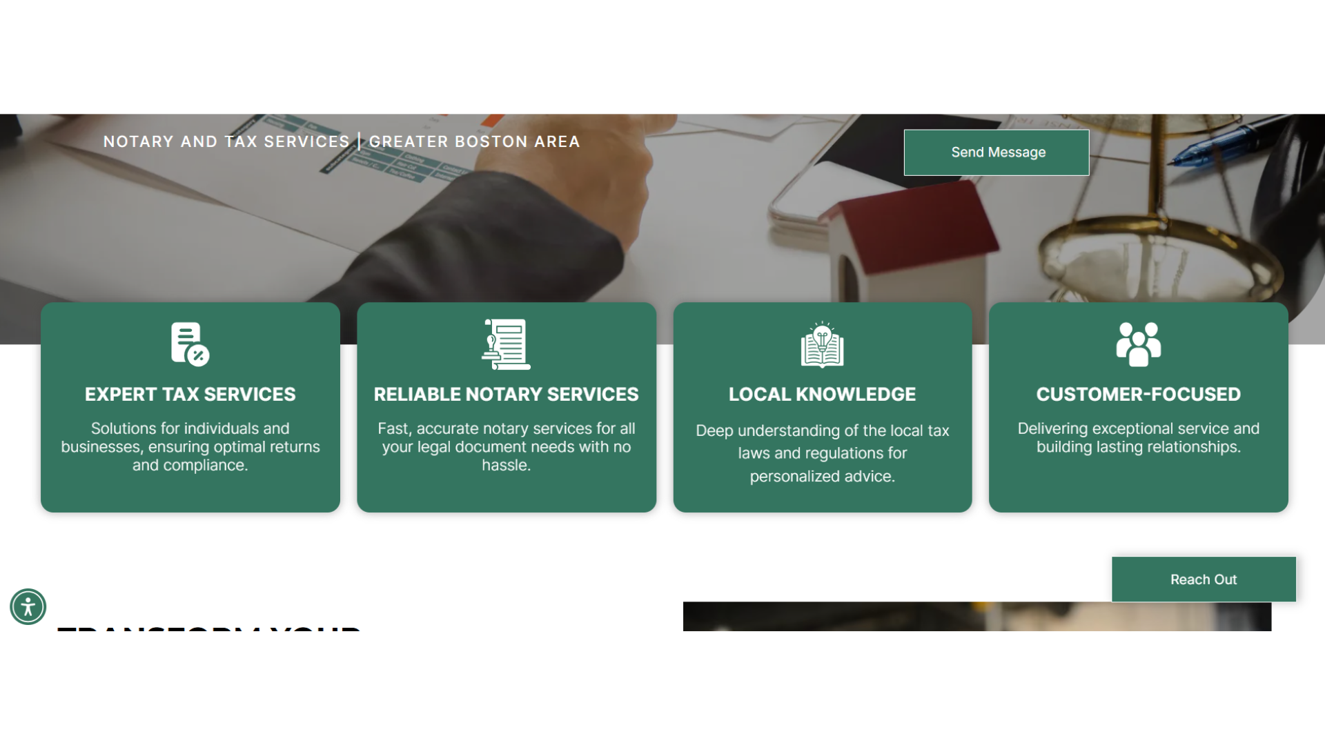
➞ GALLERY/ICON SECTION REQUIREMENT:
By now, you should have received Carissa's email explaining our new section requirements for Simple sites, and you may have noticed some changes regarding this (and a couple other things) in your Content Creator results. In brief, your Home Page should have both an icon section (highlighting service features) and a gallery section (displaying the services, products, etc. provided.) For more information, please click here.
If you need clarification or assistance with any of the above announcements, feel free to reach out to your Dev Leads.
Weekly Tips From Your Leads!
Emma
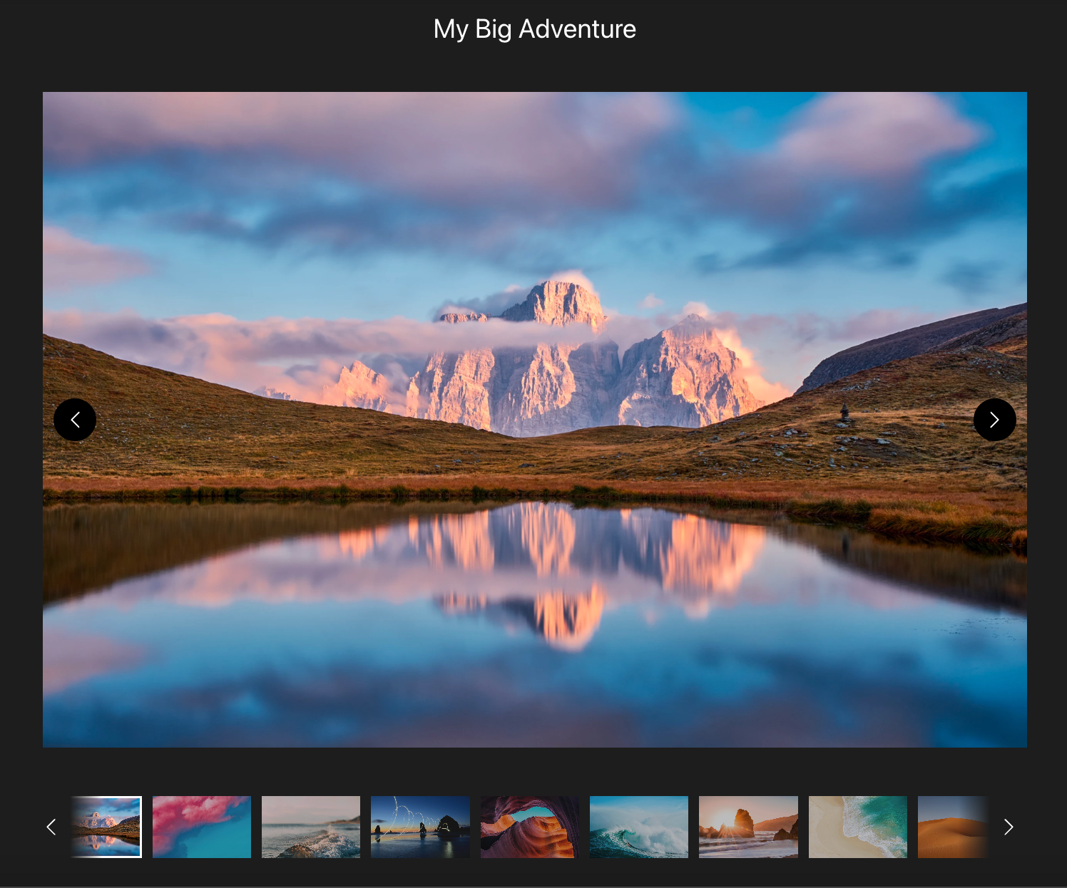
This week's design tip is about the use of the "Full Bleed Row" toggle when designing your sections in Duda. While turning this option "on" is a preferable formatting choice for most of our standard content, there are definitely times when NOT using it yields superior results. Examples of these situations include sections with extremely brief text and those with a vertically aligned photo.
Using the "Full Bleed Row" option causes section elements to stretch across the screen, which reduces negative space and "stretches" out text and images. With very little text and/or a vertical image added to this equation, the chances of the focal point of the image becoming distorted or hidden are very high. This is something you want to AVOID, so toggling "off" the "Full Bleed Row" option could help to solve this issue, as it did with the example site below:
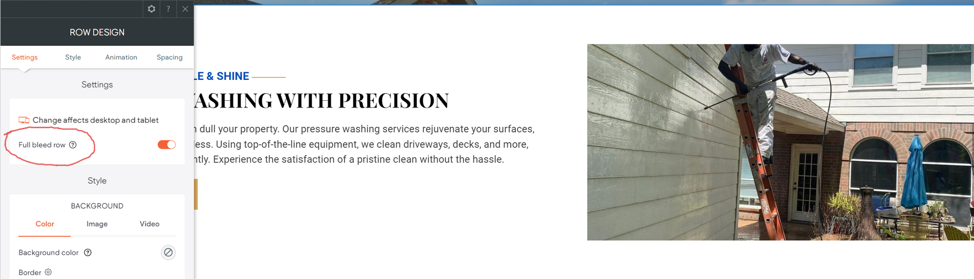

Like most things in Duda, this tip doesn't always work perfectly right away and may require spacing adjustments afterward. However, this is a great option to try when adding variety to your site's design as well as improved display of images that are vertically aligned.

Nick
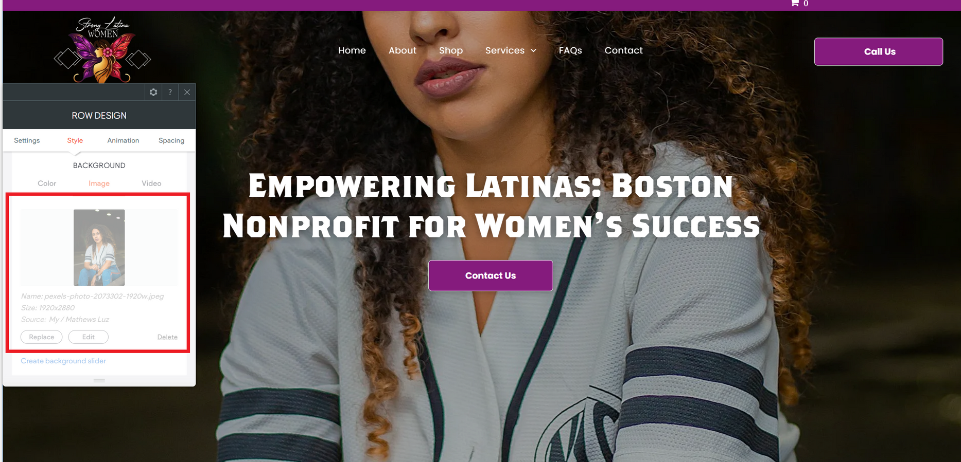
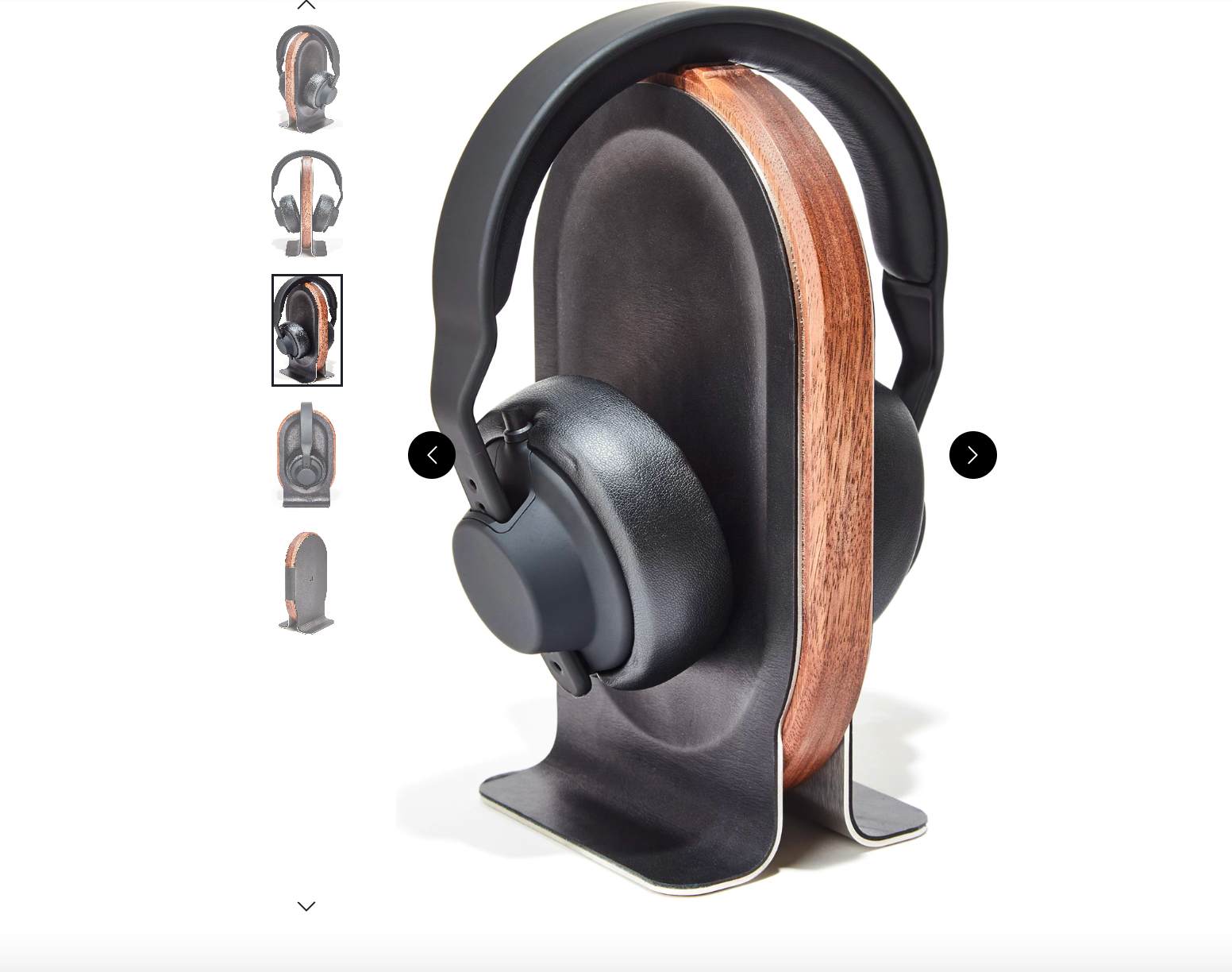
The banner section is one of the first things users see on a site, making it essential to get right from the start. A common mistake when building these sections is using vertical images instead of horizontal ones.
While vertical images may work well in other contexts, they tend to fall short in hero sections because they don’t fully utilize the horizontal space. This often leads to awkward cropping or obscuring of the image's focal point, disrupting the visual flow and balance of the design, as you can see in the example below.
To avoid this, consider using our image database when selecting photos for banner sections. These images are handpicked by your dev leads to ensure they’re the correct size and layout and free of any content issues, making the check-off process much smoother and more efficient for all!

Sophie
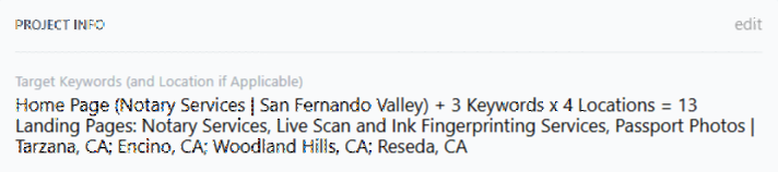
The Content Creator was recently updated to highlight the client’s target keyword(s) and home page location(s).
This change aims to enhance the visibility of headers associated with each keyword as well as draw attention to the use of locations in each header. Your Dev Leads hope that this change will help to ensure that all target keywords are getting their required representation on your site's Home Page.
Additionally, this change to your Content Creator results will make it easier to spot headers that use similar or complementary keywords, allowing you to combine them with more ease when an appropriate situation arises. This will also help with maintaining our newly introduced 13-section maximum for Home Pages. For a closer look at the updates, here are some screenshots to help clarify how it works:
Given keywords and locations:
New Content Creator Email Format:
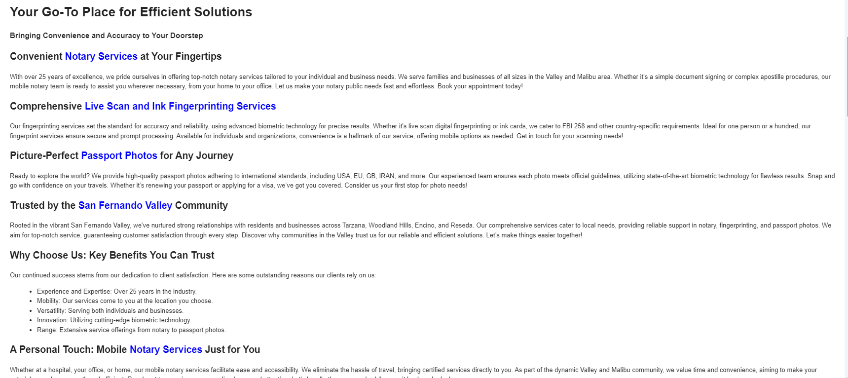
Hopefully this will make it easier for you to make sure we hit every keyword and more easy to tell when headers using extremely similar or complimentary keywords can be combined, helping you keep sites with a long list of keywords within our new 13-section maximum guideline.
Carissa
ICONS! To integrate icons into a section, think of them as visual shortcuts that highlight key features of your client's business. Just like a gallery uses images to show off services, icons use simple, recognizable symbols to represent qualities.
Start by identifying 3-4 key traits that set your business apart. Then, pair each trait with a brief description and a matching icon to help visually communicate what makes your company unique. (NOTE: When choosing icons, try to choose ones that are similarly stylized for better cohesion.) There are various ways to design this section, so below, I’ve provided several examples to help you implement icons effectively on your site.
A huge thanks to the developers who helped with this week’s tip!


Joe
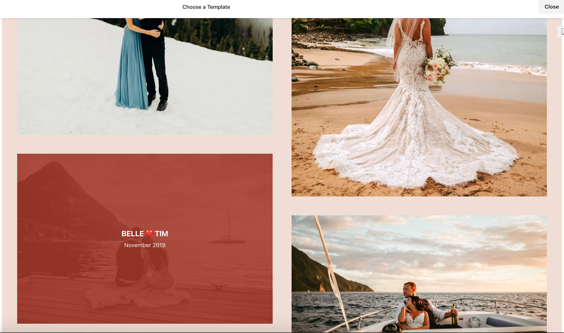
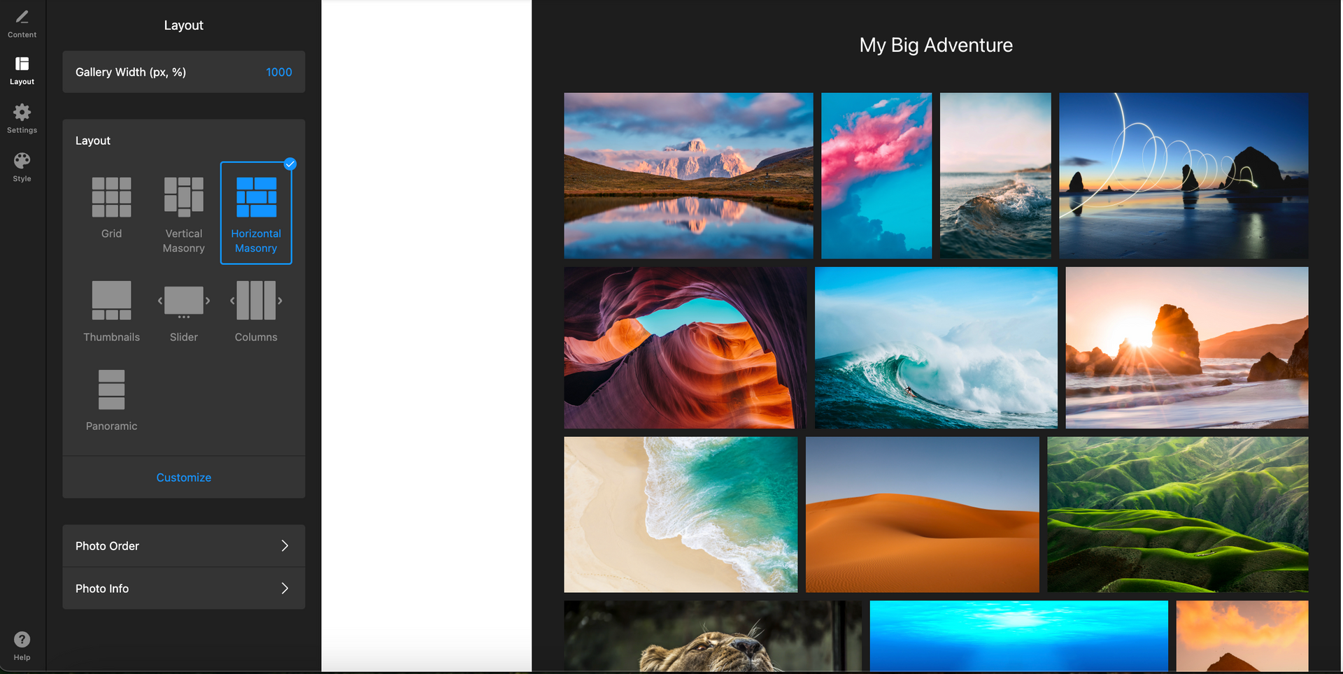
Are you running out of design ideas for the gallery section in Duda?
Try Elfsight's photo gallery widget—offering a wide variety of customizable options to help you create visually stunning galleries in no time.
In addition to having
several different templates to choose from, there are also various layouts for each template, so you can find the perfect design for your site. Whether you're showcasing images or other visual content, Elfsight provides easy-to-use templates that will enhance your site's overall look.
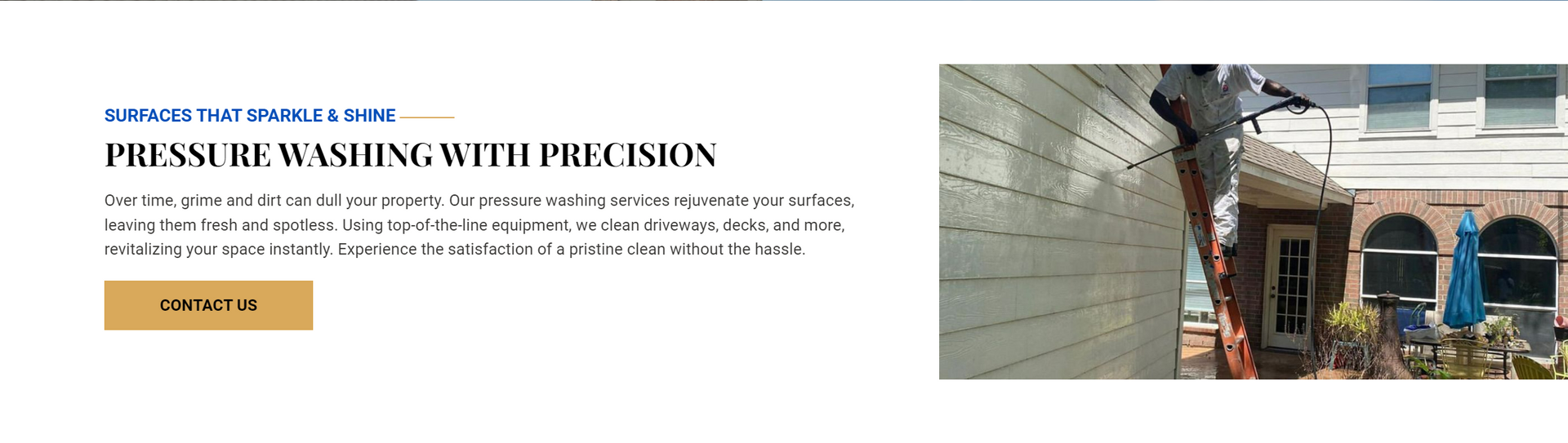
Site of the Week Winner
Thanks So Much to All of Our Amazing Devs!
This Week's Honorable Mentions:
Congratulations, Jeff Pablo for:
Eads Fence Company, Inc.
Congratulations, MM Estilloso for: