

Dev Weekly Newsletter
May 30th, 2025
Including a brief video presentation featuring:
Important Announcements of the Week:
➞ NEW AND IMPROVED: UPDATED QC CHECKLIST FOR FREELANCE DEVELOPERS
Long overdue, the Dev Leads have finalized an updated checklist for improved "Quality Control" assurance on our websites. We compiled several of our resources here for easy access, along with creating something a little more visually appealing to help our Freelancers stay on track and to make sure we are delivering the best product possible. Please take some time to poke around the document, and feel free to reach out if you have any feedback!
*** If you need clarification or assistance with any of the above announcements, feel free to reach out to your Dev Leads. ***
Weekly Tips From Your Leads
Emma
This week's Logo Design Challenge continues to demonstrate Canva's Magic Studio tools, as well as some rather unconventional methods to achieve a successful logo edit. Watch the tutorial below to see how a new company name and phone number were added to a difficult existing client logo design. And if you have the time, feel free to let me know if you found any of the tips and tricks useful for your Canva edits and creations!

Nick
Have you ever published your website and, when viewing it live on your browser, noticed that the button fonts are displaying a generic serif font that does not match the font you originally selected? If this happens to you on a future project, don’t fret — there is an effortless workaround that I walk you through in the video below!

Sophie
I'll be back next week with more helpful tips! :)

Carissa
From Uniform to Unique: Smarter Layout Choices
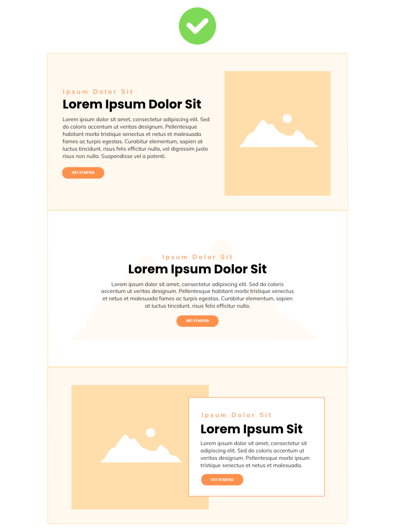
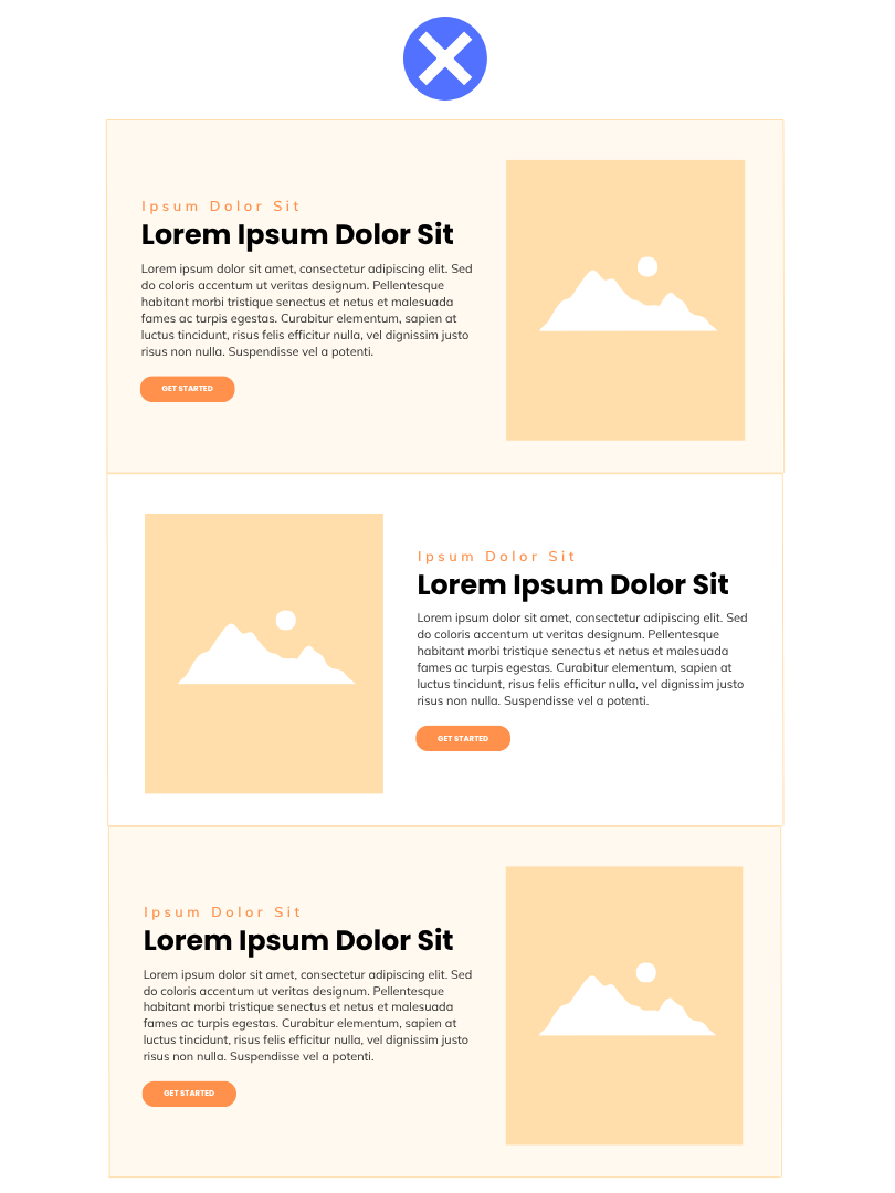
..................................................Creative variety..............................................Checkerboard Trap
Creative Variety: Using
different styles and arrangements in a design to keep it
interesting and clear.
- Keeps users interested
- Highlights what matters
- Makes the design feel unique
Checkerboard Trap:
Using the
same styles and arrangements in a design to keep it
monotonous and flat.
- Users lose interest quickly
- Content starts to blend together
- Layout becomes predictable and generic

Joe
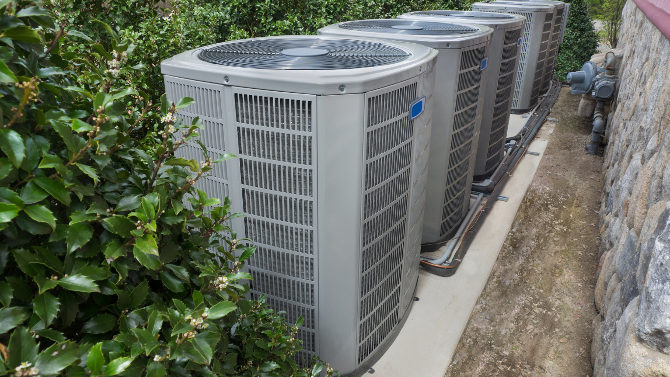
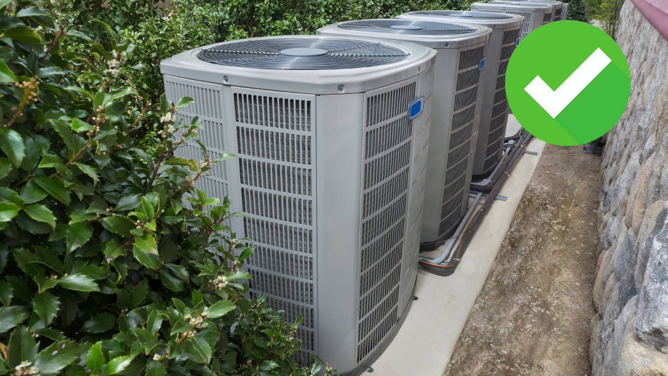
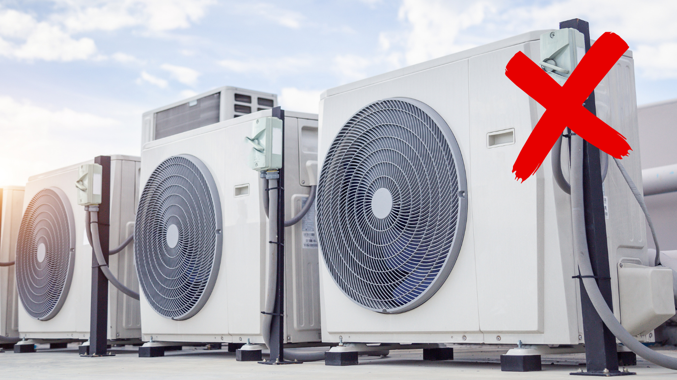
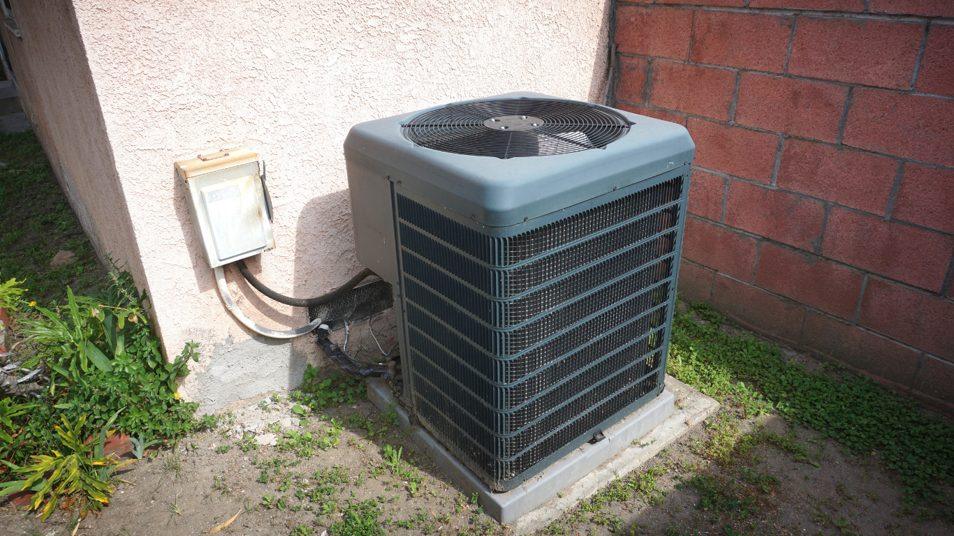
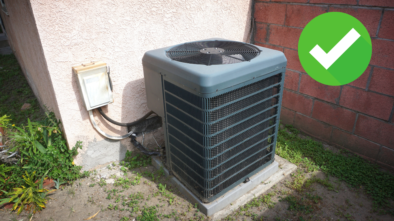
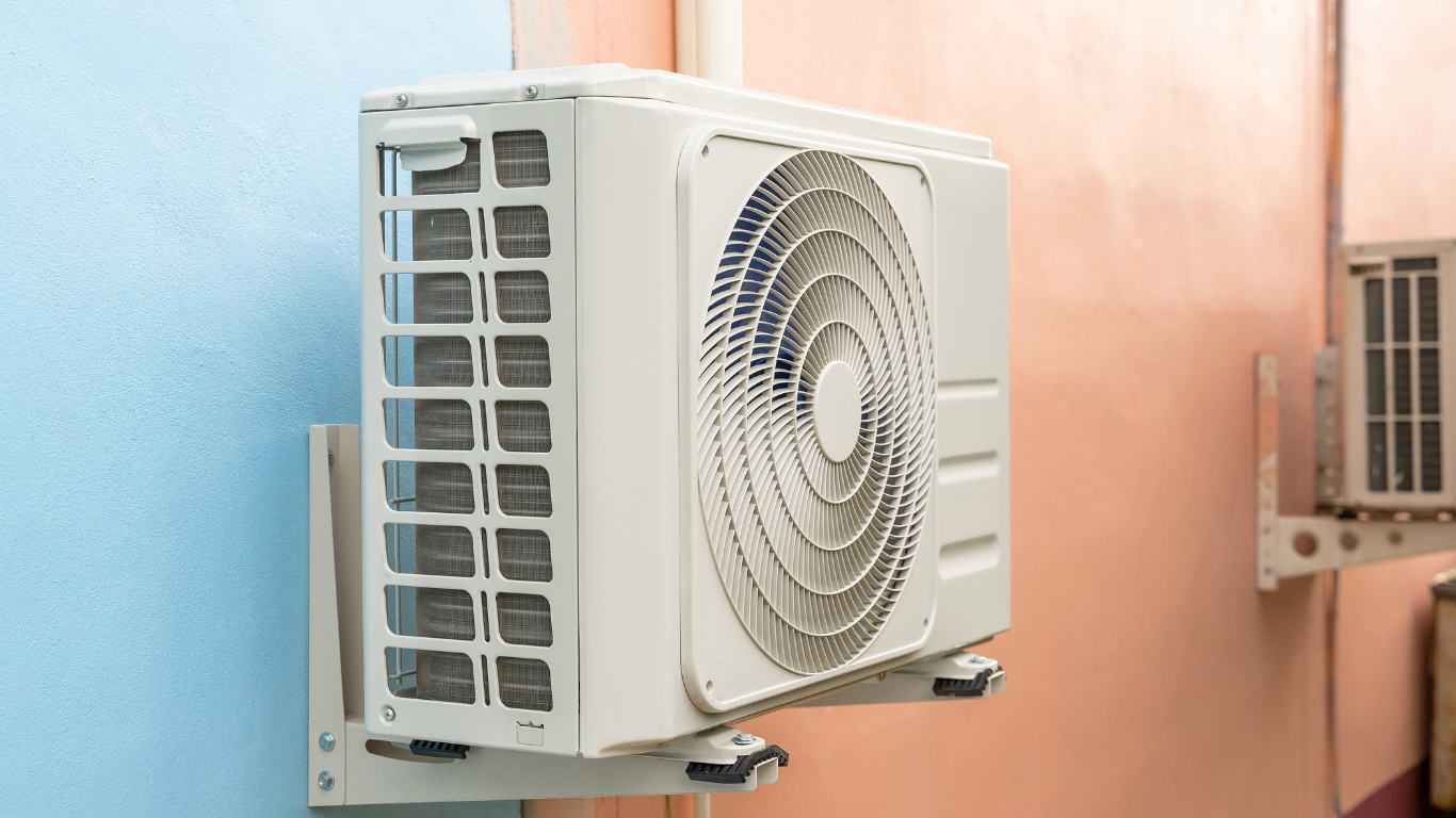
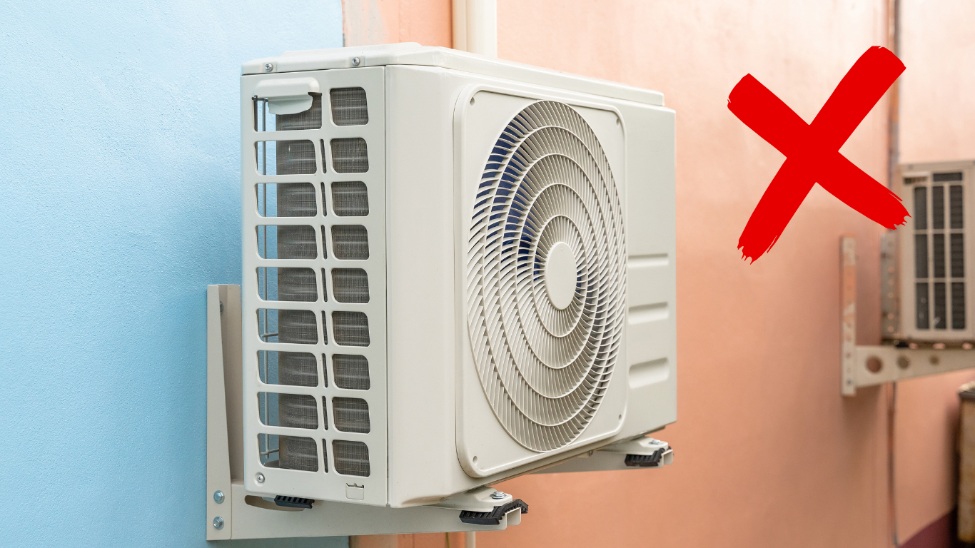
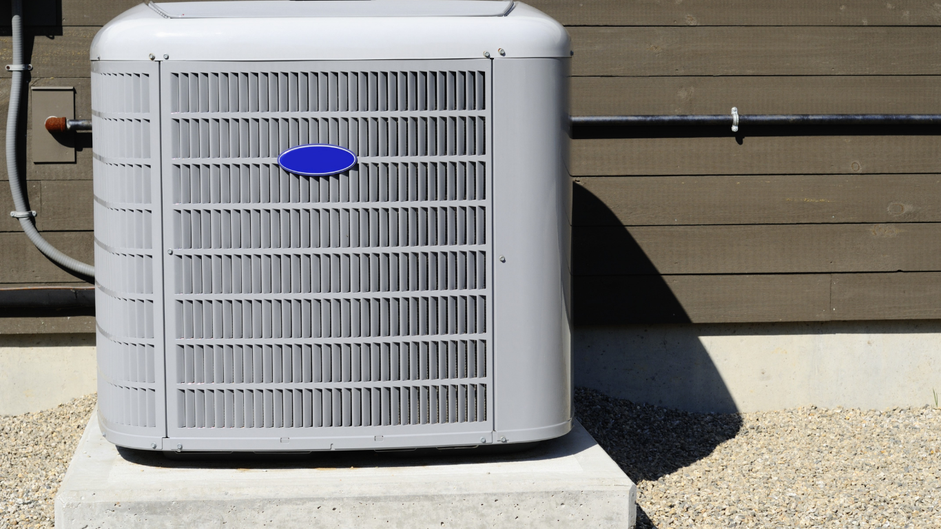
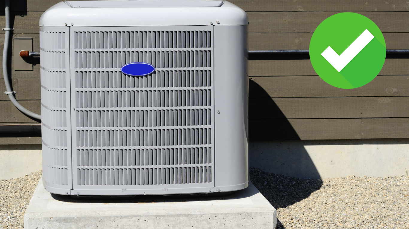
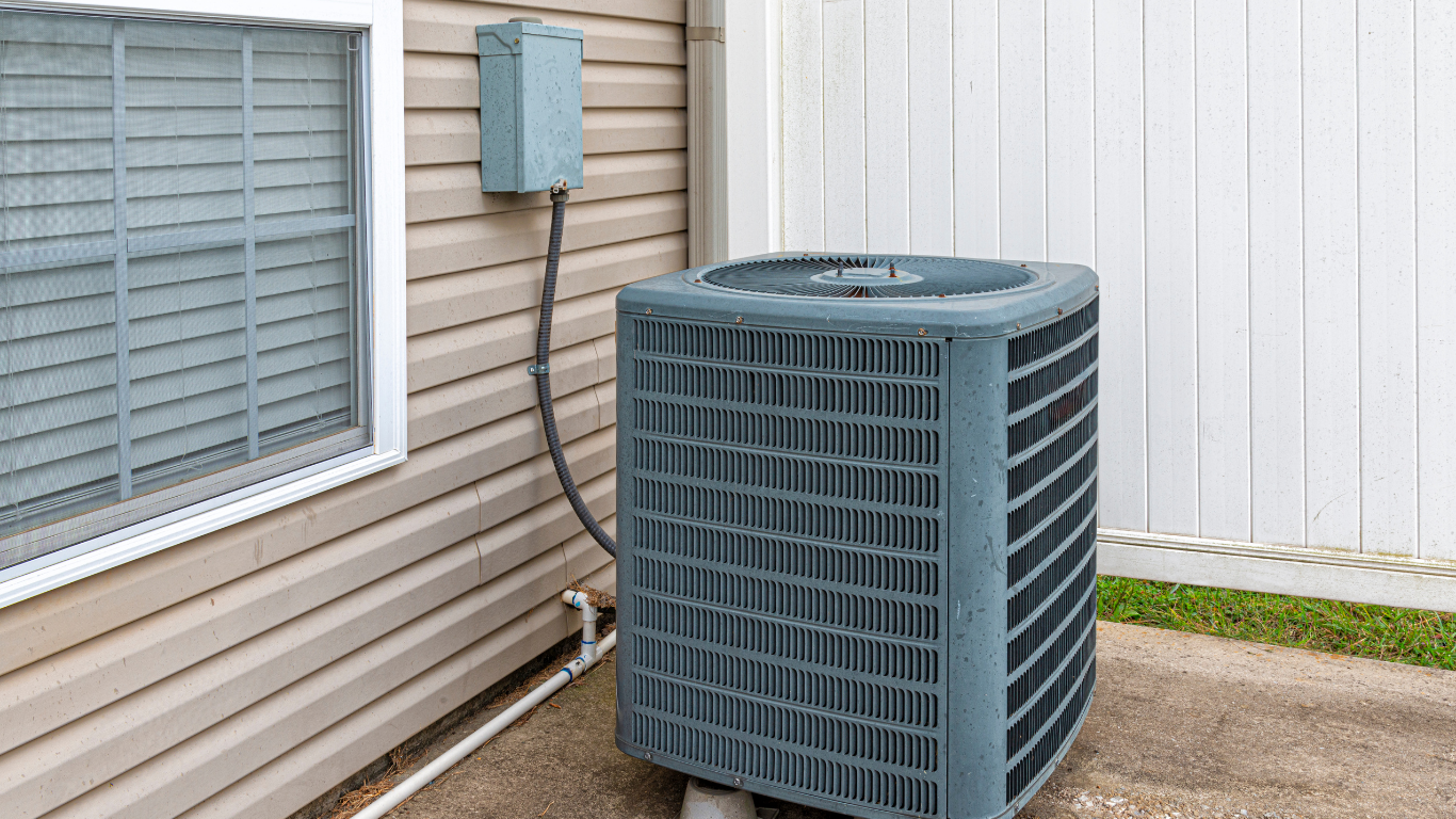
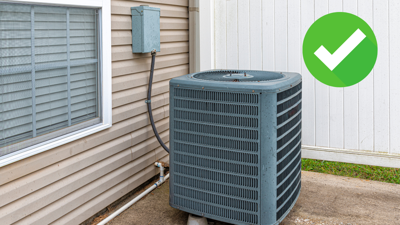
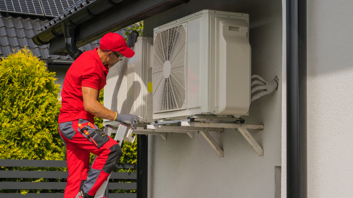
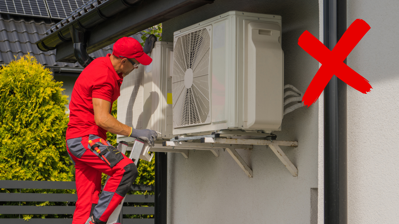
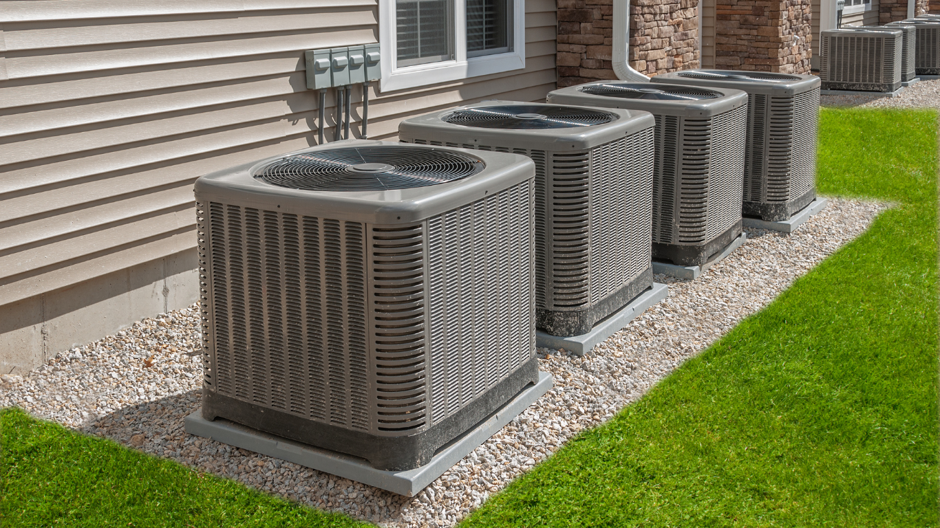
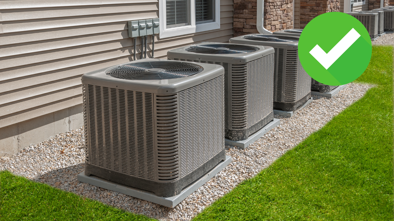
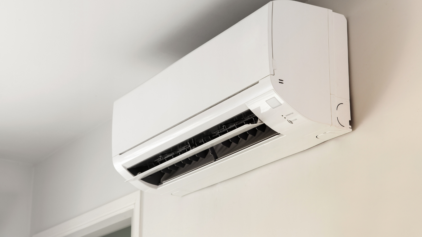
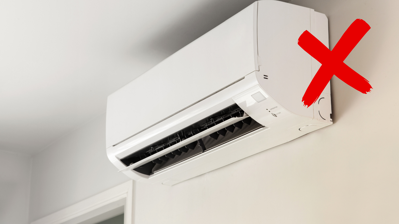
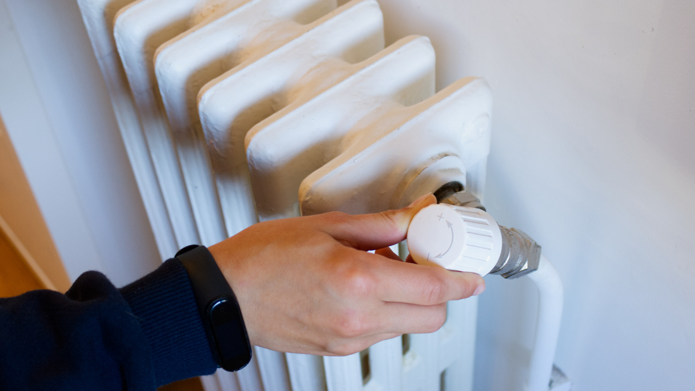
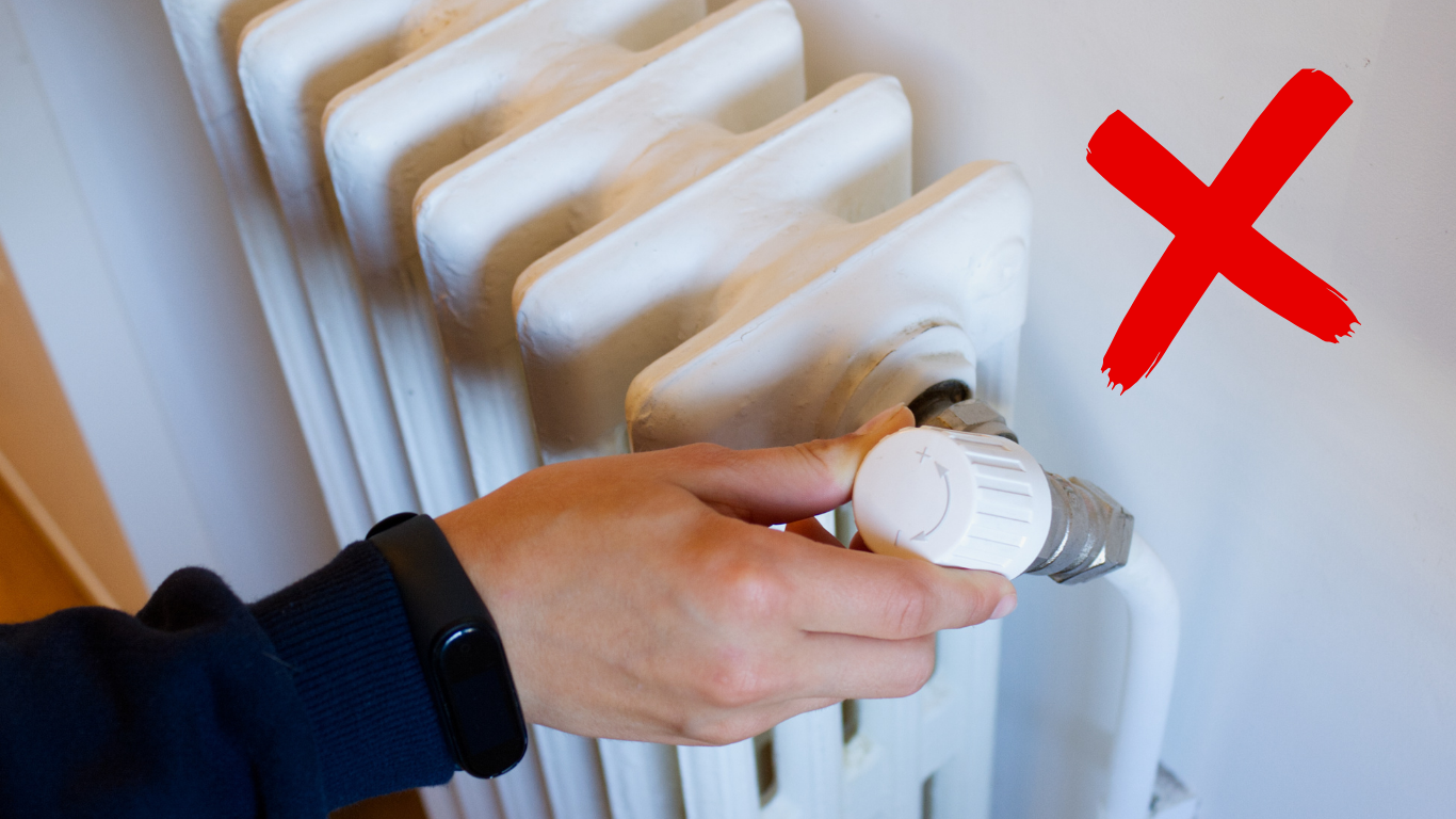
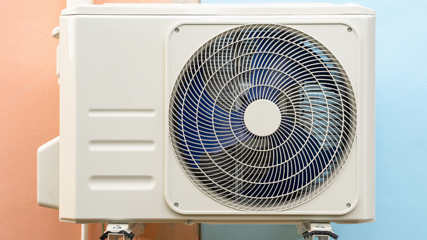
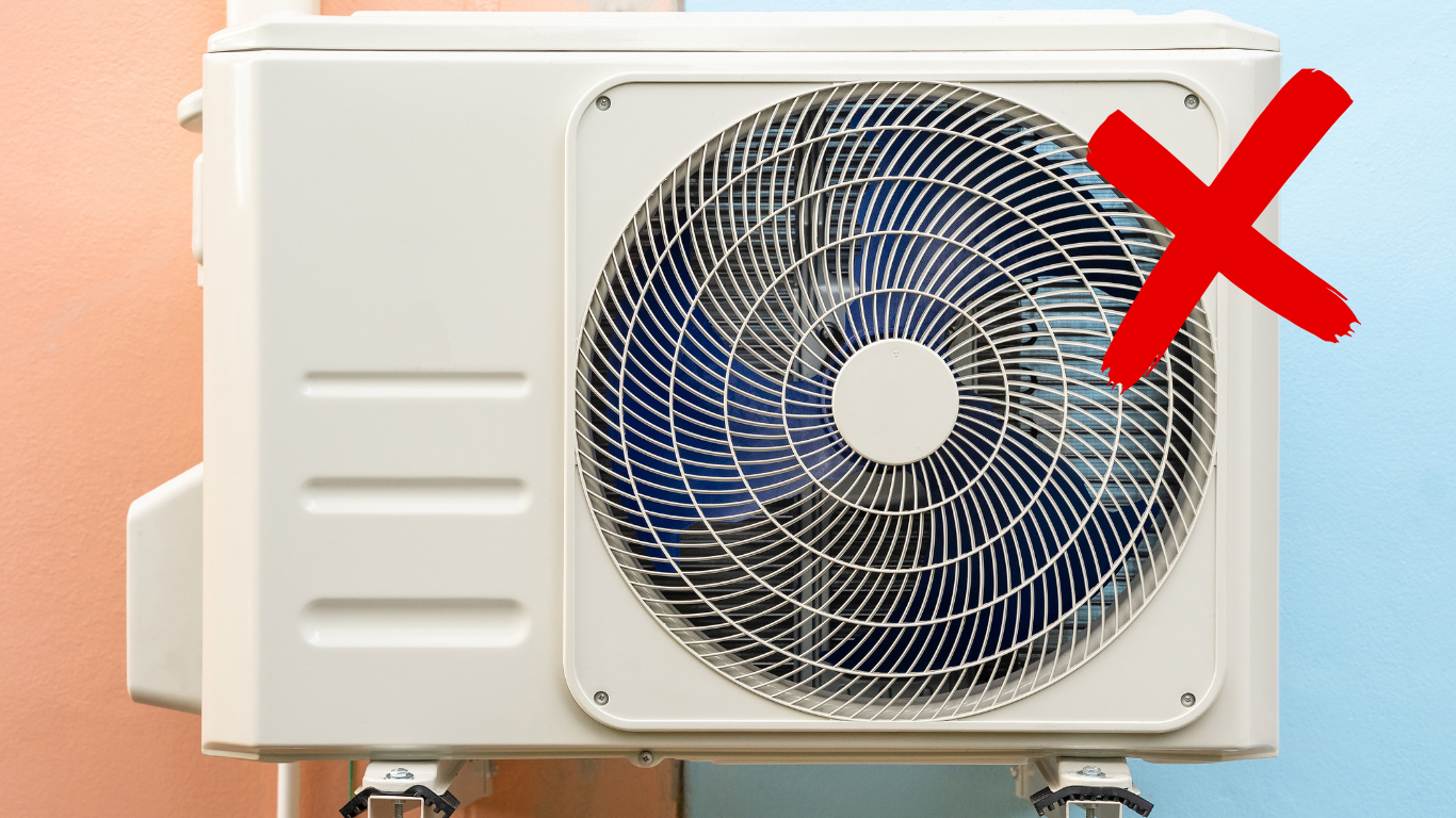
CHOOSING APPROPRIATE HVAC PHOTOS FROM THE USA
Hey guys, hope you're having a great week!
This week's tip is all about choosing the right images for an HVAC website. Ever struggled with that? Occasionally you'll see wall-mounted units, exterior systems, or large furnaces like the ones below—more commonly found in bigger cities with old buildings. But for a typical suburban American home, those setups are pretty rare.
So when you're picking photos, remember: it's all about knowing your audience and their environment.
When selecting photos, ask yourself the following:
- Is this something a typical homeowner would recognize?
- Does it match the location or audience the site is targeting?
- Does it feel professional, trustworthy, and relevant?
Let's test your photo-picking skills.
Ready? Slide away!


John
Do a Quick Social Search Before Building a Website
Before you dive into building a site, take a moment to search the company’s name and location on Google and social media. These searches can help you find useful info like bios, photos, and reviews that you might not get from the client right away. Using this info will give your content creator real material to work with and make the website stronger from the start.
Watch the clip below to see my process of researching and updating the notes: