Dev Weekly Newsletter
March 28th, 2025
Including a brief video presentation featuring:

Important Announcements of the Week:
➞ IT'S THE ONE-YEAR ANNIVERSARY OF THE SOTW NEWSLETTER!
Wow, time really flies! One year ago, your Dev Leads came up with the idea of creating a motivating and helpful newsletter to share useful tips and celebrate our Site of the Week winner. Since then, the newsletter has evolved into the Dev Resources website, which we continue to update for the benefit of our freelancers. Take a moment to appreciate the hard work your team has put into this valuable resource. Feel free to revisit some of our past tips and tricks for inspiration—and perhaps even discover something new!
➞ IMPROVEMENTS IN MEETING DEADLINES: THANK YOU DEV. TEAM!
We’ve noticed—and appreciate—the impressive improvement in site submission timing over the past week. There have been strong indicators that our freelance developers are prioritizing deadlines and moving projects through the pipeline efficiently. Therefore, the Dev Leads would like to give you all a big thank you for staying on track and getting sites submitted on time. This kind of consistency helps the entire process run smoother and keeps us aligned with client expectations. Keep up the amazing work, team!
➞ UPCOMING VOLUNTARY RE-TRAINING CLASSES ON FRIDAYS:
After receiving interest from many of our freelancers, we’re excited to offer
voluntary retraining classes on Fridays. We’d love your input on the topics that would be most valuable to train on.
Please take a moment to complete this poll and vote on the subjects you'd be willing to commit to attending a class for. We ask that you
do not vote if you do not intend to attend any retraining sessions, as this poll is to gauge genuine interest and projected attendance.
>>> CLICK HERE TO TAKE THE POLL <<<
If you need clarification or assistance with any of the above announcements, feel free to reach out to your Dev Leads.
Weekly Tips From Your Leads

Emma
While a transparent header with a white logo is often considered modern and clean—and tends to be the preferred choice of Dev Leads—this approach doesn't always produce the best results. Sometimes, a logo cannot be easily inverted or changed to a uniform color without losing important details. This is particularly true for logos with intricate linework, gradients, or complex color schemes. When aiming to create an elegant and eye-catching header design with these Client-Provided (CP) logos, here are a few video demos in Canva of alternative approaches you can try:
#1: Add a border or outline to the entire logo to make it stand out.
#2: Simplify a logo and display original on hover and/or shrinking header.
#3: Select certain parts of the logo to whiten or brighten for better contrast.

Nick
Be mindful of
subtle details in background images when selecting visuals for your site. Not often, but occasionally, there are
small details that can make an image unusable. The biggest one is
foreign languages
appearing on products,
books, and different elements that have text incorporated into them. The majority of images that I see with this error are with
Bibles that are printed in Latin or Spanish
and images of
books that have Spanish printed on the spines. Take these examples below for consideration:

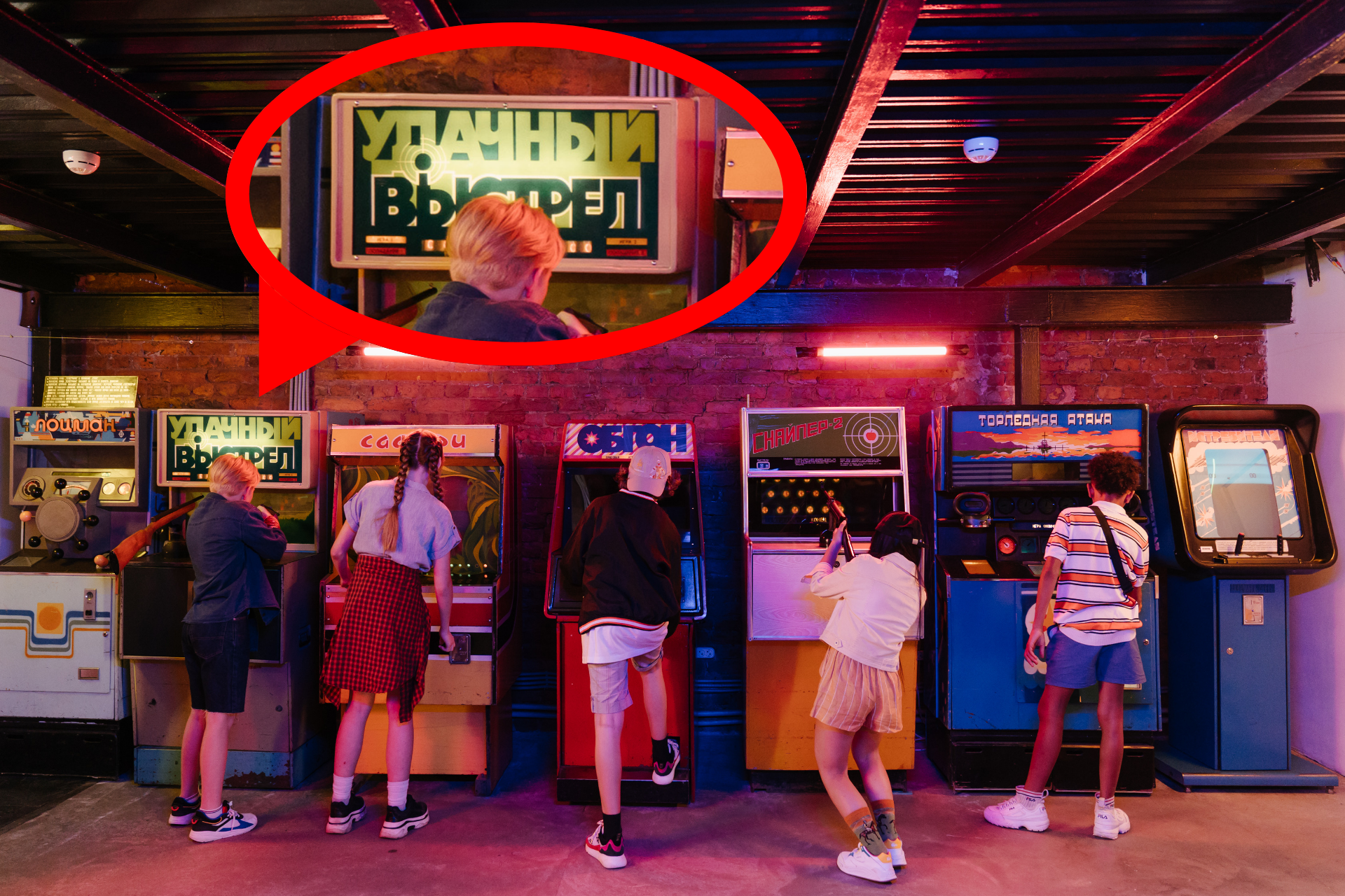
The next time you are searching for images that are not within the
Simple Image Database, be sure to
keep a lookout for these minor, yet
highly important, details!

Sophie
Adding 2 versions of your client's logo to the SEO & Settings > My Site Icons page is an important part of setting up the backend of your site that is often left incomplete.
Resizing your client's logo is the key to it being accepted by the
Open Graph
and
mobile device home screen icon
image
fields. Watch the brief tutorial below to learn how!

Carissa
Want to add visual variety?

Design by Thea K.............................................................................................................Design by Jake Q.
Instead of using an icon section, try making your sections more engaging by experimenting with different layouts beyond the text-image format. Above, you'll find creative examples from our talented developers, featuring alternative section designs that add extra visual interest. To replace the icons, consider using a graphic element from the company logo or relevant images instead.

Joe
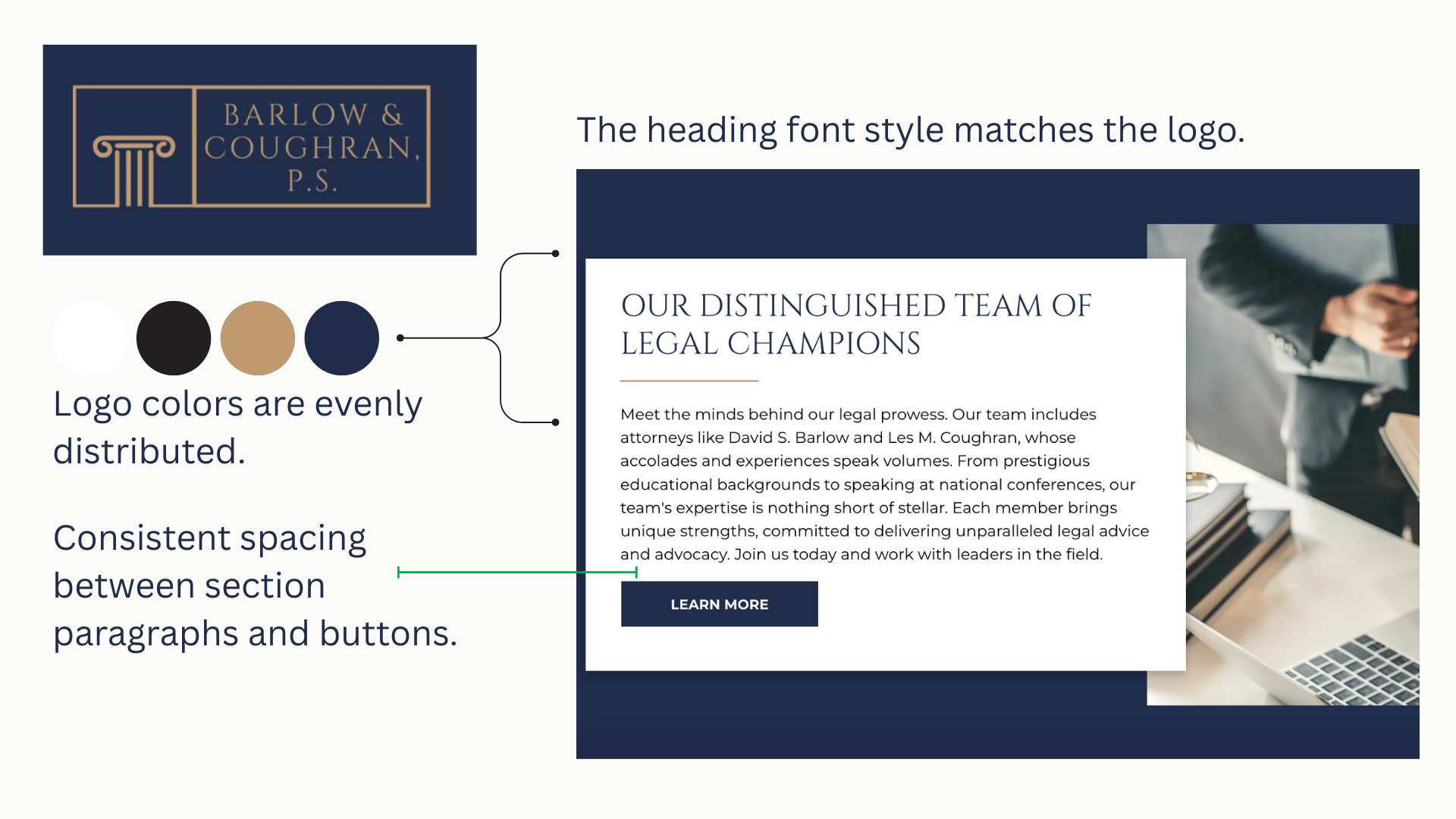
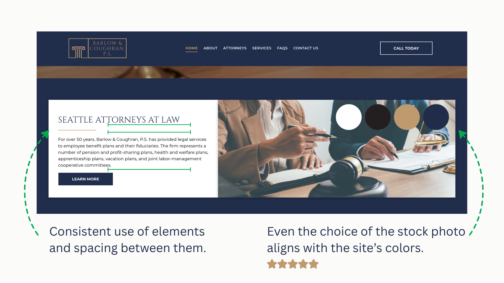
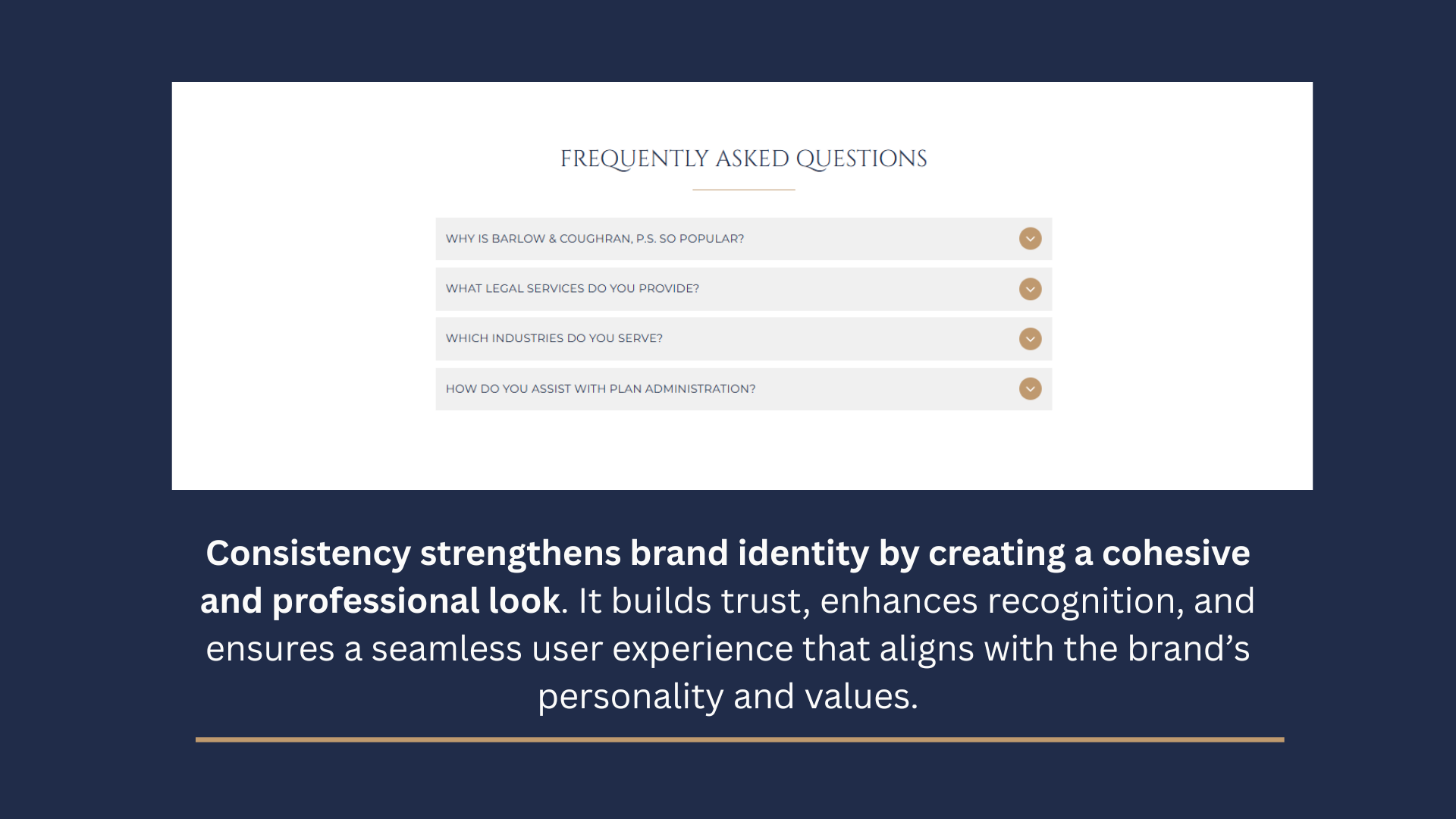
Enhance Your Brand with Cohesive Design
The use of typography and colors on a website says a lot about a brand. A consistent style helps create a polished, professional look that grabs attention and makes a site more recognizable. Let’s dive into how the right design choices can strengthen your brand identity below:

John
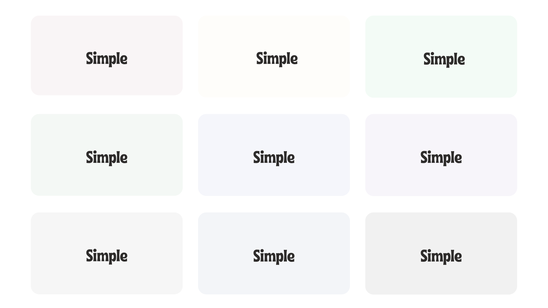
Let’s Break Up White Space with Barely-There Color
If your site has too much white space, break it up with a Barely-There Color that complements your design. Instead of pure white, use a soft-tinted shade of your primary color to add depth while keeping the layout clean and airy. A hint of warmth or coolness can make sections feel more intentional without overpowering the design.
Here are some samples: