

Dev Weekly Newsletter
9/13/24
Featuring
Weekly Tips From Your Leads!
Emma
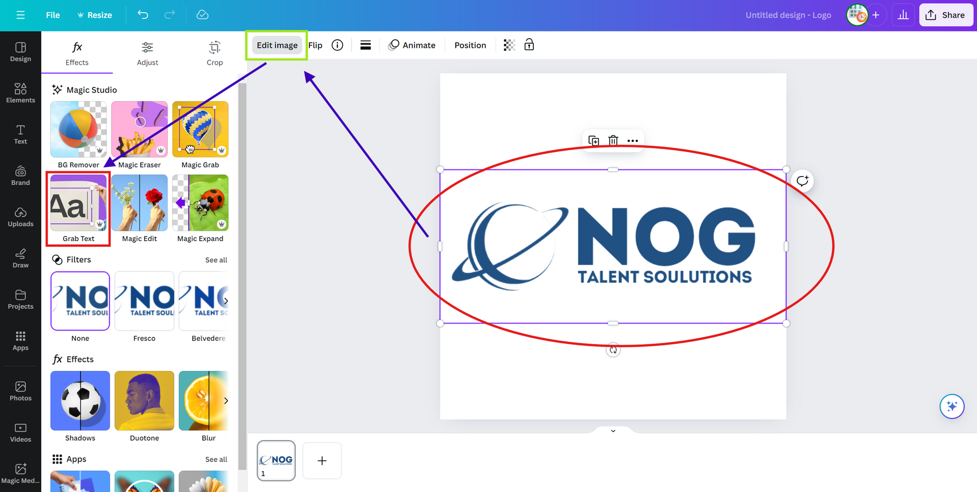
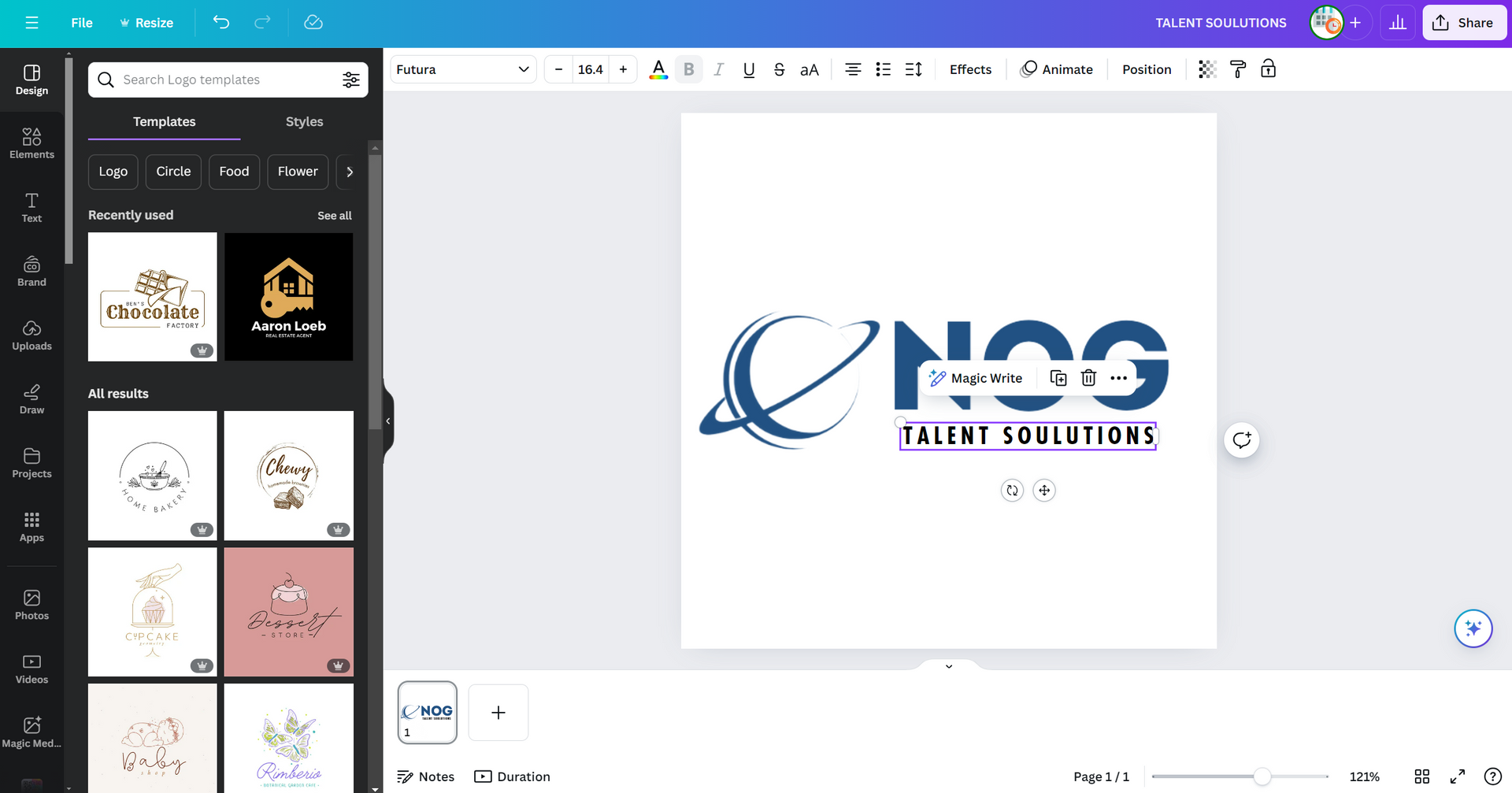
This week, let's dive into Canva's "Grab Text" feature, a useful AI tool from the "Magic Studio" collection. This user-friendly tool enables you to effortlessly extract text from a high-resolution logo, giving you the flexibility to edit, remove, or customize it however you'd like. Check out the gallery below for a step-by-step guide on how to make the most of this time-saving feature, which can enhance your logo designs or simplify modifications to CP branding.


Nick
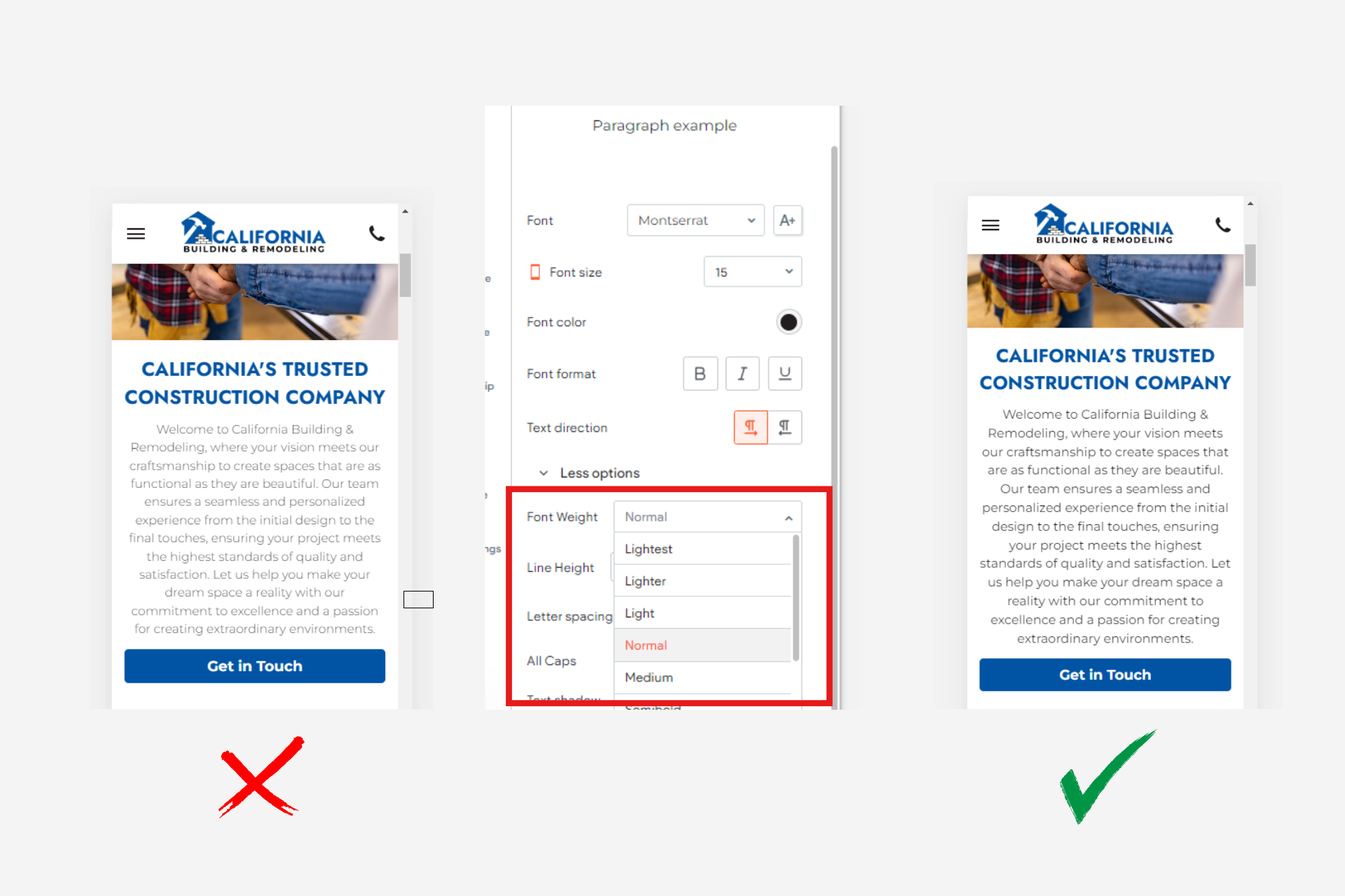
Avoid Using "Light" Font Weights for Paragraph Text on Mobile Versions:
A common accessibility issue that I run into when checking off sites is the use of light font weights on mobile versions. These lighter font weights make it difficult for users to read text due to the thin characters, ultimately resulting in an increased effort on the user to read text and causing strain on the eyes. To avoid this, opt for using normal font weight. To do this quickly, you can make the change in the theme settings when you are editing the text parameters. The next time you are optimizing your mobile version of your site, check to see if this is applied to your paragraph text!

Sophie
A helpful trick to ensure your site’s buttons are visually consistent is to standardize their dimensions across all sections. While our editor allows us to set global settings for fonts, colors, and shapes, it doesn’t apply to button height and length. This is an easy detail to overlook but can make a significant difference in maintaining a polished design. To avoid the tedious task of resizing each button individually, start by creating a button with the ideal dimensions and copy-pasting it across your site. Just remember to update the text and links for each section. This approach saves time and ensures a cohesive look without the extra hassle.

Carissa
Creating a specific feeling and personality for a site is crucial to strengthening a company's brand identity because it helps differentiate the brand in a crowded market. A well-crafted identity not only makes the brand more unique and personalized but also ensures that it resonates emotionally with the audience. This emotional connection fosters loyalty and makes the brand more memorable, encouraging customers to return and recommend it to others. By aligning the site's design, tone, and experience with the company's values and goals, the brand becomes more consistent and recognizable, reinforcing its overall image.
Here are a few examples of specific brand identities and personalities:
- Nike – Athletic and motivational: Nike's brand identity is centered around performance, empowerment, and motivation.
- Apple – Sleek and innovative: Apple's brand personality revolves around simplicity, sophistication, and cutting-edge technology.
- Coca-Cola – Fun and joyful: Coca-Cola’s brand is built on happiness, nostalgia, and bringing people together.
- IKEA – Affordable and practical: IKEA’s brand identity is rooted in being functional, accessible, and minimalist.
Each of these brands establishes a distinct identity that resonates with its target audience, making them memorable and successful.

Joe
Optimize Font Sizes Across Devices Before Building Dynamic Page Templates:
Ensure your homepage’s font sizes are properly set on desktop, tablet, and mobile versions before using it as a template for dynamic pages. If your homepage isn’t optimized for tablet and mobile, using it as a template will multiply those errors across all your dynamic pages. Consistent font sizes across devices will save time and prevent formatting issues, helping you maintain a polished and professional look as you build out your site.
Recommended Font Sizes
These are the recommended font sizes for optimal readability and design consistency:
Mobile:
Hero Header: 36-48px
Header: 30-36px
Paragraph & H1: 16px
Desktop/Tablet:
Hero Header: 60-72px
Header: 36-48px
Paragraph & H1: 16-18px
Site of the Week Winner
Thanks So Much to All of Our Amazing Devs!
This Week's Honorable Mentions:
Congratulations, Anna Aleksandrova, for:
Falasca's Friendly Service
Congratulations, John Zimmer, for: