

Dev Weekly Newsletter
April 18th, 2025
Including a brief video presentation featuring:
Important Announcements of the Week:
➞ APRIL 25TH DESIGN WORKSHOP WITH SOPHIE:
Next Friday, April 25th, Sophie will be hosting a voluntary design workshop between 10 AM and 11 AM EST! Want to brush up on your design skills? Have you ever wanted to learn how to implement a design choice on your site that you’ve always been curious about? This workshop is the perfect opportunity to explore, ask questions, and get hands-on tips from Sophie. Don’t miss it! Reach out directly to Sophie to let her know that you are interested and she will provide you with any further details!
*** If you need clarification or assistance with any of the above announcements, feel free to reach out to your Dev Leads. ***
Weekly Tips From Your Leads
Emma
I'll be back soon with more helpful tips! :)

Nick
You may be inclined to choose an image for your dynamic page banner that you have already used on your site to save time. I find that this typically comes up with images that are found in the gallery that are also used as the banner image. This choice might not seem like a huge deal at first glance, but it makes the design of your site feel unpolished, as opposed to using unique images throughout. So, if you ever find yourself in this situation, take the extra time to find a new and unique image to use as the banner photo!
*** I created this scenario on this website as an example to use for this week's newsletter tip ***

Sophie
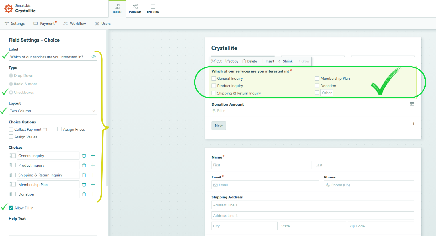
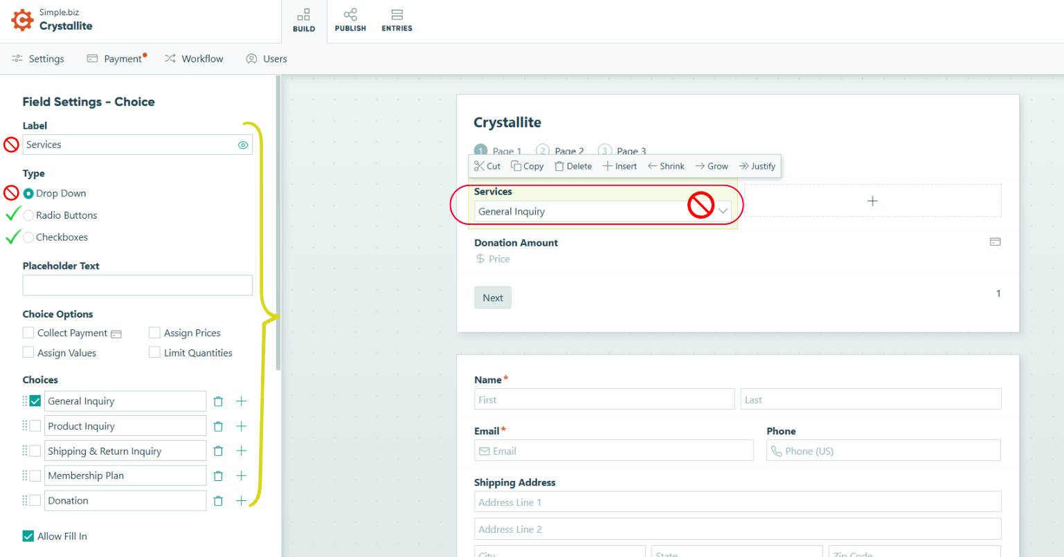
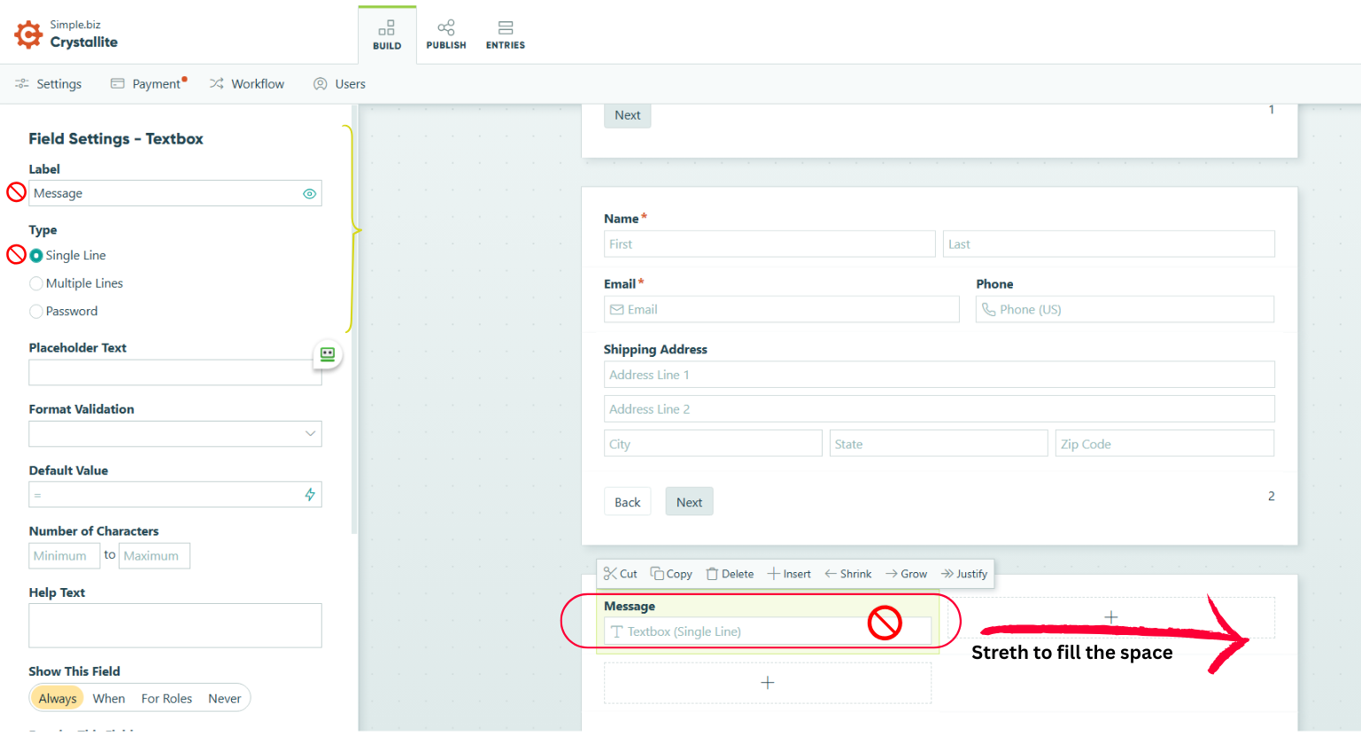
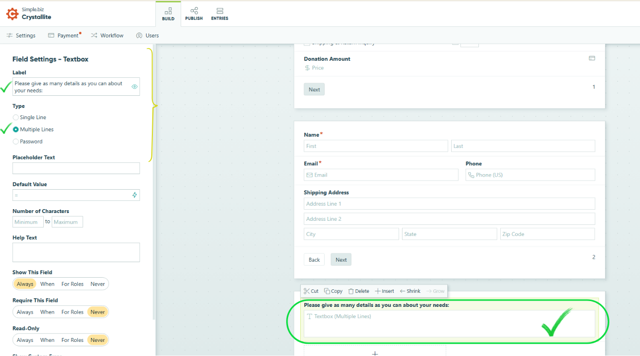
This week, I’d like to offer a reminder about Cognito Forms. More often than not, these important forms don't follow our established SOPs, leading formatting and style to vary among developers. One of our main goals on the Web Development Team is to ensure consistent formatting, regardless of which developer builds the site. Let’s review the most common formatting mistakes to improve consistency:
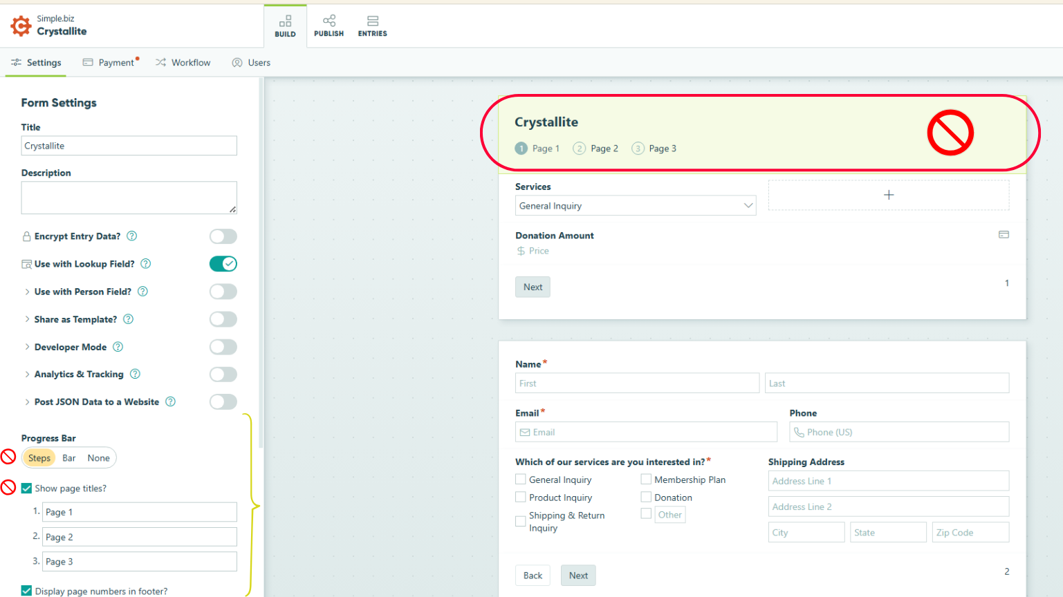
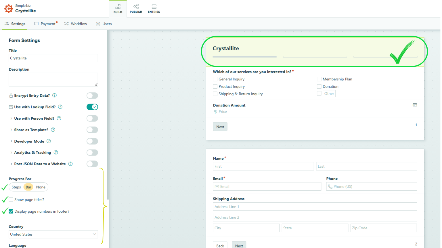

Carissa
The Power of Accent Colors


...............................Intentional color use.............................................................Unintentional color use
Color is a strong design tool, but too many colors can make everything blend together. Instead, pick one or two accent colors and use them carefully. This helps guide attention, keeps things clear, and gives your design a balanced feel.
Intentional Accent Color:
- Clear focus
- Balanced design
- Stronger impact
Too Many Colors:
- Cluttered and overwhelming
- Lack of focus
- Visual fatigue

Joe
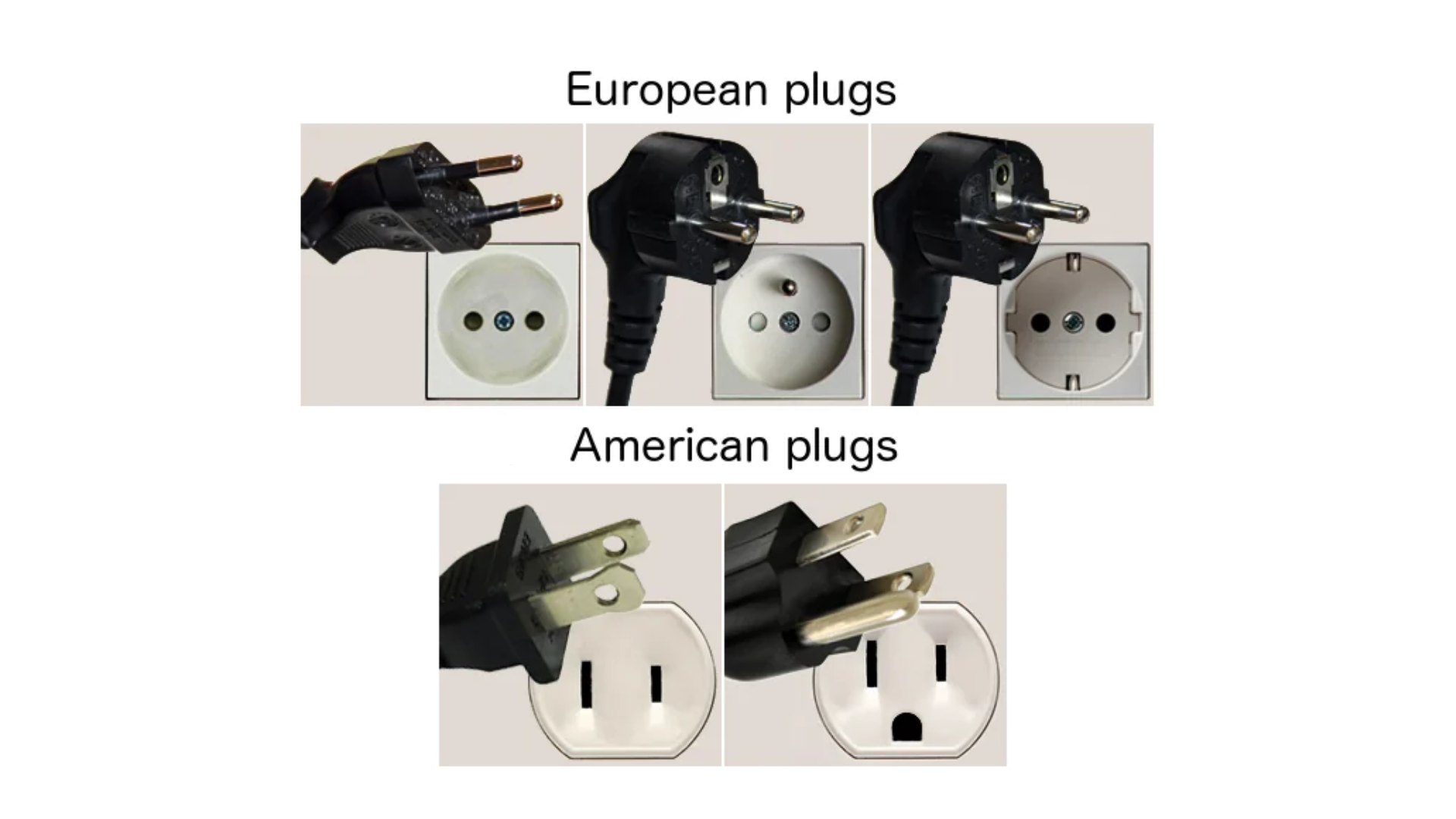
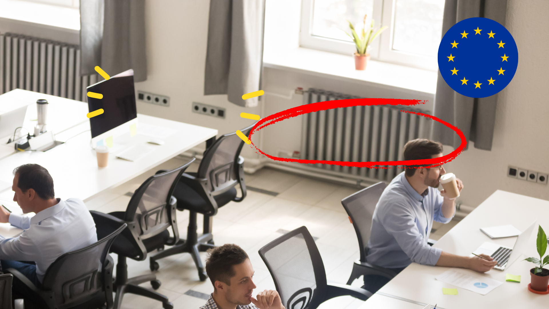
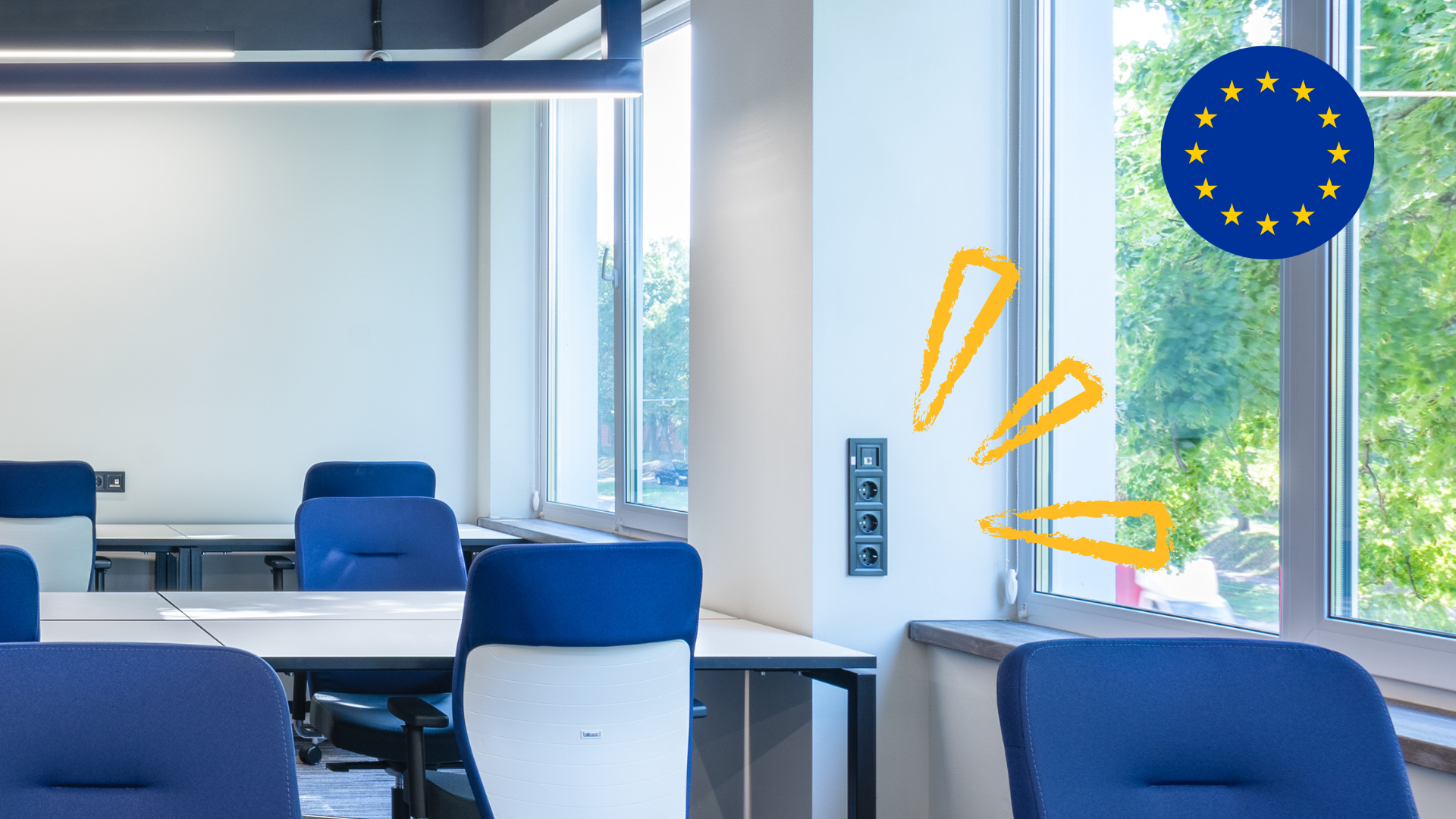
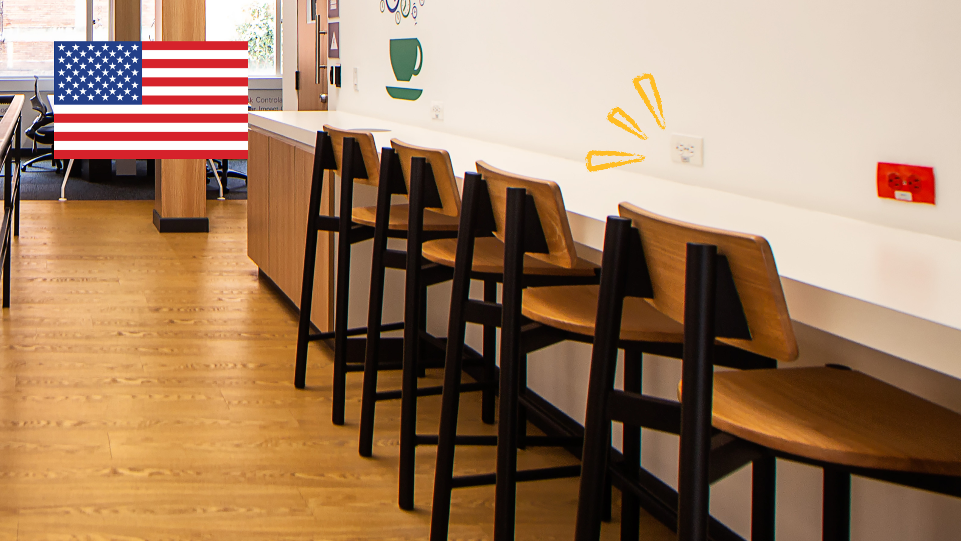
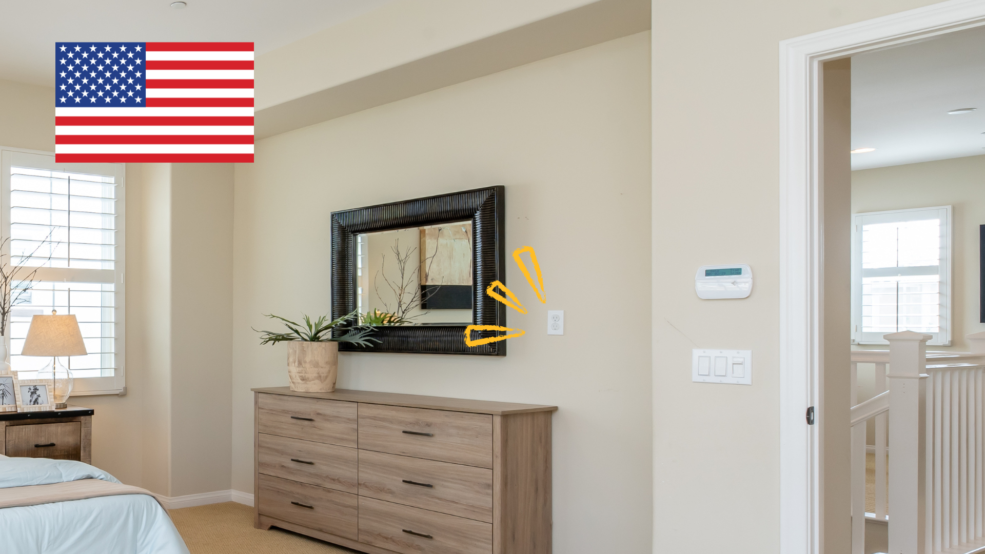
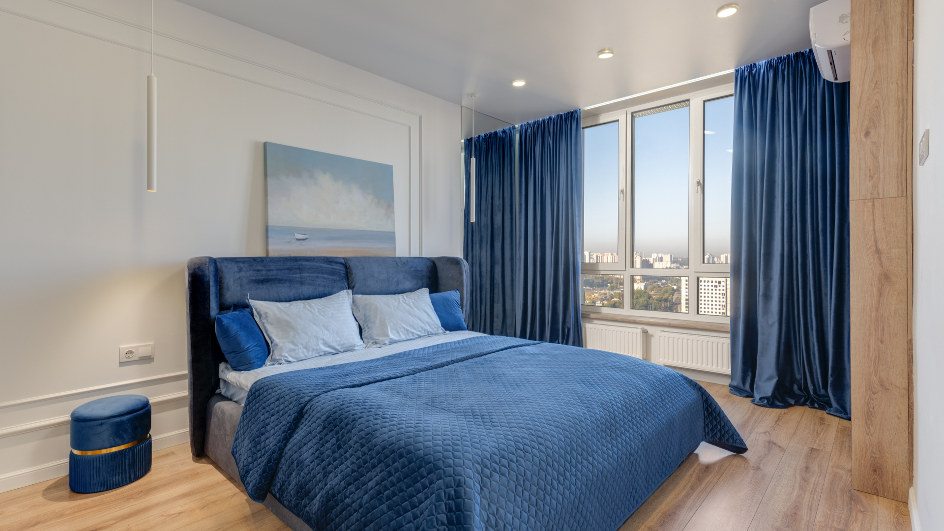
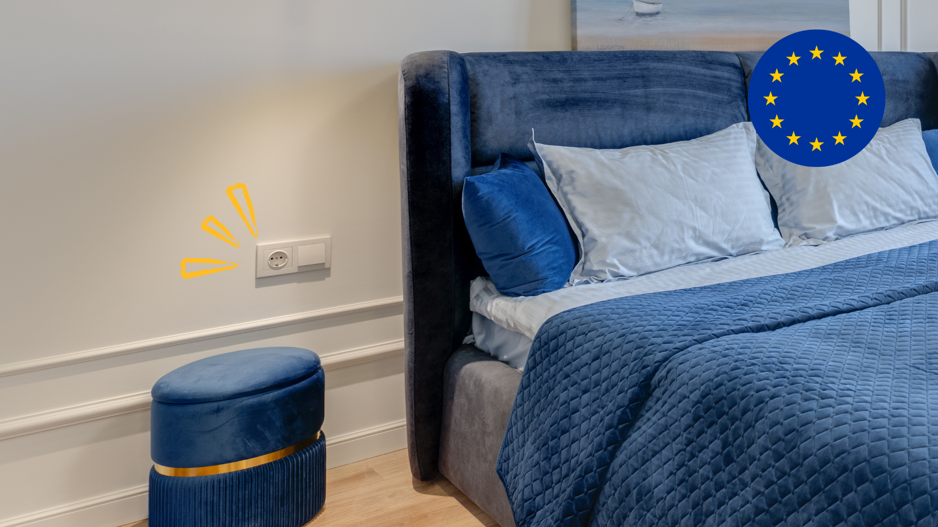
Spot the Difference: U.S. vs. European Outlets in Stock Photos
Be mindful of subtle image details; they can affect how authentic a website feels.
Some stock photos may look appealing at first glance, but a closer look might reveal
European-style electrical outlets
or other elements that don’t align with U.S. standards.
Outlet differences:
USA: 110–120V,
flat pins or grounding pin
Europe: 220–240V,
round pins
Most offices in America have central heat and air, so if you spot a visible furnace or wall-mounted heater, that’s usually a sign the photo may not be U.S.-based.
We always aim to represent our clients as
locally
and
authentically
as possible.
Even small details like outlets or appliances can hint that an image is out of place. Always choose
clean, locally relevant, and context-appropriate photos.
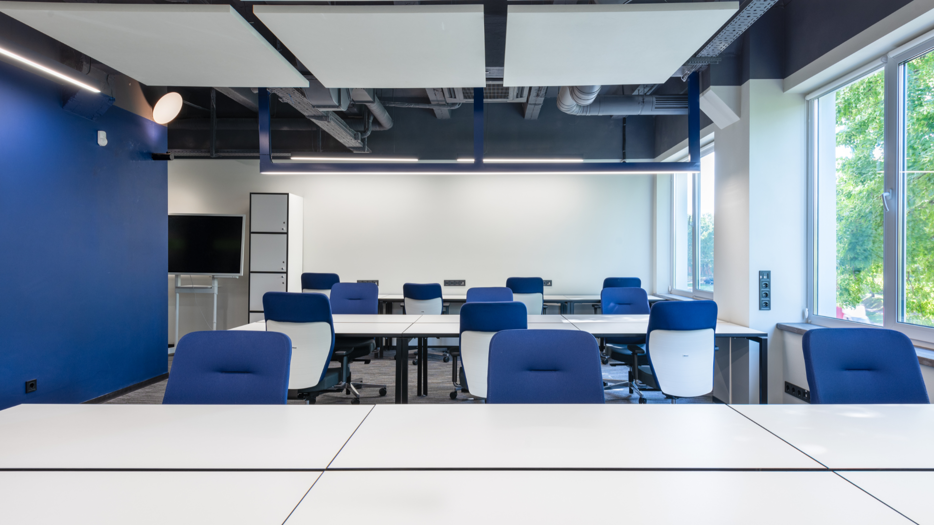
Below are examples of commercial and residential spaces to help you visually spot the difference.
Use these as a guide to better recognize what looks natural in a U.S. setting vs. what might feel off.


John
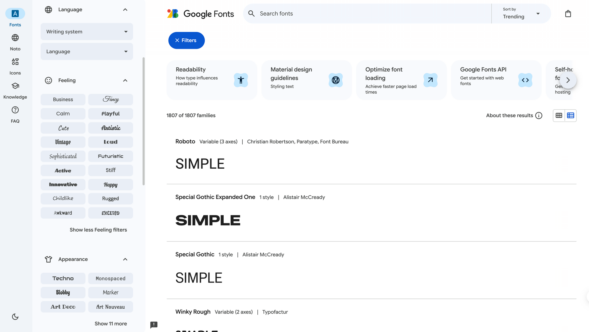
Preview Before You Pick
Remember when we talked about adding fonts within the Duda editor? Here’s a quick tip to help you pick the right one for your site before implementing it into your design settings.
Head over to
fonts.google.com, where you can try out different fonts and see how headers will look when paired with your chosen paragraph font.
You can filter the fonts by:
- Feeling – like fun, serious, or modern
- Appearance – bold, thin, wide, etc.
- Calligraphy – fancy, handwritten styles
- Serif / Sans Serif – classic or clean styles
- And more, use your imagination!
Once you find one you like, go back to Duda and add it. No need to download anything!
Site of the Week Winner
Thanks So Much to All of Our Amazing Devs!
This Week's Honorable Mentions:
Congratulations, Jake Quick for:
Holmes Construction and Fence
Congratulations, Kim Feenstra for: