Dev Weekly Newsletter
June 13th, 2025
Including a brief video presentation featuring:
Important Announcements of the Week:
➞ COMING SOON: SIMPLE WEB DEVELOPMENT TEAM'S 2ND QUARTERLY PRESENTATION
Your Dev. Leads have been busy at work creating a presentation for the second quarter of this year. The goal of these presentations is to point out achievements, recognize improvement, and summarize and review team goals as we end "Q2." This presentation is an opportunity for us to show our appreciation for your hard work and shout out valuable members of our amazing freelance team. Stay tuned for updates and keep your eyes on your inbox!
*** If you need clarification or assistance with any of the above announcements, feel free to reach out to your Dev Leads. ***
Weekly Tips From Your Leads
Emma
This week's Design Challenge looks simple on the surface but required a bit of strategizing, as well as the ever-helpful suite of tools in Canva's Magic Studio. Watch the quick demonstration below to see how I created a new logo design with colors that will pop on a dark background or when overlaid on a photo. If you have a design challenge or client request that has left you perplexed, reach out for a solution and perhaps a feature in next week's tip!

Nick
Inverting a logo for transparent headers can be a bit tricky—it’s not always as simple as swapping all of the colors to white. In this fairly quick video, I’ll walk you through how to do it in Adobe Illustrator while making sure highlights, shadows, and overall composition stay sharp!

Sophie

Carissa
Back to basics: The Golden Rule of Font Sizing


Desktop Rule of Thumb:
- H1 Text .............................. 16px
- Paragraph ...................... 16px-18px
- Section Title .................... 36px-48px
- Hero Banner Title ..........
60px-72px
Mobile Rule of Thumb:
- H1 Text ................................ 16px
- Paragraph ........................ 16px
- Section Title ..................... 30px-32px
- Hero Banner Title ...........
36px-48px
*Disclaimer: Font sizing can vary depending on the typeface you choose. Some fonts appear naturally larger or smaller than others at the same point size, so always test for readability across devices and screen sizes!

Joe
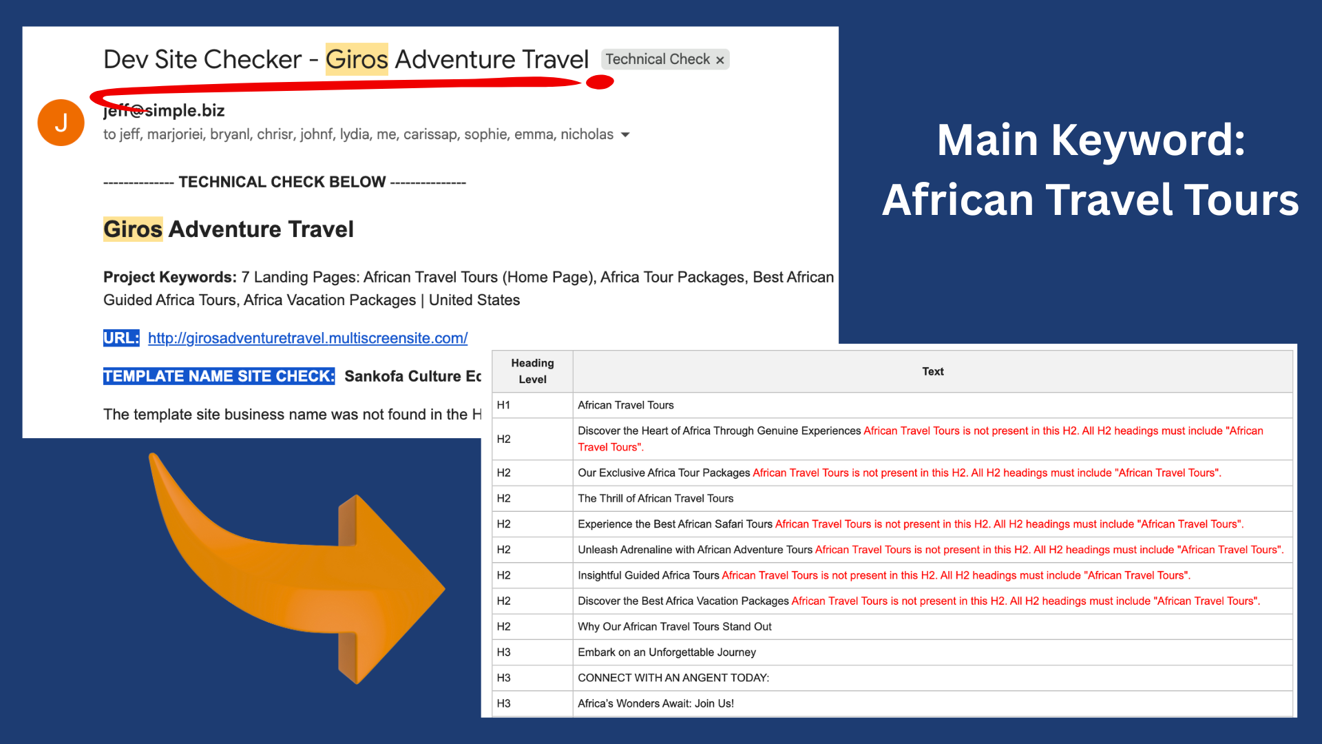
Master Header Tagging for Better SEO
Always use H1-H6 header tags correctly to help search engines understand the structure and hierarchy of content. This practice improves the website's SEO by making it easier for search engines to index and rank pages effectively. Make sure this technique is
applied consistently across all projects.
While working on your website,
always make sure to check the Dev Site Checker email
to address improper heading tags,
ensuring a more polished home page and dynamic pages.

John
A Better Way to Check Your Mobile Layouts
Duda’s mobile view doesn’t always accurately reflect what a website will actually look like on a real phone, not to mention various models. Responsively is an app that gives you a more accurate preview on different devices. It updates in real time and helps you spot issues that might not show up in the Duda editor.
Here’s a preview of my experience checking a site using the Responsively App:
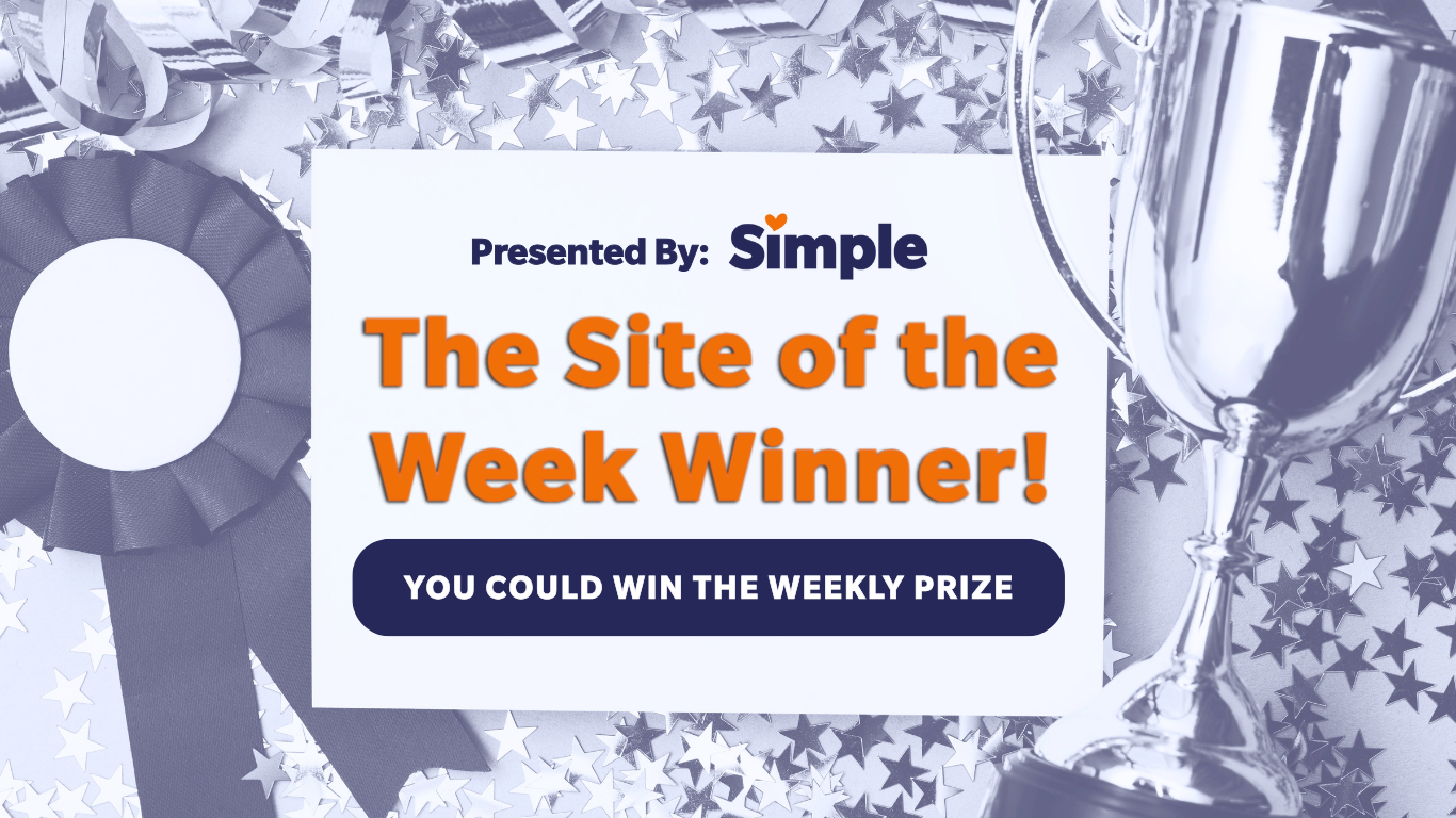
Site of the Week Winner
Thanks So Much to All of Our Amazing Devs!
This Week's Honorable Mentions:
Congratulations to Khalil T. for:
Ecopal Mobile Detail
Congratulations to Lyle V. for: