
Dev Weekly Newsletter
8/16/24
Featuring

Weekly Tips From Your Leads!

Emma
If you haven’t checked it out yet, Duda has rolled out a handy new feature under the Design tab for Navigation Links. This new option lets you apply consistent capitalization to all your links with just one click, ensuring your site’s interface looks streamlined and tidy. Now, if only Duda would extend this feature to buttons—talk about a major time-saver!

Nature's Symphony

Nick
There are many things to look out for when optimizing the mobile version of your website, but one thing that I see most frequently is inadequate spacing between two sections or rows. Luckily, there is an easy fix to correct this! If you have encountered this issue before, you might have been tempted to add an empty row between two sections and call it a day. But if you add an empty row between two sections, this actually causes issues if you forget to hide it on the tablet or desktop versions of the site. So, instead, I recommend adding some margin spacing to either the top of a row or to the bottom of a row. This is because Duda will not carry over the spacing parameters you set on a mobile version of the site to the desktop version (they are treated separately, similarly to font sizes). Try this tip out the next time you are optimizing the mobile version of your site!


Sophie
Buttons are an important tool, and we use them in almost every section of our sites. When you're working on your site, take a moment to read the text on each button. It's important not to repeat the same call to action, like "Call Now" or "Contact Us," over and over. Mix it up with different phrases like "Request a Quote," "Check Out Our FAQ," or "Get in Touch."
Also, don't forget to check where your buttons are actually linking. Sometimes, template buttons can be linked incorrectly—like a "Learn More" button going to the home page or a "Call Now" button that open's the Cognito form pop-up. Ensuring each button directs users to the correct location creates a positive user experience!

Carissa
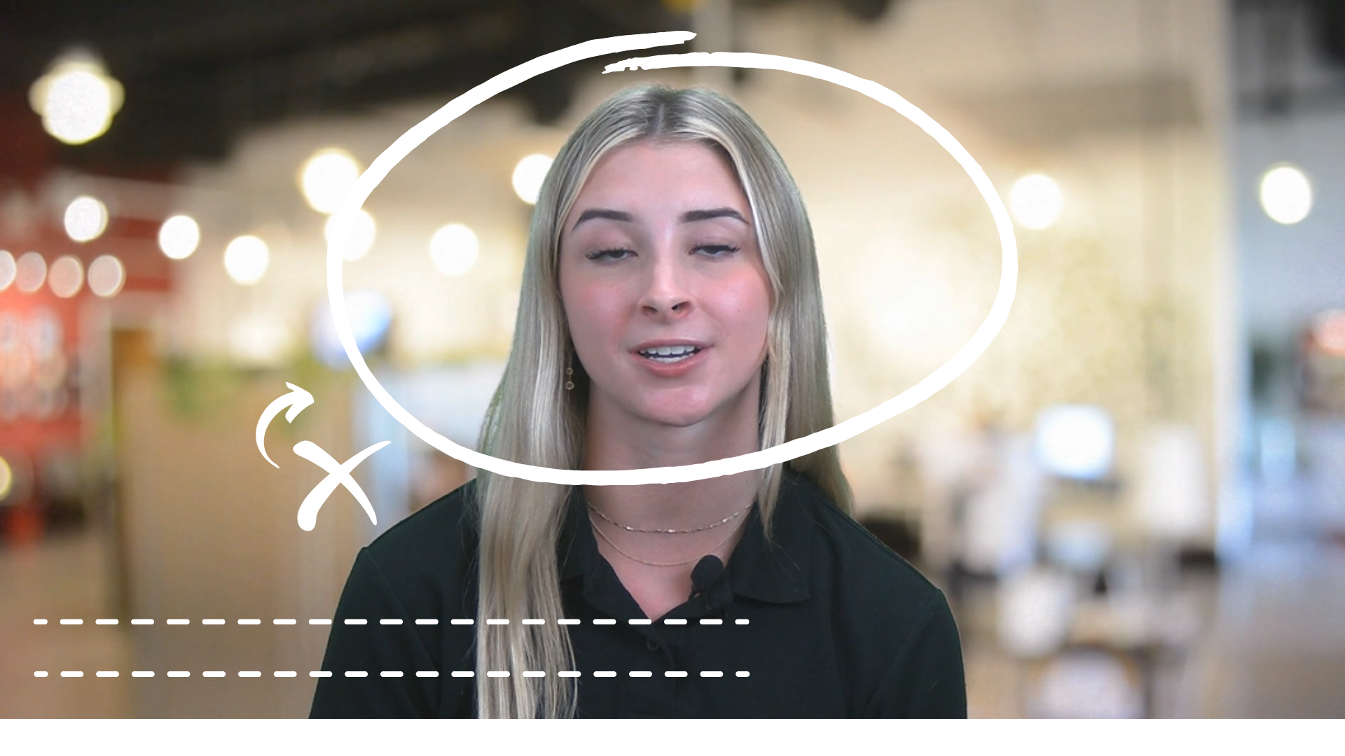
What makes a great Green Screen (GS) video thumbnail? The ingredients include the business's name, the business's phone number, a smiling spokesperson, and a color scheme that matches the rest of the website. With these four elements, your thumbnail is ready to go!
We want to make sure we include these things in order to provide a comprehensive preview to the user of what the video is about. We want to capture the spokesperson in a flattering shot as well, because we want to encourage first-time visitors to play the video when they see the section. Down below, you'll see examples of what a thumbnail should and shouldn't look like: