

Designing Adaptive Layouts for Tablet and Mobile
Tablet View:
- Since desktop changes can impact the tablet layout (and vice versa), prioritize optimizing the desktop experience.
- The tablet design doesn’t need to be perfectly tailored, it should remain user-friendly and consistent.
Mobile View:
- Mobile designs are independent of desktop and tablet changes, offering more flexibility.
- Tailor the design to mobile needs for the best user experience.
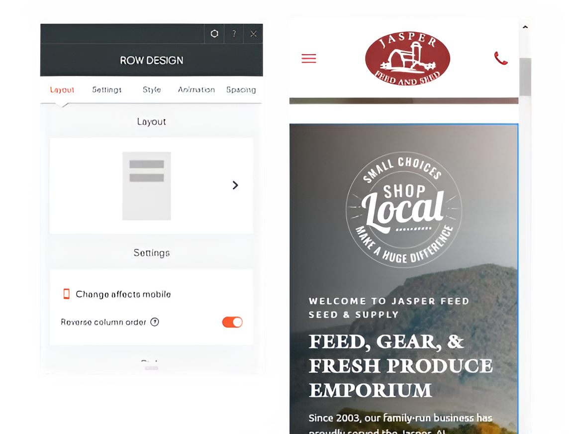
Reversing Column Order on Mobile View:
- There is a feature in the mobile view that allows you to reverse the column order (i.e., the image and text order). By adjusting the column arrangement, we can modify the section's design so that the image appears above the text.
- Access the mobile view: In your design, switch to the mobile view to make adjustments specific to mobile devices.
- Locate the column settings: Find the section with the image and text layout that you want to adjust.
- Reverse the column order: In the column settings, enable the option to reverse the order of the columns, switching the position of the image and text.
- Preview and adjust: After reversing the order, preview the mobile layout to ensure the image now appears above the text, and make any necessary adjustments to spacing or alignment.
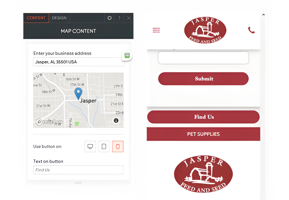
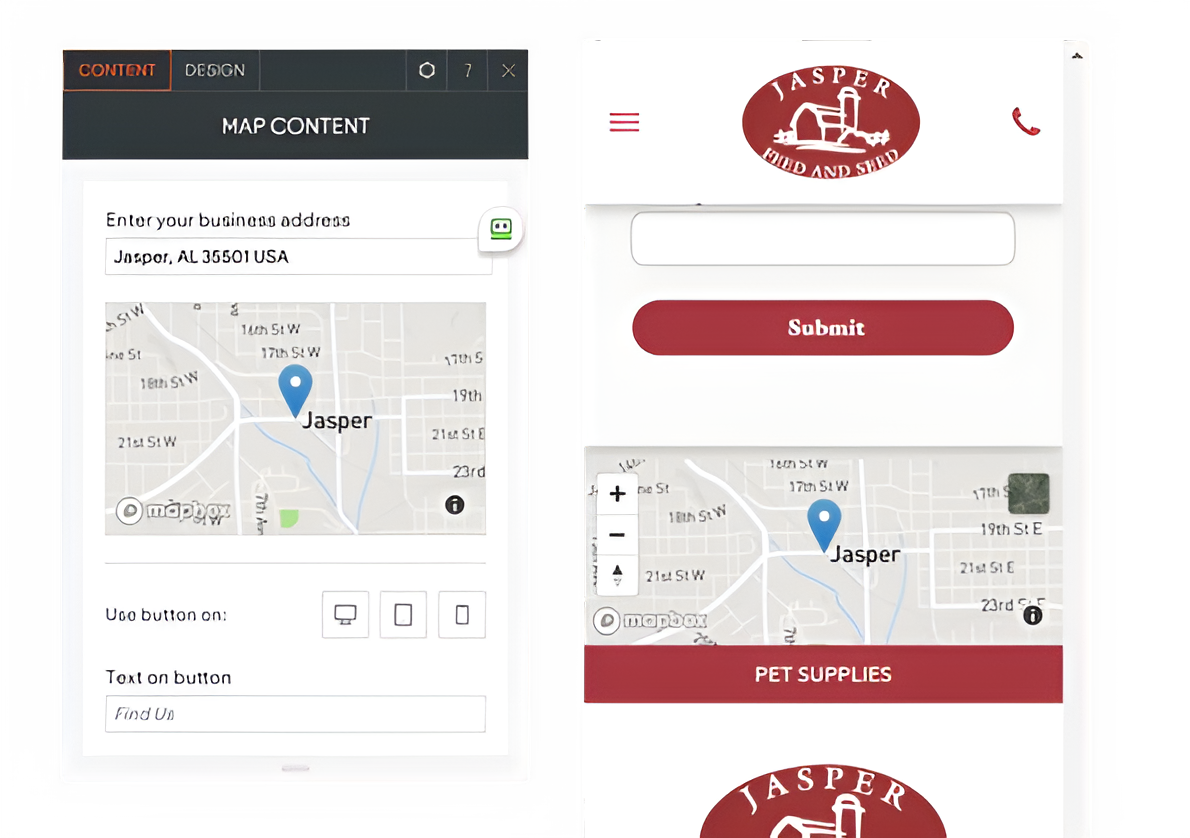
Displaying the Map on Mobile View:
- There is a feature in the mobile view that allows you to display the map box. By enabling this, you can change the "Find Us" button into a map box.
- Switch to mobile view: Access the mobile-specific settings by selecting the mobile option.
- Enable the map box feature: Locate the button that allows you to display the map box and turn it on.
- Preview and adjust:
Review the mobile view to ensure the map box displays correctly and adjust if needed.