Dev Weekly Newsletter
12/13/24
Featuring
Important Announcements of the Week:
➞ ORGANIZE PROJECT NOTES:
Bitrix now has a script you can run to receive an AI-generated interpretation of client notes that should make them more organized and easier to digest. At the top of your project dashboard, there should be a tab that includes an option for "Smart Scripts," where you will find "Organize Project Notes" in the drop-down menu. Click on this, and the notes will be posted as an unpinned comment in Bitrix in a few minutes or less. We hope this is helpful!
➞ PRE-CHECK FOR DOUBLE SITES:
The next time you are assigned a "double" (a site with multiple keywords and locations), save yourself some time and effort and allow a Dev Lead to perform a pre-check. To do this, you must first complete the HOME PAGE and 1 (ONE) DYNAMIC PAGE so we know how the rest of the site will look. When you are ready, check the corresponding box in Bitrix and then move your site to "COLLABORATION." This will trigger a notification to your Dev Leads, who will then begin pre-checking your site. We will move it back to "UNDER CONSTRUCTION" when finished so that you may complete your work!
If you need clarification or assistance with any of the above announcements, feel free to reach out to your Dev Leads.
Weekly Tips From Your Leads!

Emma
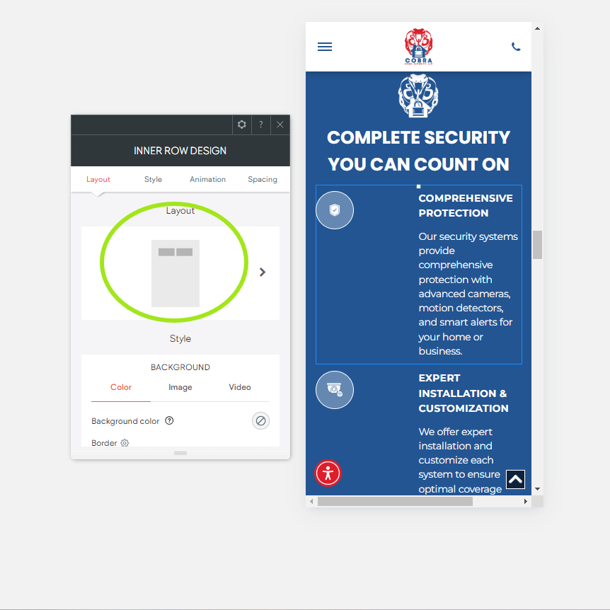
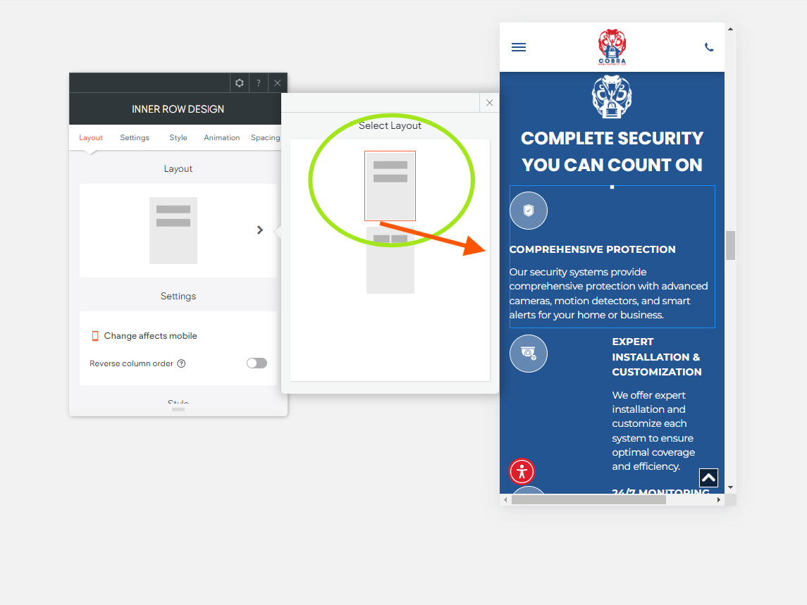
This week we will focus on a tip to improve the formatting of your site in Mobile View. Inner rows can be a beneficial way to align sections, for example, those that contain a lot of written information or highlight a company's services with icons. While inner rows may look great in Desktop View, the same is not always true in Mobile View. Fortunately, Duda recently introduced a way to make these sections more user-friendly when viewed on a mobile device, and the changes won't affect the other views once made.
Check out the image gallery below to see an excellent example of
how you can better format inner rows in mobile view:


Nick
When it comes to choosing stock images for websites, we all know there are certain guidelines to follow. But it’s equally important to apply those same principles when selecting stock footage for Hero Banner background videos or for Green Screen Video edits.
As a quick refresher, here are some things to look out for when selecting stock video footage for your projects:
- AUTOMOBILES: Do not use any footage that contains European- and Asian-style vehicles (esp. trucks), right-side drivers/roads, or non-U.S. license plates.
- CONTRACTORS/COMPANIES: Avoid stock footage that depicts the identity or uniform (esp. overalls) of a contractor or employee, as well as footage that specifically shows the interior or exterior of a location (ex. stock exterior shot of a church that is not the actual church we are building the site for.)
- SPECIFIC/UNIQUE LOCATIONS: Avoid using footage that depicts a very specific place, or be sure to find video clips that accurately depict the location of your client. (ex. no palm trees for a client in New Hampshire, but there should be New England-style architecture, etc.)
Of course, that doesn't cover everything, but by keeping these details in mind, you should be able to choose stock images and videos for your website with greater discernment. This will ensure the site looks authentic and accurately depicts the client's company!

Sophie
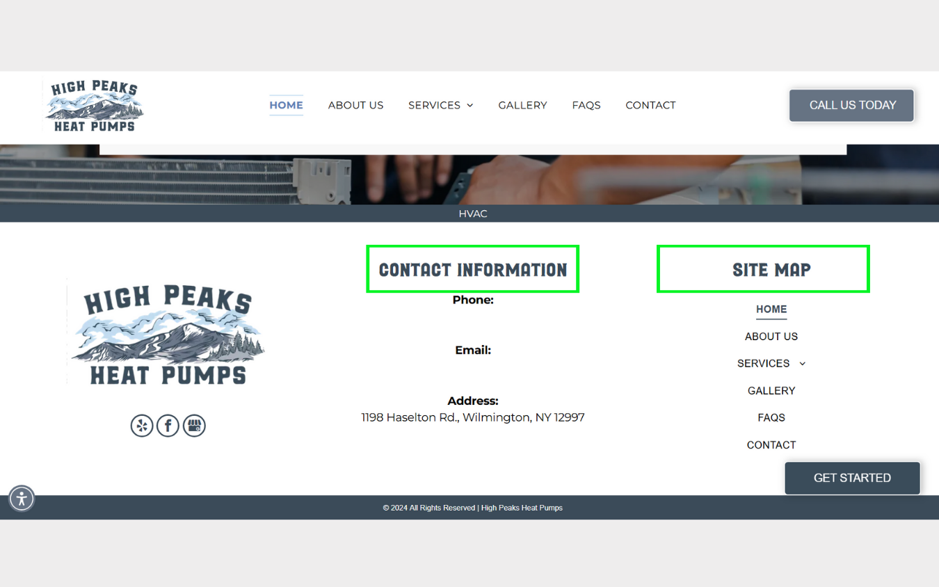
Let's take a closer look at how to properly set up header titles for SEO. Every header on your website has the option of being a H1, H2, H3, H4, H5, or H6. Knowing when to use each is critical to achieving an effective SEO score.
Here is a guide for when and where to use each:
For best results,
each header should be used
at least once
on every webpage tasked with ranking for SEO.
H1: The Top Priority
- Each webpage must have one H1 tag—no more, no less, and always 16 pt. font.
- The H1 should exclusively target the page's main keyword.
- Place the H1 at the bottom of the page, above the footer. Avoid placing it in the footer to prevent SEO issues.
H2: The Keyword in Action
- Use H2 tags for headers that contain the main keyword in a sentence or phrase.
- You can use as many H2s on a page as needed.
H3: Related Topics
- Use H3 tags for headers containing language related to the keyword.
- H3s provide context without directly repeating the main keyword.
- You can use as many H3s on a page as needed.
H4-H6: Additional Content
- Reserve these for less critical, non-topical header titles like "Contact Us" or "Frequestly Asked Questions."
- The content of these headers will not mention the keyword or any language related to the keyword.
- Because header structures follow a descending hierarchy, h6's should be reserved for the most generic content.
- You can use as many H4s-H6s on a page as needed.
Here are some visual examples of what each header should be tagged as:
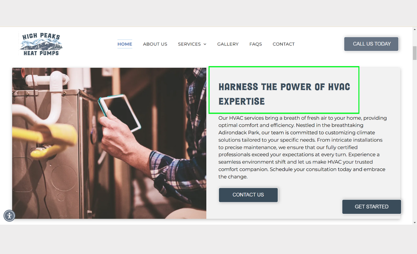
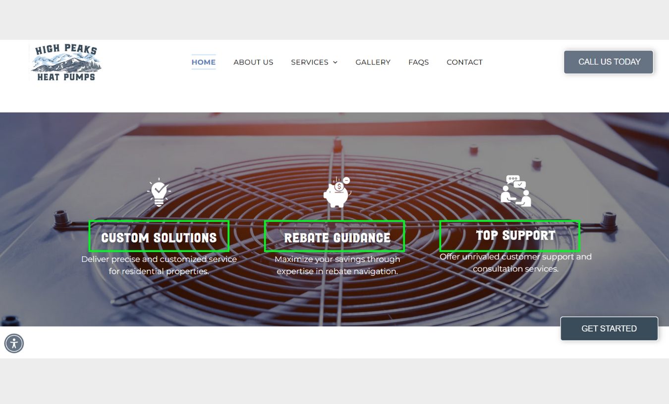
The keyword for the example's webpage is “HVAC”

Carissa
LOGOS! A clean and professional-looking logo is essential for a company's brand and visual appeal, including their website. This week, let's delve into some of the characteristics of an effective and eye-catching logo design.
Here are the top 3 keys to creating an excellent logo:
- Alignment: Ensure that the words in the logo are aligned properly. If stacking words (e.g., two lines), align them so that each line is balanced and spaced evenly.
- Color Scheme Matching: The logo’s colors should complement the website’s color scheme, creating harmony and reinforcing the brand identity.
- Font Style: Choose a font style that aligns with the brand's personality and complements the website’s typography. The font should be legible and scalable, ensuring readability on all screen sizes.
A huge thanks to the developers who helped with this week’s tip by creating the wonderful logos below!


Joe
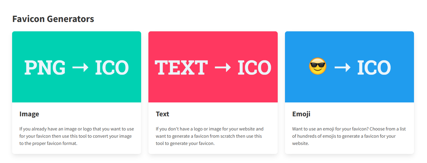
WHAT IS A FAVICON AND WHY IS IT IMPORTANT?
A favicon is a small 16×16 or 32x32 pixel image that is an element of a website's branding,
usually a company's logo, or a graphic icon that represents what they do. Its main purpose is to
help visitors locate your page more easily when they have multiple tabs open.
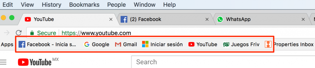
WHERE CAN FAVICONS BE FOUND?
- Drop-down menus for bookmarks
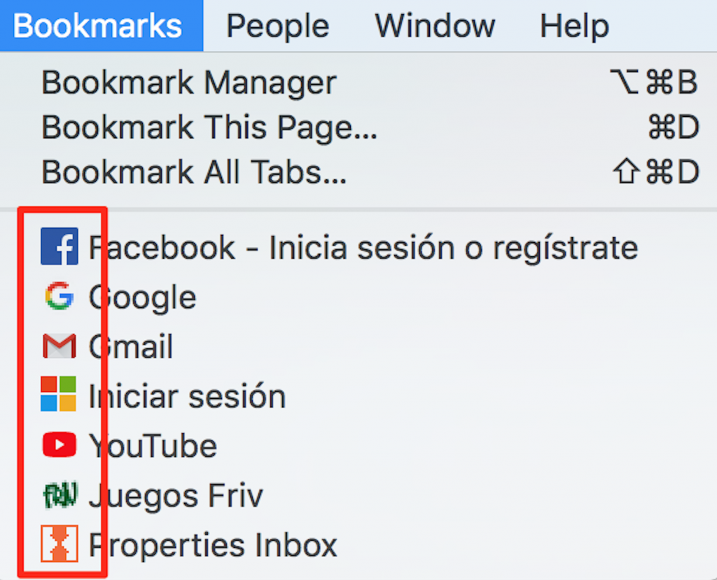
- Browser tabs
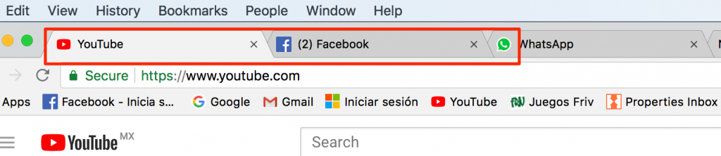
- Toolbar Apps
Want to try out a new efficient way to create Favicons for your site? This tool (https://favicon.io/) allows users to turn exisiting logos into Favicons and helps you create letter icons.