Joe
Tip of the Week: 3 Commonly Overlooked Mobile View Design Details
When reviewing a site, it’s easy to overlook the small but impactful design details that make a big difference in the user experience. Here are three common elements that often get missed:
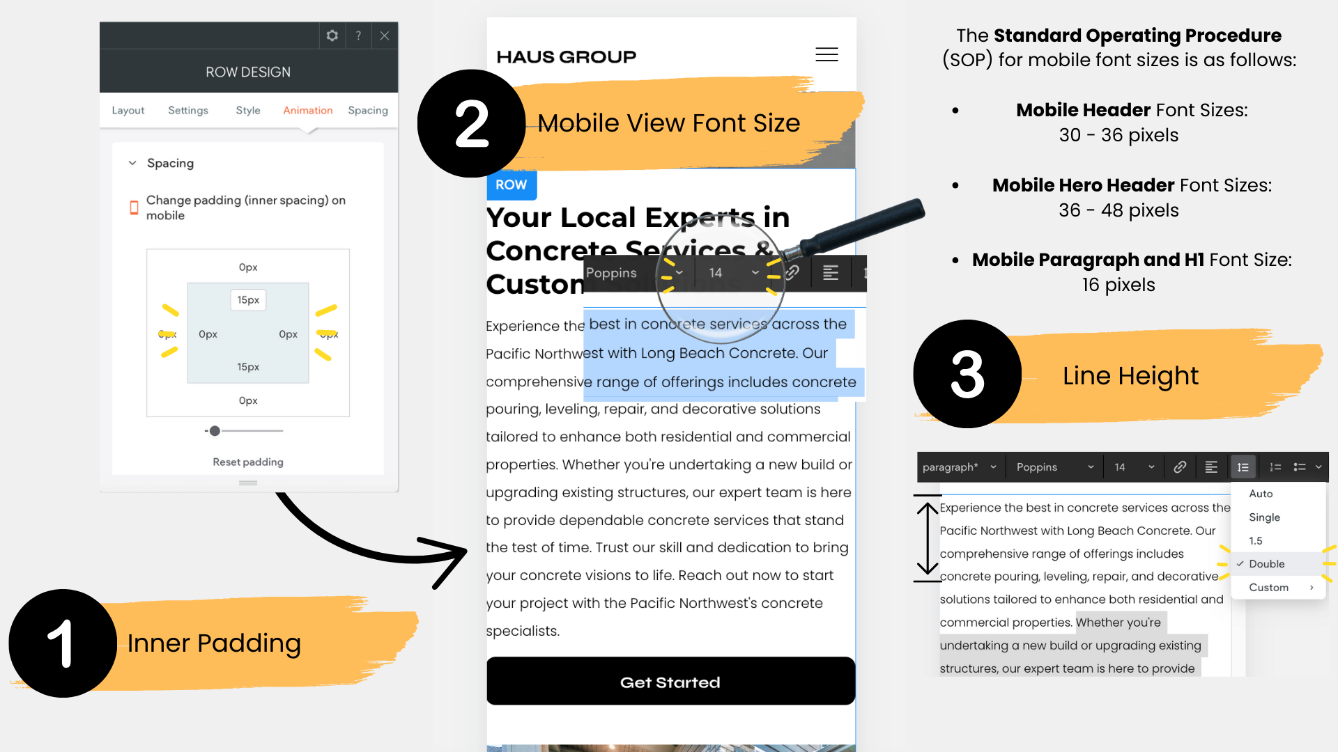
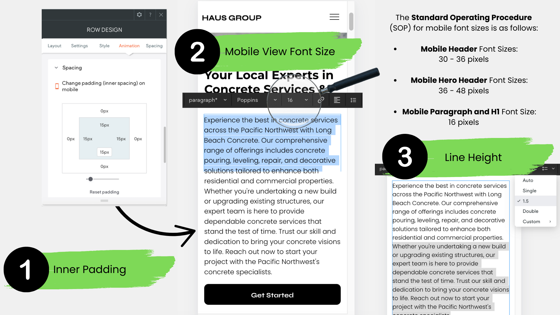
- Mobile View Inner Padding:
Make sure that inner padding on mobile versions is adjusted properly. Without adequate padding, text and elements can feel cramped, leading to a cluttered and hard-to-read design. Ensuring proper spacing around content is key for a clean, legible mobile experience. - Paragraph Font Size:
Many sites still use font sizes smaller than the recommended 16px for body text. Keeping the font at this size ensures readability across all devices. Anything smaller can strain the reader's eyes, especially on mobile screens. - Line Spacing:
Proper line spacing is crucial for readability, yet it’s often overlooked. The recommended line spacing is 1.5. Anything smaller can make the text feel cramped and harder to read, while spacing set to double can appear too loose. Consistent 1.5 line spacing strikes the perfect balance.