

Dev Weekly Newsletter
January 31st, 2025
Including a brief video presentation featuring:
Important Announcements of the Week:
➞ REMINDER ABOUT USE OF LICENSED/COPYRIGHTED FONTS ON WEBSITES:
Despite the announcement last week, your Dev Leads are still finding sites that use fonts that were created for
PERSONAL USE ONLY. This means they
can't be used for logos or any other site branding
without paying for a license.
In order to help our company avoid receiving
DMCA notices (a legal claim about unauthorized use of copyrighted material), please revisit these
guildelines from last week's newsletter.
➞ FINAL UPDATE ABOUT DEPARTMENT-WIDE MEETING:
Due to a low number of responses to our survey about the date and time of a live online department-wide meeting, plans have changed. Instead, your Dev Leads will be preparing a multimedia presentation of sorts (which is still in the planning stages) to share with you all mid-February. So, stay tuned for that and be sure to check here for updates!
➞ A STRONG SUGGESTION REGARDING PROMISE DATES/DEADLINES:
In order to reduce the number of late sites or last-minute revisions/collaborations that can lead to subpar work, we ask that you strive to submit your projects
at least 1-2 days prior to the Promise Date listed in Bitrix.
This assures your site is given the proper attention and care it needs, whether by you, a dev lead, or a collaboration,
without sacrificing deadlines.
If you need clarification or assistance with any of the above announcements, feel free to reach out to your Dev Leads.
Weekly Tips From Your Leads

Emma
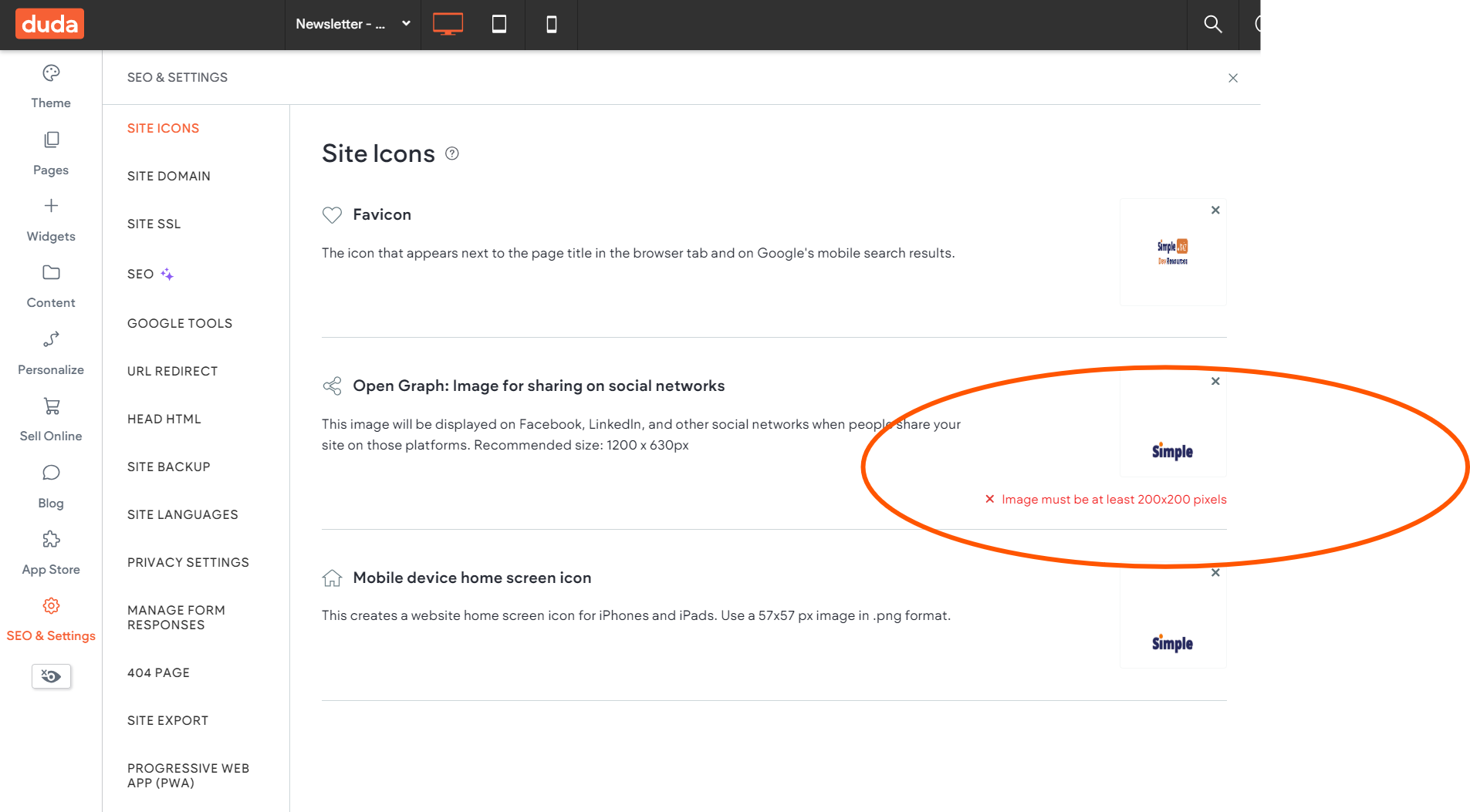
A small yet important detail in promoting and aligning a site's branding is the Site Icon settings in Duda. It’s crucial that the Favicon reflect the client’s existing branding—either using an element from their current graphic assets or a relevant, well-cropped icon that is clear and matches their brand colors.
The two other Site Icons—the Open Graph and Mobile Device icons—should feature the client’s logo. The Open Graph icon differs from the Mobile Device icon in size and is required to be at least 200 x 200 pixels. If your current logo does not meet this size requirement, it is a very easy fix in Canva. View the image gallery for an example and watch the short video tutorial below to see one method for creating a flawless Open Graph Icon:

Nick
Maintaining a clear visual hierarchy and staying true to the site's branding are crucial considerations when choosing a duotone color scheme for your headers. Effective use of contrast and color pairing ensures that key information stands out without overwhelming the design. By carefully selecting colors that complement both the brand identity and readability, you can enhance user engagement while preserving the intended context.
Take these examples below from a few of our developers. They have carefully selected colors that compliment the overall design of the site and have delicately decided what the most important text is for the user to read. While this is not a requirement for you to do on your sites, it is a tasteful way to break up headers and make them more digestible for users.


Sophie
Duda has a feature that allows us to hide elements or entire rows from mobile, tablet, or desktop view. Check out the video below for a refresher on how to tell if any elements are hidden and how and when to hide or unhide them:

Carissa
When designing for the tablet and mobile view, focus on creating layouts that adapt to each platform.
Tablet View:
- Since desktop changes can impact the tablet layout (and vice versa), prioritize optimizing the desktop experience.
- The tablet design doesn’t need to be perfectly tailored, it should remain user-friendly and consistent.
Mobile View:
- Mobile designs are independent of desktop and tablet changes, offering more flexibility.
- Tailor the design to mobile needs for the best user experience.
CLICK HERE to see our new resource page, "Tablet and Mobile View" under the "Web Designing" tab.

Joe
For this week, my tip is going to be very simple:
to avoid repetitive design or overly stretched-out section formatting, try having some sections that are
not set as
full-bleed.
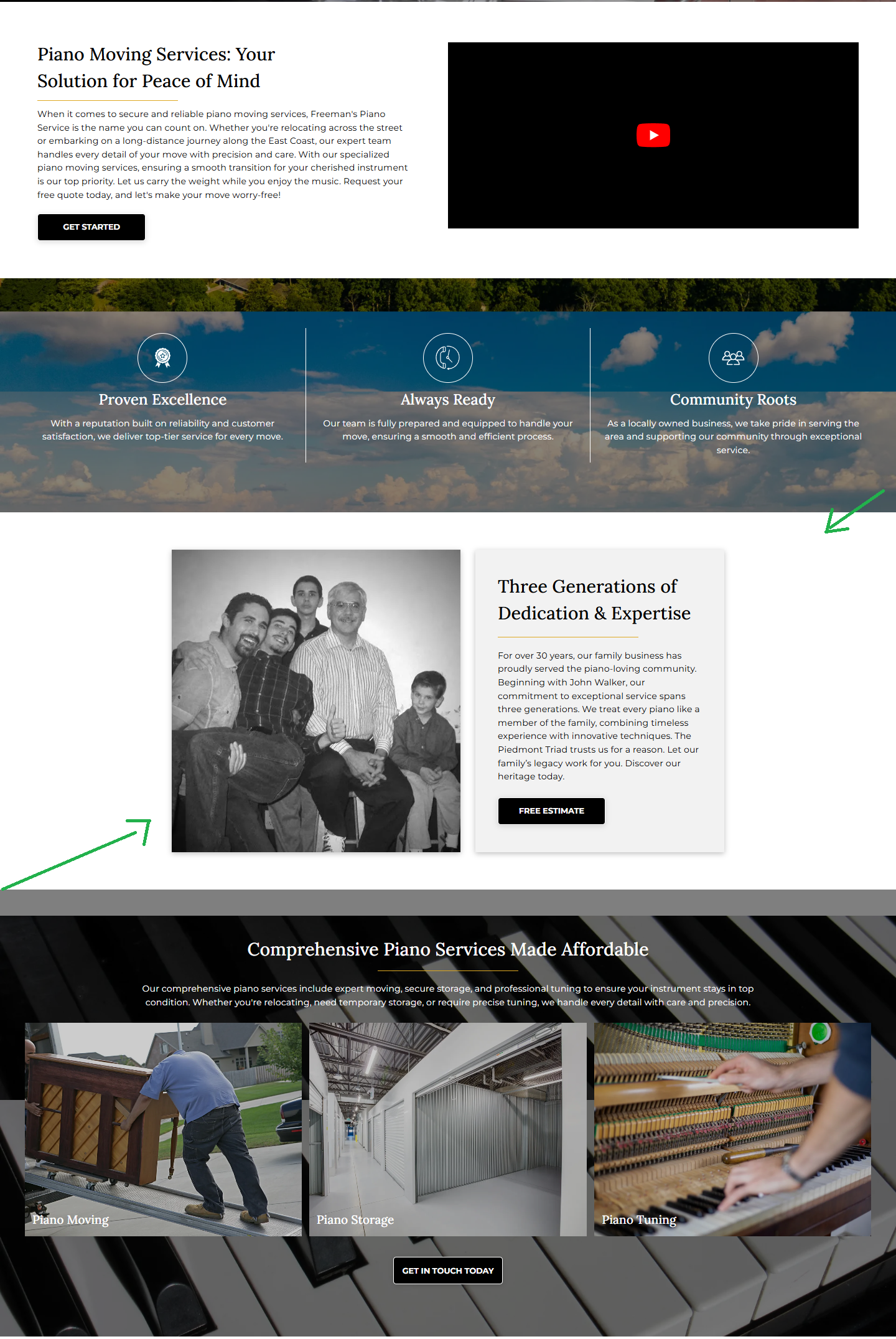
The section shown in the picture below benefits from
not using full-bleed formatting. This
not only creates balance but also adds variety to the design for the user, keeping their attention and engagement.
Alternating full-bleed formatting with other, more padded section designs will improve your website and the user experience.

John
If you want to customize your logo colors in Canva, follow these simple steps:
Select Your Logo – Click on the logo you want to edit.
Go to "Edit Image" – This option appears in the toolbar at the top.
Find the "Duo Tone" Effect – Scroll down or use the search bar in the Edit Image panel to locate it.
Choose "Custom" – Click on any of the Duo Tone presets, then select "Custom" to unlock more editing options.
Pick Your Colors – Here, you can change the highlight and shadow colors to match your brand or desired look.
Adjust Intensity – Use the available sliders to tweak the brightness, contrast, and intensity for a polished finish.
Apply the Changes – Once satisfied, click Apply, and your logo will now feature the updated colors.
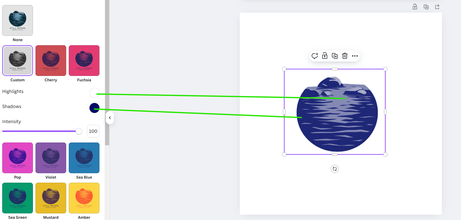
This method is an easy way to refresh a logo while keeping it aligned with the business brand identity.
Site of the Week Winner
Thanks So Much to All of Our Amazing Devs!
This Week's Honorable Mentions:
Congratulations, MC Edquila for:
Rescue 24 Hour
Congratulations, Don Dizon for: