Dev Weekly Newsletter
11/08/24
Featuring

Weekly Tips From Your Leads!

Emma
This week, I’m excited to share a practical tool from the Simple AI Department: an easy-to-use Image Grabber that allows you to gather all photos from a particular website in one step. Just enter the URL of the site you want to extract images from and provide your email address. In around five minutes, you'll receive an email with a link to our company's Google Drive containing the images, organized in a labeled folder. Not only is this tool a time saver, but it will also help to keep your personal hard drive free of clutter. Watch the video below for a quick and easy guide to using the Image Grabber:
Note: Unfortunately, there are some cases where websites block the tool from accessing and downloading photos. In addition, the Image Grabber does not work on social media sites like Facebook and Instagram... yet. Workarounds to this issue are being explored, so stay tuned for updates!

Nick
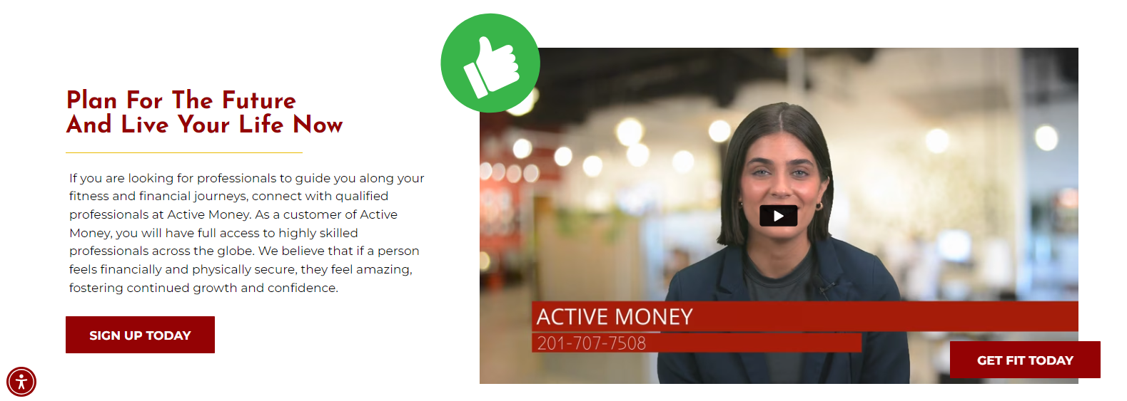
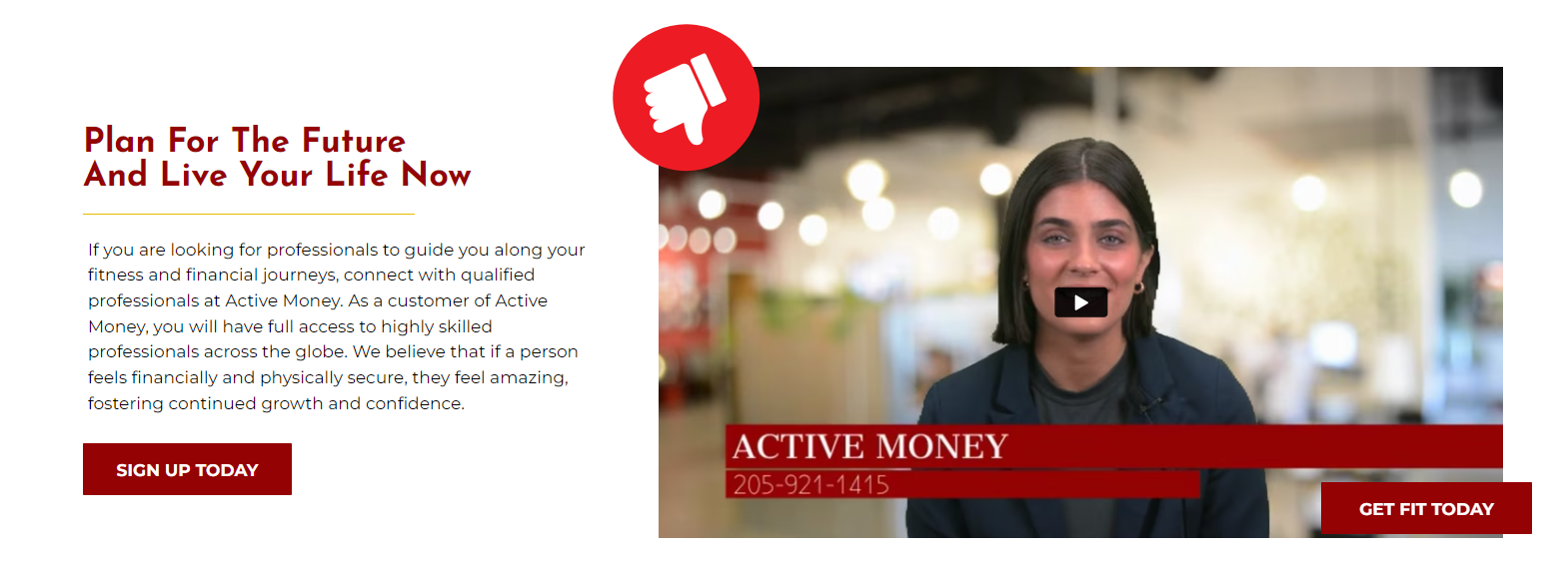
Creating a consistent brand identity across your Duda site goes beyond the platform's design elements and settings—it should also extend to your green screen videos. If you use lower-third titles (captions) in videos, try matching the font style to your site’s header fonts. This small but impactful detail helps create a cohesive design and strengthens the brand identity for your client.
This all ties back to the way we want to portray a client's product/service(s) not only to them but also to their existing and potential customer base. Consistency in design not only reinforces the client’s professionalism but also shows that every website element has been thoughtfully crafted.
If your chosen site font isn't available in
WeVideo, find the closest or best alternative to maintain
visual harmony.
See the example below for reference of "good" and "bad" font choices for GS videos:

Sophie
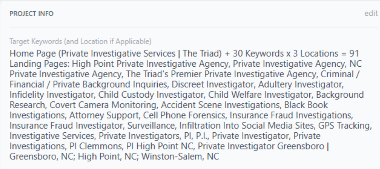
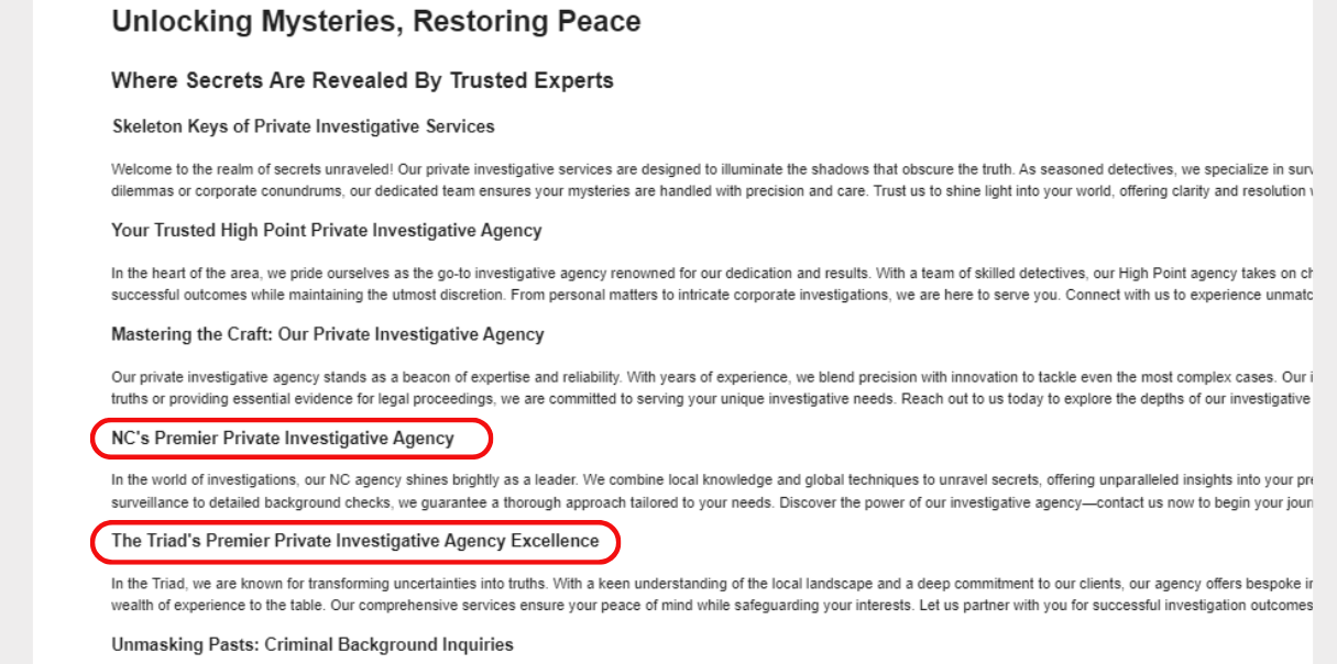
When working with AI-generated content, it’s important to use discretion, especially on projects with many or similar keywords. Our Content Creator AI generates headers and paragraphs for each keyword, but excessive or repetitive keywords can lead to redundant content. Since AI isn't reliable enough for direct use, ALWAYS proofread and edit to enhance the quality.
Including every AI-generated header isn’t always necessary. It can create unprofessional copy, damaging both our reputation and our clients’. Plus, repetitive content can hurt search engine rankings. To avoid this, thoughtfully combine similar headers. While our guidelines require all keywords to be included on the homepage, it’s acceptable to group 2-3 keywords in one header when it fits naturally. This approach ensures the website remains polished, engaging, and SEO-optimized. See the example below for tips on avoiding redundancy in your website's written copy:
Carissa
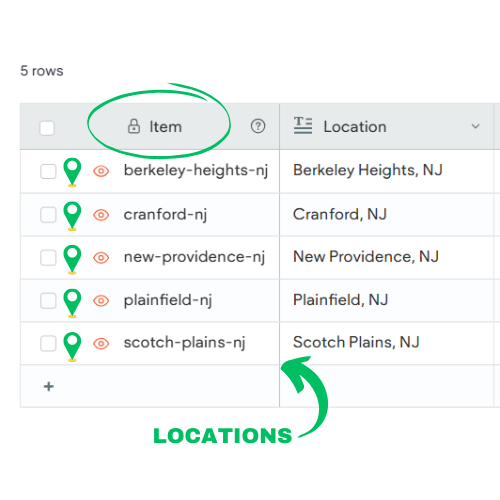
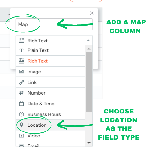
When working with internal collections, your “Item” might set to be either a keyword or a location. If your items are locations, make sure to include a column for the map when building your collection. This ensures each location has a corresponding map ready for its specific landing page when connecting your data. Below is a quick visual guide on how to set up the map column.
Note: This step only applies when your item is a location. If your item is a keyword (service), you can skip this process.

Joe
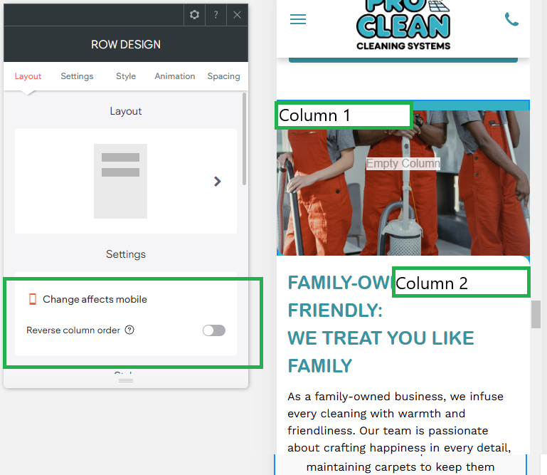
For better visual flow and an improved user experience, a good trick is reversing the order of columns within a row for mobile views. This improves alignment, spacing, and consistency, as well as reducing confusion. With our varied layouts in desktop and tablet views, images often appear on the left with text on the right, or vice versa.
On mobile, however, this arrangement results in two images appearing one right after the other, which looks unorganized and unintentional. Additionally, it causes the footer elements in mobile view to appear out of the standard order (Logo, Social Links, Contact Information, Mapbox, etc.) Check out the example photos below, and be sure to address this issue the next time you check your site's mobile optimization!
Site of the Week Winner
Thanks So Much to All of Our Amazing Devs!
This Week's Honorable Mentions:
Congratulations, Jessica Franco, for:
SeaTech Marine Electronics
Congratulations, Michael Theodore, for:
