Dev Weekly Newsletter
March 7th, 2025
Including a brief video presentation featuring:

Important Announcements of the Week:
➞ ACCURATELY NAMING YOUR GS & BG VIDEOS IN WEVIDEO:
Before you even start to edit, PLEASE be sure to name your GS video projects as the company name (listed in Bitrix) in WeVideo. If you do not, the title is left as "My Project" and makes it nearly impossible to tell which GS video is the one for your site unless we open each individual one. Also, keep in mind that failure to name your videos not only causes headaches for your Dev Leads but the entire Simple Edit Team as well.
➞ Reminder of where to check for client notes/requests:
To assure we meet the expectations of our clients, YOU MUST check these 3 VITAL LOCATIONS for CP notes/requests, information, photos, logos, and more:
- The
"Project Notes (from Sales Rep and/or Project Manager)" field in
Bitrix is typically where client requests/notes are shared. Some of these items may be directed at the PM (such as creating new emails) and should be copied and pasted to the
"Promises & Expectations (Post-Delivery Tasks for PM)" field, if applicable.
If you are unsure, please leave both fields as-is.
- It is also important to scroll
ALL THE WAY DOWN in the
comments section of Bitrix to ensure there are
no hidden notes containing important information or files. These types of comments
SHOULD be pinned, but ensure your bases are covered by checking thoroughly.
NOTE:
Bitrix will only allow 3 comments to be pinned at a time.
- Do not neglect the
GOOGLE DRIVE FOLDER. While mostly used for uploading large numbers of client photos/files, just because it is not mentioned in the notes
does not mean it does not contain important data. It is a good idea to check the folder when
beginning a project, in the interim, and when reaching completion to
ensure no late additions were missed.
If you need clarification or assistance with any of the above announcements, feel free to reach out to your Dev Leads.
Weekly Tips From Your Leads

Emma
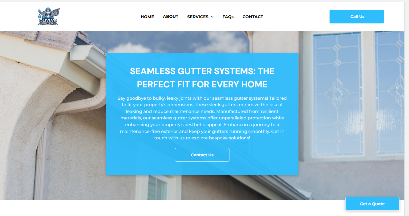
This week, I would like to present you with two simple and easy tips for elevating your Hero Banner, a vital part of your website that is responsible for making a positive first impression. These tips can be applied to other sections of your site as well, improving the overall user experience:
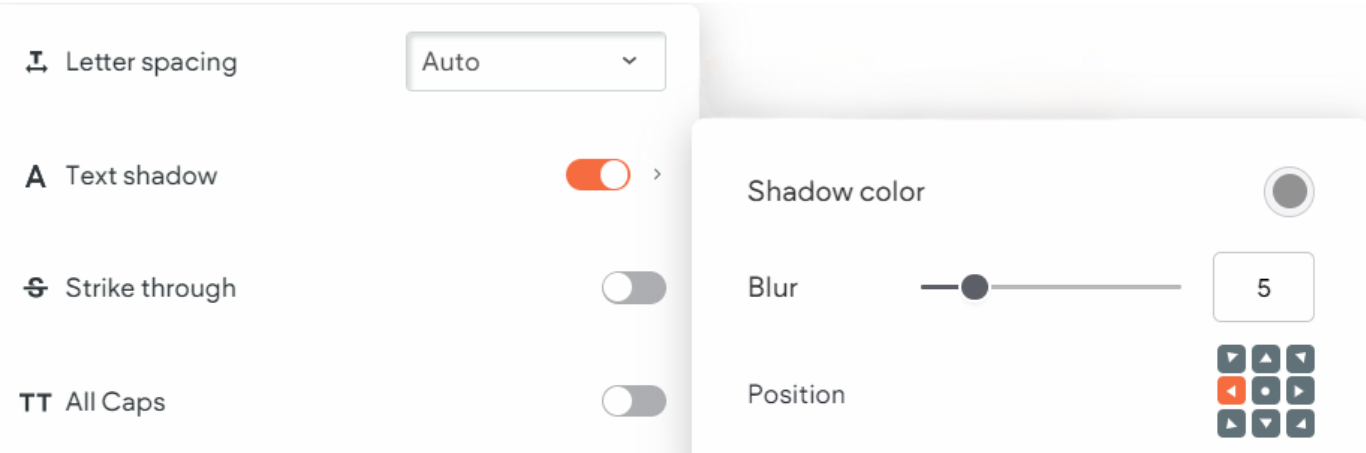
1. ADD A SHADOW EFFECT TO YOUR BANNER TEXT: Depending on several factors, such as image or video selection and overlay opacity, the readability of text can become comprimised. Adding a subtle shadow effect to your text gives it that extra "pop" it needs to become more visible to the user and stand out from the background imagery.
NOTE:
I have found that using about
4-8% blur and angling the shadow to the
right or left
yields the best results. The effect
is and should be very subtle, so you should enlarge and look closely at the images below to distinguish it.

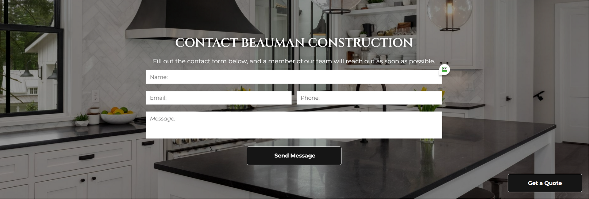
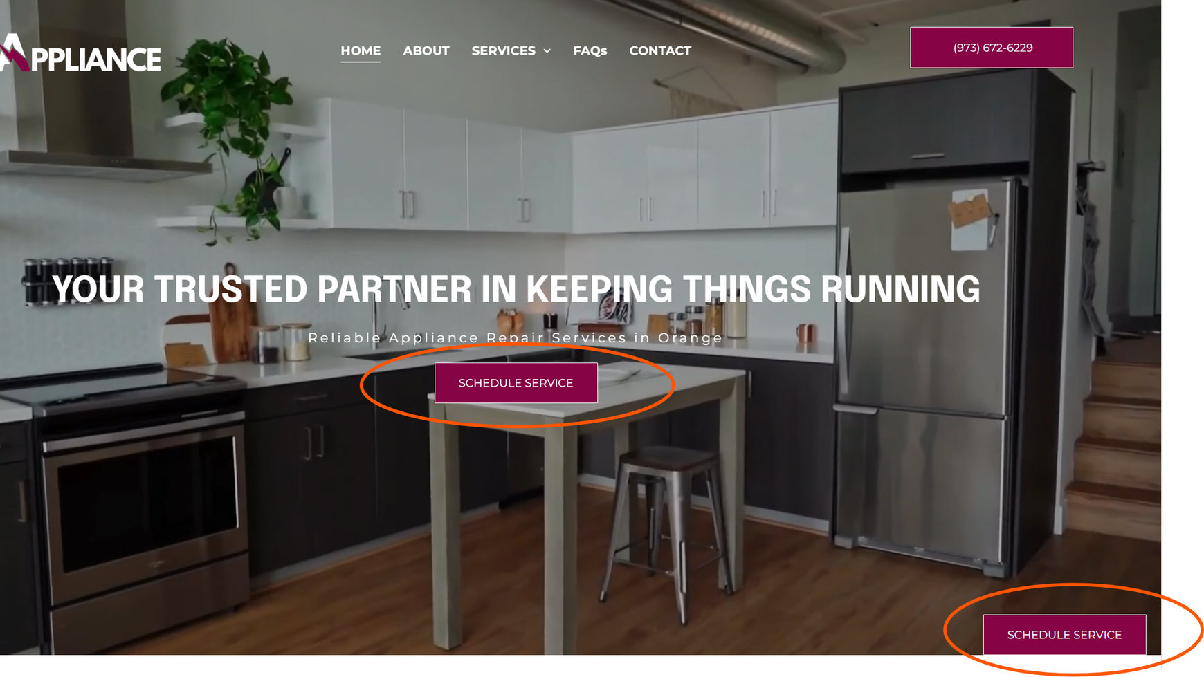
2. AVOID REPETITIVE BUTTON DESCRIPTIONS AND LINKS: If you are going to add a button to your Hero Banner, ensure that it is unique from the required Click-to-Call phone button in the header, as well as the floating button. Additionally, you want to make sure you are thoughtful about the buttons contained in each section, how they are labeled, and where they lead the user. Avoid repeating the same call-to-actions while keeping them concise, and try to have buttons link to a variety of different pages or anchors instead of all to the pop-up form.


Nick
When you create a new logo for a deal you are working on, please upload the .png file(s) to the Google Drive project folder. I know from personal experience that it is easy to create a logo on Canva, download it to your desktop, upload it to the site you are working on, and then forget about it forever.
However, by uploading the logo files to the Google Drive project folder, you ensure that there is a high-quality rendition of the logo that is accessible not only for us on the development side of things but also for the entirety of our company.
The client may love your logo now, but they may want to update or change its color later. This is much easier to do when there is a clean, high-resolution file that is easily accessible to the edit team rather than searching through hundreds of Canva files or downloading a lower-quality version directly from the website.
So, the next time you make a logo,
don’t forget to upload both the all-white version (if you created one) and the regular version of your logo with the implemented color scheme to the Google Drive project folder!

Sophie
Have you been assigned a site with 50+ keywords? Normally, we require that each keyword in Bitrix be represented in a header title on your home page. But when dealing with a project with an
unusually high number of keywords, we take a different approach.
Instead of attempting to inject as many keywords as possible into individual header titles,
outsource to
Chat GPT for help breaking the client's keywords into categories.
We will use
8-10 all-encompassing keywords for our header titles
and hit all of the other keywords
within the paragraph text.
It takes some practice to learn how to deal with large sites like these,
so
please reach out to your dev leads for assistance and we can help you come up with the best solution for your next mega-keyword site before you begin.

Carissa
Here’s a quick and easy tip to seamlessly integrate your color scheme into your site. Subpage design is often overlooked, but a small tweak—matching your subpage hover color to your key palette color—can make a big difference.
This subtle change helps create a more cohesive and polished look across your site. It’s a simple yet effective way to enhance your overall aesthetic. Check out the examples below—each developer has applied this trick beautifully, resulting in a more unified design:


Joe
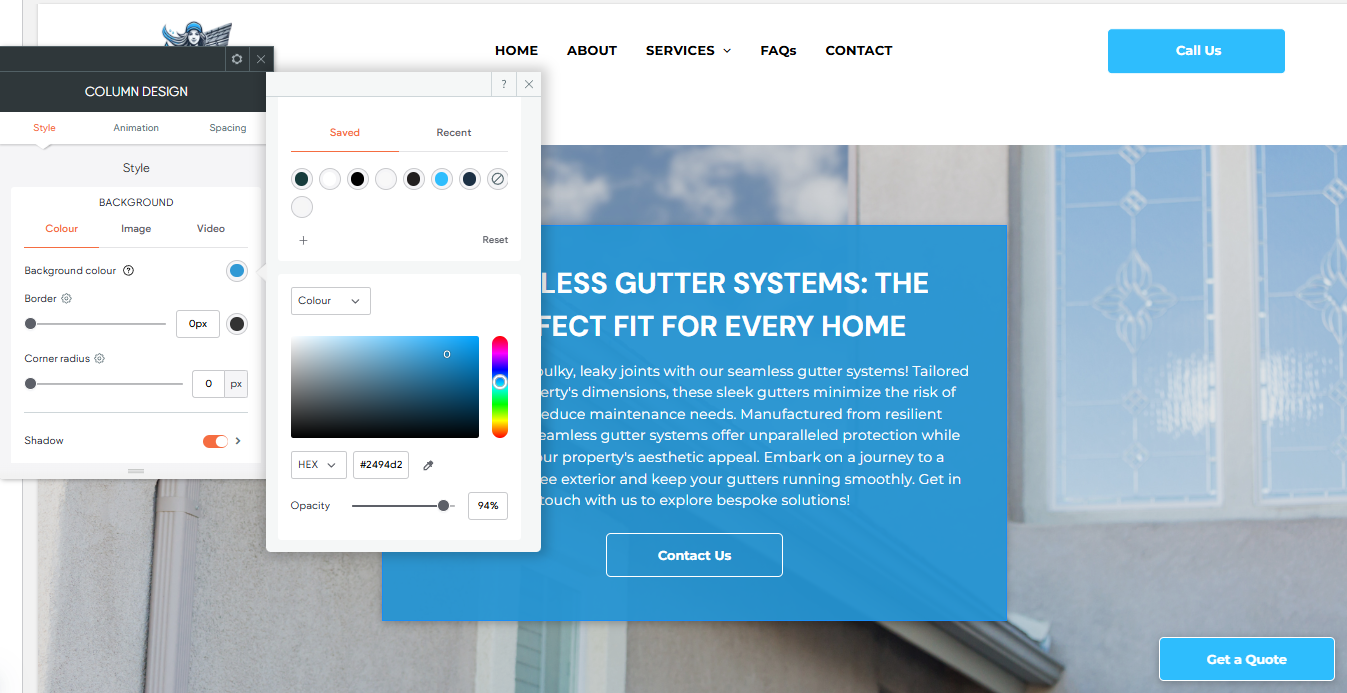
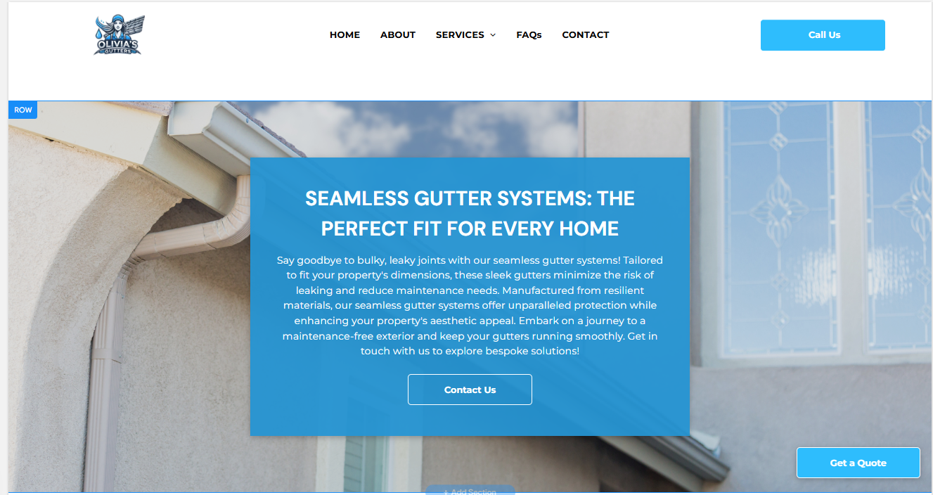
For this week’s tip, I want to review the readability of text in relation to the choice of column background color. The ideal amount of contrast in an image, paired with more neutral tones, helps to improve readability. On the other hand, busier backgrounds or those featuring a lot of text or lines can hinder a user's experience.
Below I have provided a guide of some quick tips that will help you ensure that your text is popping and legible!

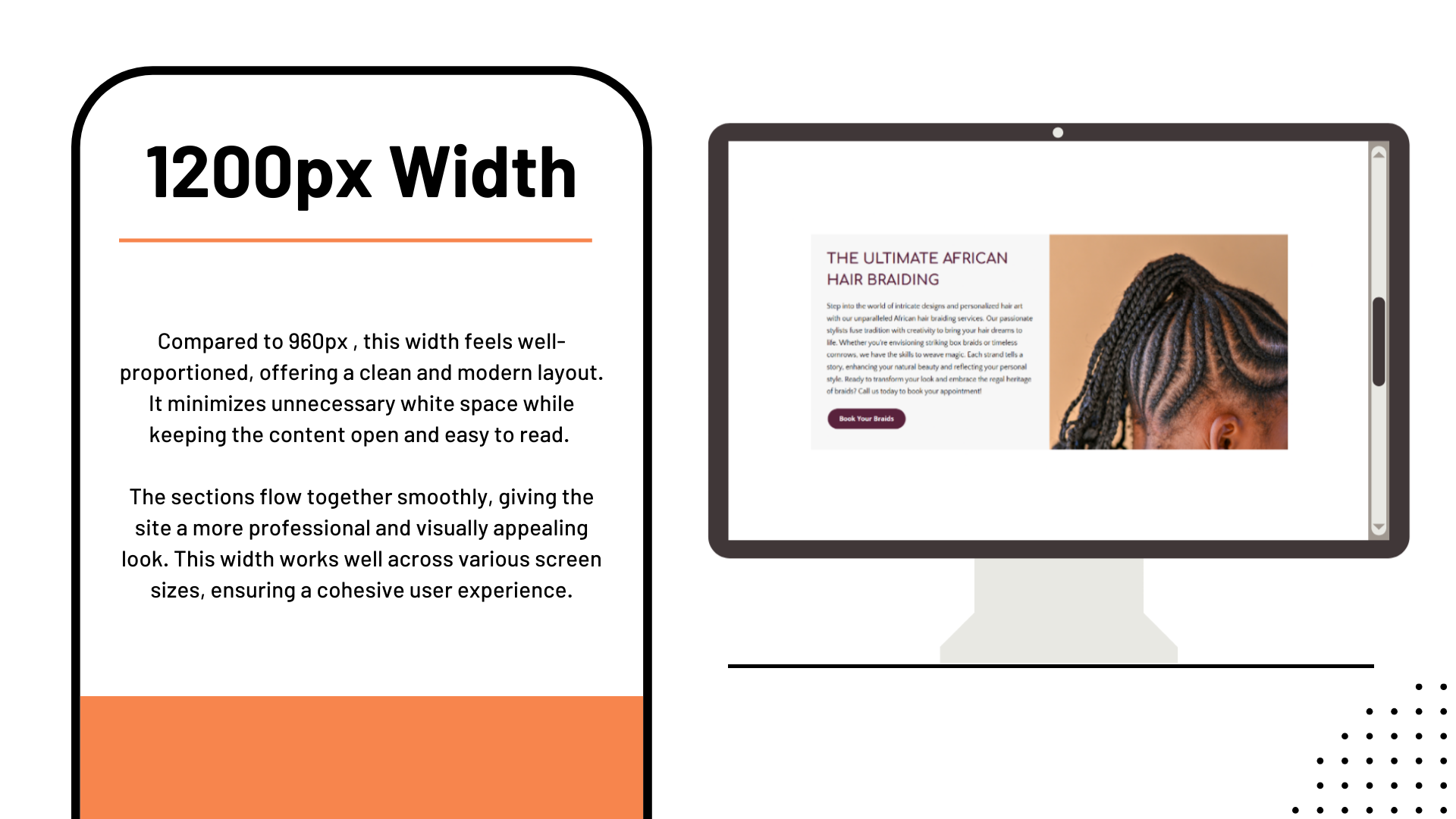
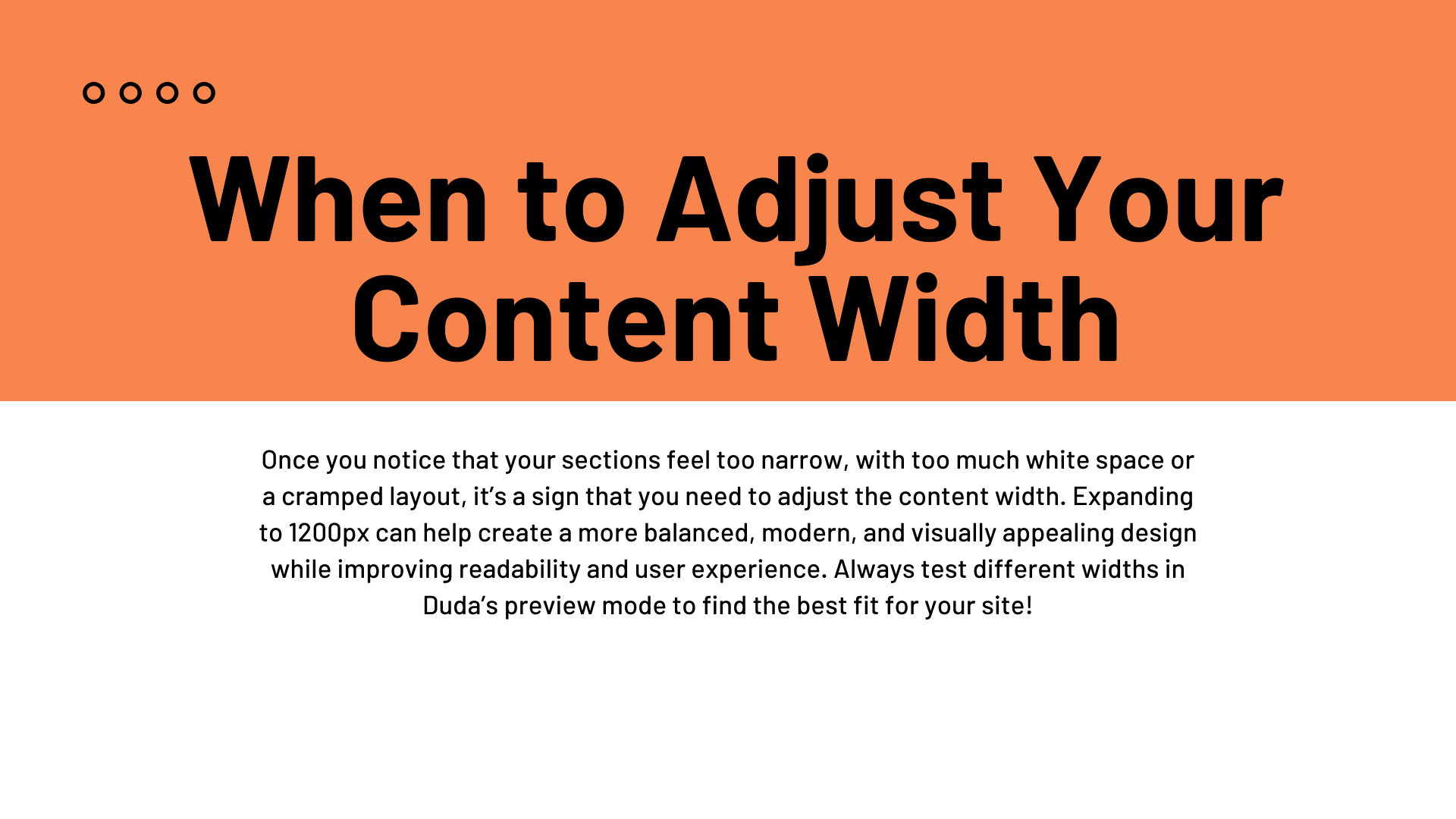
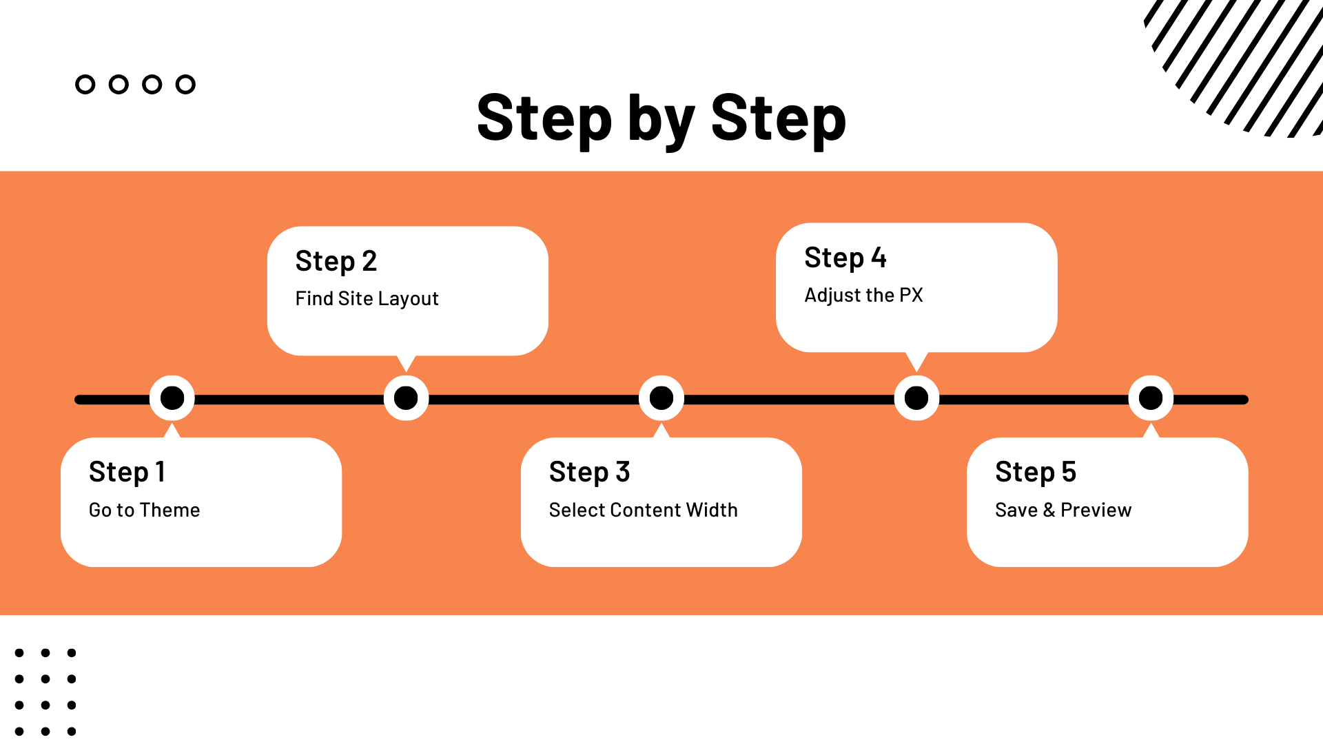
John
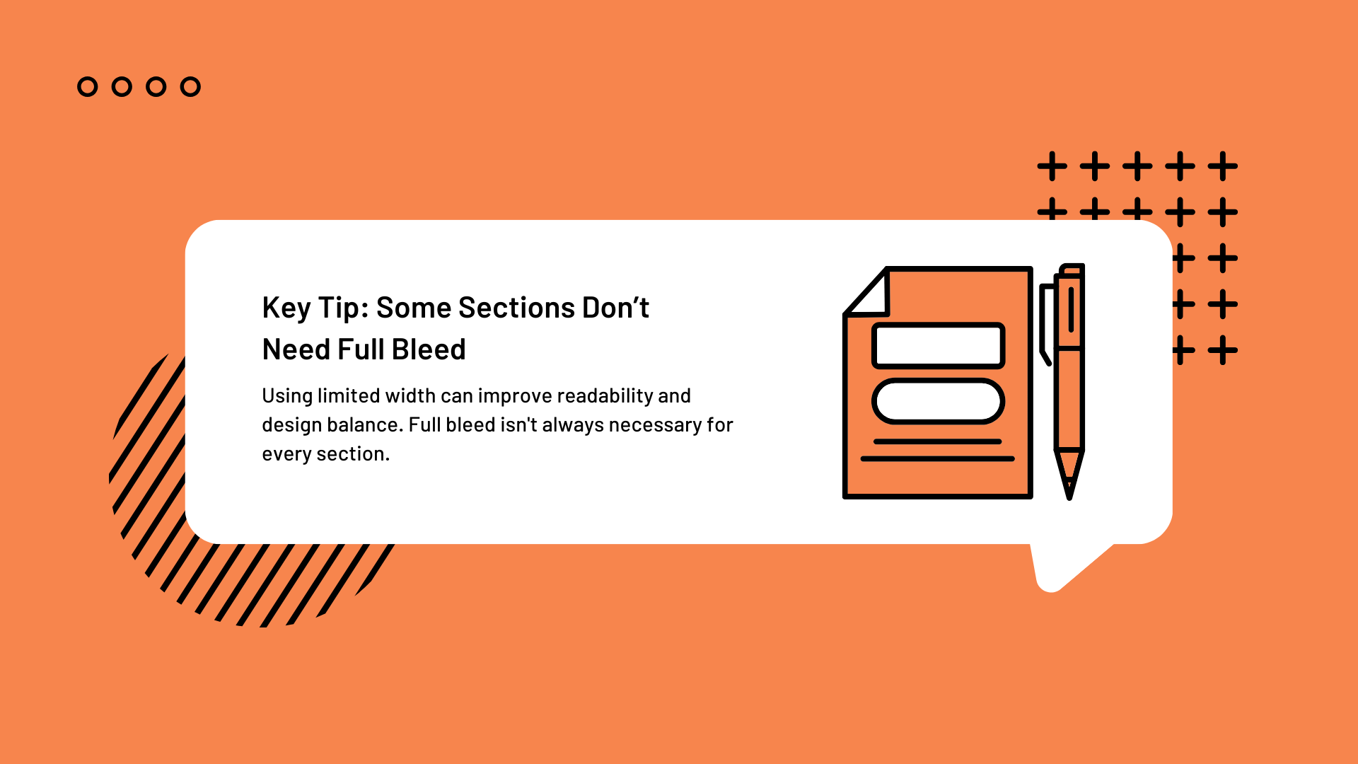
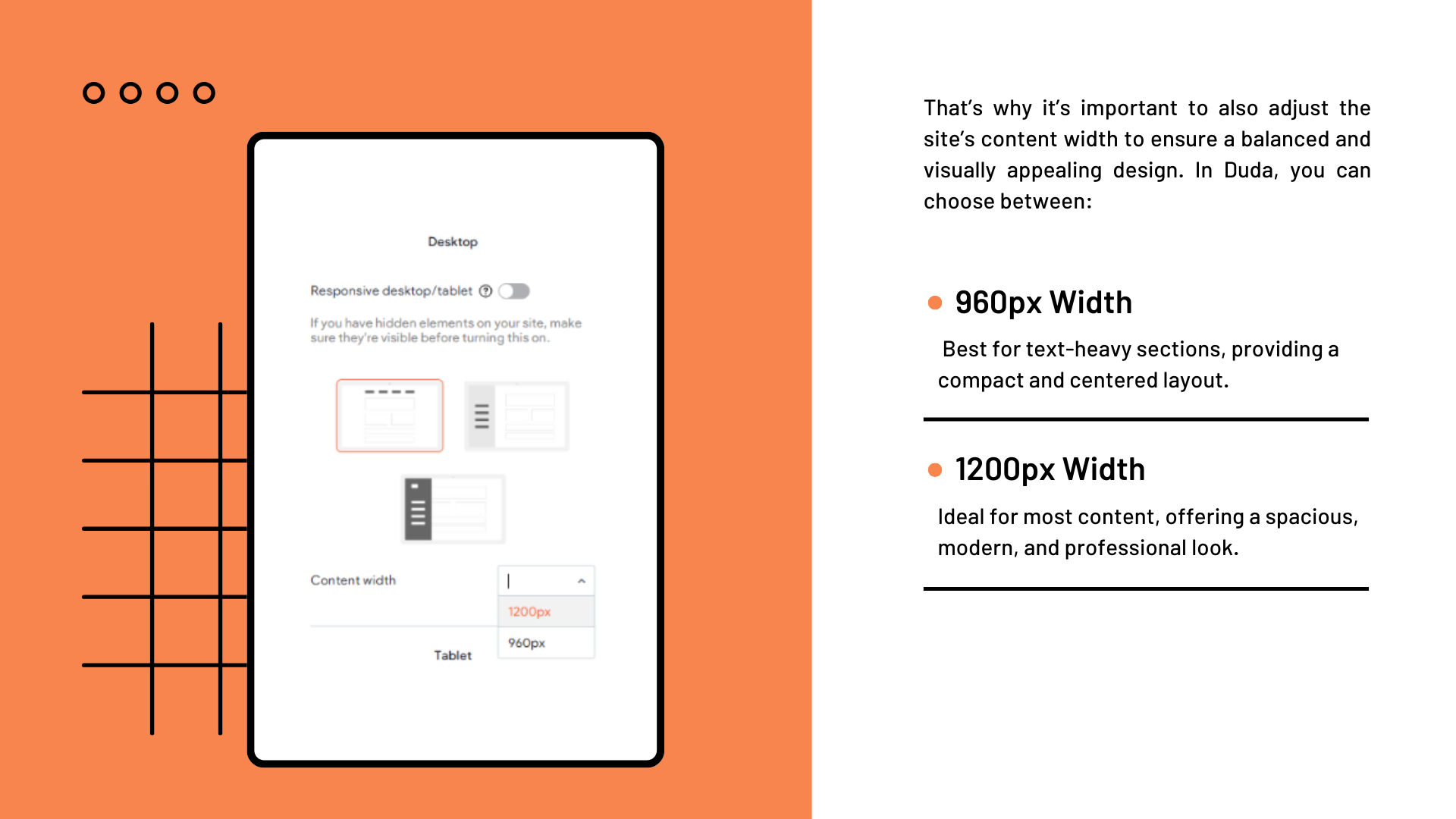
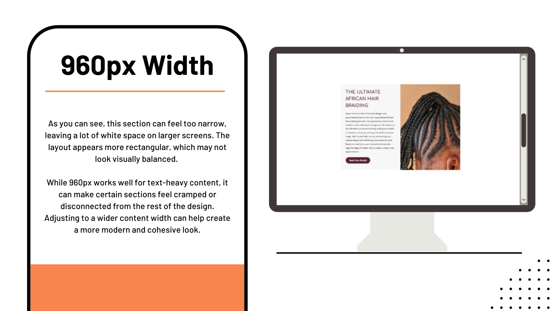
Content Width Guide
By the end of this simple tutorial, you’ll understand how to optimize your site’s layout for better readability, design consistency, and overall user experience: