

Dev Weekly Newsletter
10/04/24
Featuring

Weekly Tips From Your Leads!

Emma
To further support our freelance developers in saving time and avoiding unnecessary effort, we've begun expanding our long-dormant stock image library. This will help prevent the use of non-USA-specific images, and over time, we aim to include a broader range of location-specific images within the USA. If you notice a category that is missing or lacking quality images, please reach out to your Dev Leads, and we’ll work to address it as quickly as possible!
Note: Because all images need Dev approval, freelancers should NOT add any images to this library. Thank you!

Nick
Consistency is key when it comes to design. Not only does it create a sense of harmony and professionalism across your website, but it also reinforces the credibility and brand identity of our clients while improving the overall user experience. From color choices for buttons and headers to the tone of voice in your content, every element should align cohesively. Today, I want to focus on one design element that might seem insignificant but can disrupt the balance of a layout when it isn’t applied consistently: rounded corners.
Rounded corners often convey a sense of friendliness and approachability, giving the UI a softer and more humanized feel. When executed correctly, this design element reinforces the mood that a company wants to project—this can be particularly effective for websites like daycare centers, dog groomers, and even tech companies. However, the key to creating a cohesive mood is consistency. Applying rounded corners uniformly across all design elements is crucial. Too often, I see websites with a mix of sharp and rounded corners, which creates a disjointed and less polished appearance.
Next time you're incorporating rounded corners into your design, remember to use them consistently across the site. This will help us create cohesive, well-rounded websites that reinforce our clients' brand identity!

Sophie
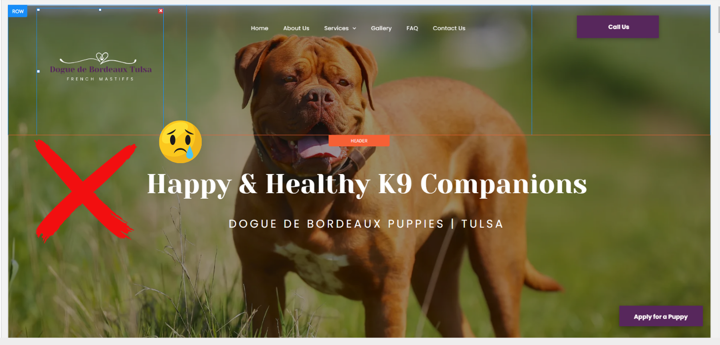
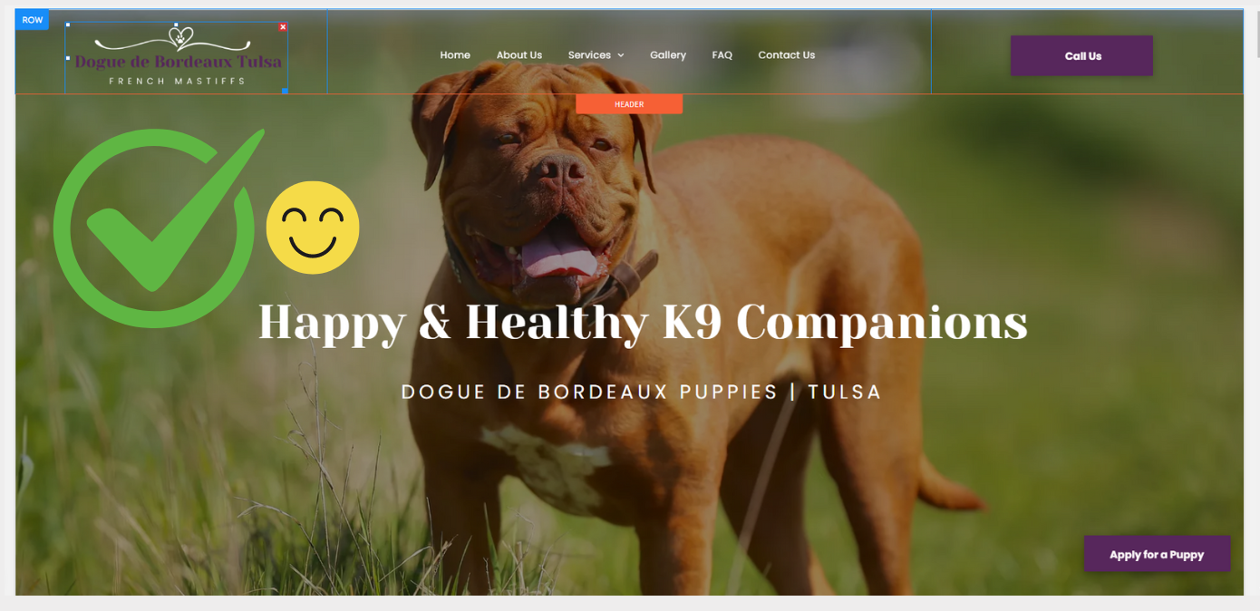
When adding a logo to your site’s header, it's important to crop out any excess space around the graphic. Duda's built-in image editor allows you to easily crop uploaded images. This helps prevent a blocky, unprofessional-looking header and ensures a clean, polished design. Cropping excess negative space from your logo is especially crucial for shrinking headers.

Carissa
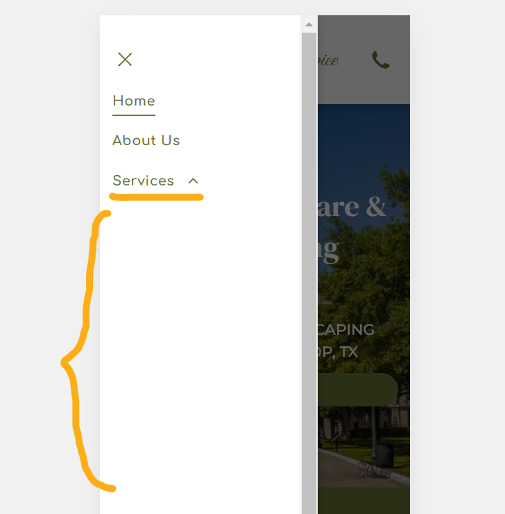
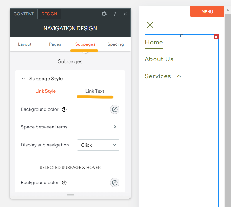
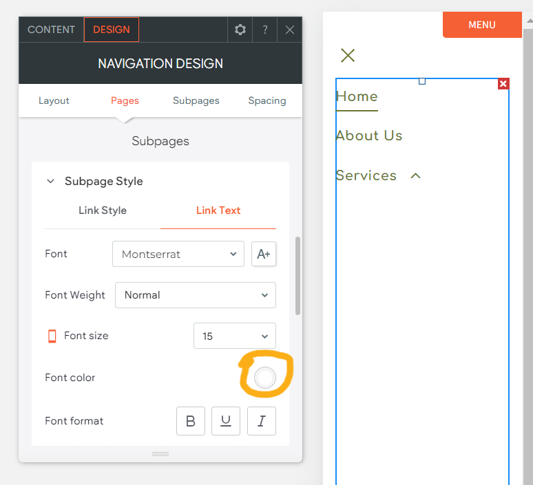
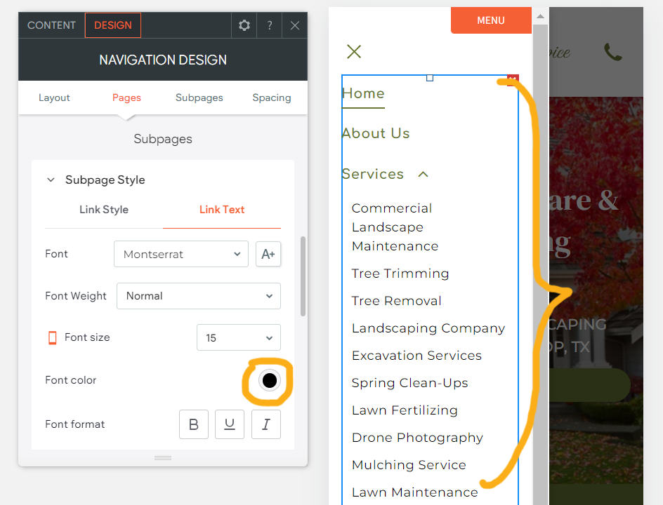
Adjusting the colors for subpage text on the mobile view is important for readability and user experience. Mobile screens are smaller, and the wrong color can make it difficult for users to read content, leading to frustration and potential loss of engagement. Proper color adjustments ensure that the text remains clear and legible, improving accessibility and overall design aesthetics. This attention to detail helps maintain a consistent, professional appearance across all devices.
Down below are steps to adjust the text color of the subpages, specifically for the mobile view:

Joe
Apart from design, the structure of a website is a major factor we consider when evaluating it for approval. A well-structured website is crucial for its performance and can significantly impact its ability to rank and generate leads or revenue over time.
For this week's tip, I’d like to share a
Chrome extension/app that will help you assess the current structure of the website you're building.
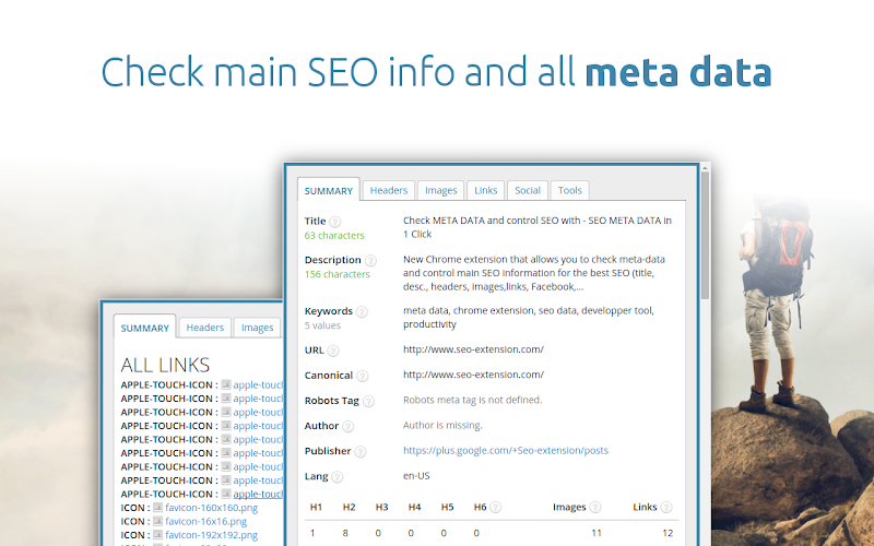
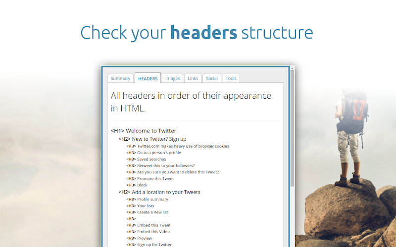
Note: You can check the structure using the multiscreen site link. This toolbar works on published pages, not in the DUDA editor.
Site of the Week Winner
Thanks So Much to All of Our Amazing Devs!
This Week's Honorable Mentions:
Congratulations, Jessica Franco, for:
American Design Gallery
Congratulations, John Zimmer, for: