

Dev Weekly Newsletter
January 24th, 2025
Including a brief video presentation featuring:

Important Announcements of the Week:
➞ UPDATED DEV RESOURCES AND NEWSLETTER PAGES:
You may have noticed that our
Dev Resources page has a bit of a different look this week,
thanks to Joe V! In addition to the design changes, we also have a new
AI Chat Bot that will help you with questions about our SOPs, website building tips, and more! Try it out;
the more we use it, the better it will become!
➞ USE OF LICENSED/COPYRIGHTED FONTS ON WEBSITES:
In order to help our company avoid receiving any kind of
DMCA notice (a legal claim about unauthorized use of copyrighted material), you must keep the following in mind when selecting fonts for your sites:
Use Fonts That are Free for Commercial Use:
Any font we use must explicitly state that it is free for commercial use. Fonts labeled as free for personal use are NOT allowed on commercial websites.
Check Licensing:
Always verify the font’s licensing terms to ensure it’s approved for commercial use.
Client Requests:
If a client wants a specific font that isn’t free for commercial use, inform the PM. The PM can communicate to the client that using this font may incur a licensing fee. Until the PM or a dev lead confirms that the client will purchase the copyrighted font, use a similarly styled font that is copyright-free.
Use Reliable Font Sources:
Stick to trusted sources like DaFont or Google Fonts, which provide fonts free for commercial use.
Document Everything:
From now on, whenever uploading a new font to Duda, save the font source and licensing information to the Google Drive Project Folder. Create a subfolder called "Website Font" to upload the documents into.
When in Doubt, Just Ask:
If you are unsure how to verify that a font is copyright-free or free for commercial use, reach out to one of your Dev leads. We can verify it for you and teach you how to verify it yourself moving forward.
If you need clarification or assistance with any of the above announcements, feel free to reach out to your Dev Leads.
Weekly Tips From Your Leads

Emma
Icon sections have recently become an essential feature on our websites, helping to break up text-heavy content and present key information in a quick, visually appealing way. There are various methods to create an icon section, but using Inner Rows in Duda ensures a clean design, easy editing, and a straightforward format for incorporating required elements like headers and buttons. To learn how to use Inner Rows effectively, watch this brief, silent tutorial video:

Nick
It's extremely important to ensure that the fonts you choose for your site have a free commercial-use license. Luckily, there are large selections of commercial-use fonts available online, particularly on Google Fonts, which is a great resource that I am sure you are all aware of.
If you’re unsure whether or not the font you downloaded has a
free commercial-use license, or if you want to
double-check to be 100% certain, here’s one way to find out: Open the
.zip folder for the downloaded font and look for the font’s
metadata file. This file typically contains the license details, so you can confirm if the font is
safe to use in your projects. If the license type is listed as
SIL Open Font License (OFL),
it indicates that the font permits
unrestricted commercial use.
Another way to check would be to simply
filter the fonts you are searching for on a website, such as 1001fonts.com, by
"free commercial use" only, but be sure to
always double-check that these fonts have the correct license to be absolutely certain!
By taking the time to
confirm font licensing, this will keep your designs copyright-compliant and
ensure the avoidance of potential legal issues down the road.

Sophie
Hello team!
Today I will be providing a brief demo on
how to use outer row padding to break up sections on your websites and
the benefits of using this technique
to do so.

Carissa
A monochromatic color scheme takes one color and plays with its shades, tints, and tones to craft a design that's both unified and visually captivating.
Why it works:
- Consistency: It gives your site a cohesive, polished look, reinforcing your brand identity or the mood you're going for.
- Simplicity: Sticking to one color makes your design feel clean and easy to navigate, without any distractions.
- Visual Harmony: Mixing up shades and tones of the same color adds depth and balance, so your design stays dynamic without feeling overwhelming.
As shown below, these developers demonstrate how a monochromatic color scheme can create harmonious, visually striking results.

Joe
Creating a successful website starts with getting the basics right. These five foundational steps ensure your site is well-designed, client-focused, and ready to perform. Let’s set the stage for a strong build!


John
This week, let’s talk about the Color Contrast Checker. This tool helps ensure text is easy to read against backgrounds, improving accessibility, usability, and design quality.
Using the right color contrast is important because it ensures:
- Improved readability for all users, reducing eye strain.
- Better accessibility for users with visual impairments or color blindness.
- More professional-looking designs, with well-balanced text and visuals.
The Contrast Checker will show if the text passes (AA or AAA) or fails (X).
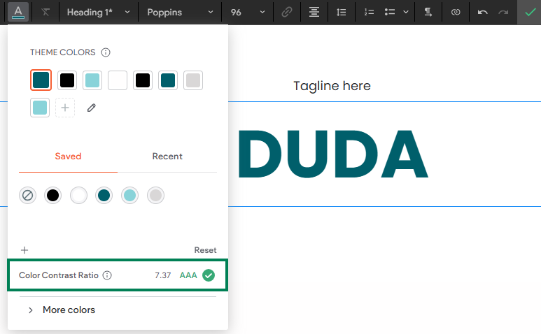
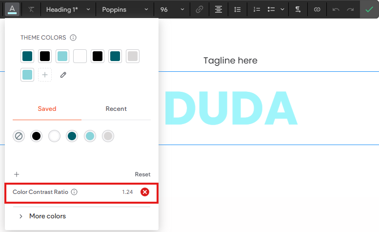
You’ll always see this feature whenever you’re adding text, so make sure to check it to help you create better designs.
Site of the Week Winner
Thanks So Much to All of Our Amazing Devs!
This Week's Honorable Mentions:
Congratulations, Don Dizon for:
Pool Refelctions
Congratulations, Ryan McDermott for:
Enviro Tech Labratory LLC
Congratulations, Lawrence
Osunde for: