

Dev Weekly Newsletter
8/30/24
Featuring

Weekly Tips From Your Leads!
Emma
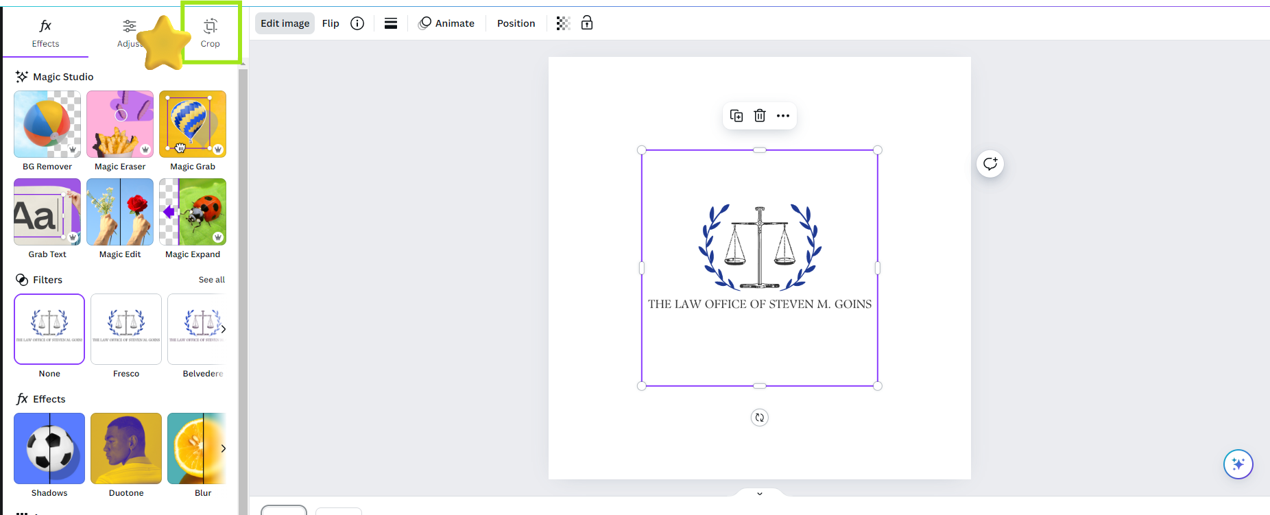
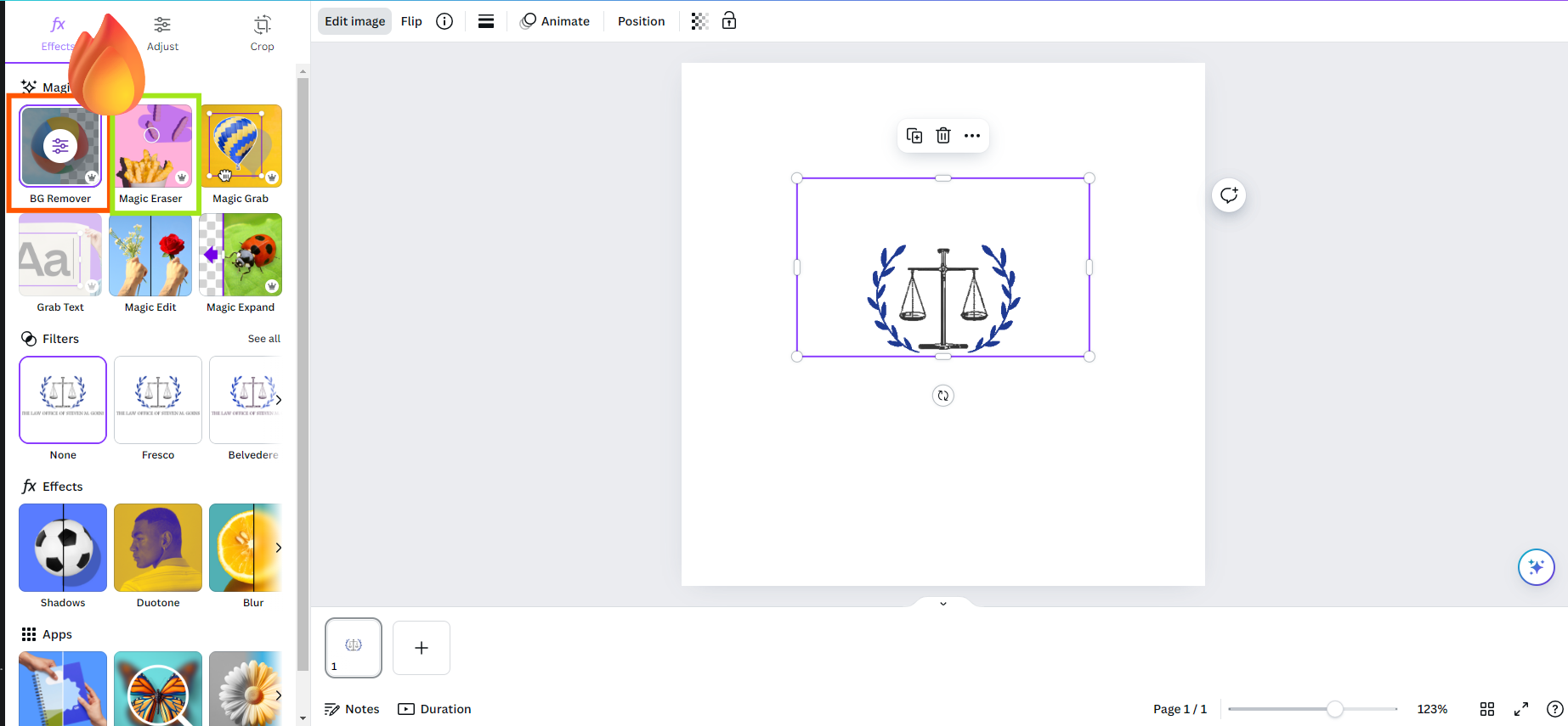
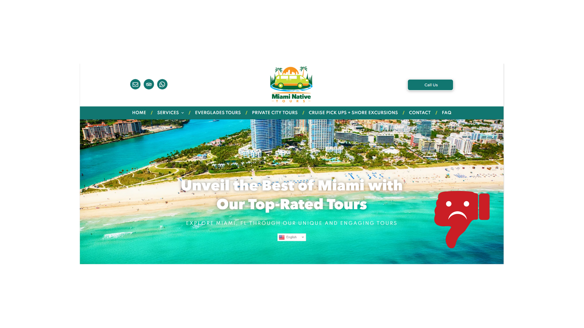
Creating a fully customized Favicon is an excellent way to enhance your client's branding and demonstrate our commitment to providing personalized content for their website. Using Canva to design a Favicon is quite straightforward. However, if you require assistance or are interested in learning how to add unique graphic flourishes to your site, please refer to the photo guide below for detailed instructions. (Hover over image to read text.)


Nick
Looking to speed up your workflow? Here is a helpful tip to use when building your next double! MORE ABOUT DOUBLES HERE.
Quickly Connect Your Dynamic Pages to a New Collection:
- Once you have already made a duplicate version of your home page and made the necessary connections to your collection, instead of duplicating the home page again and making those connections from scratch, go ahead and duplicate the dynamic page you already connected!
- From here, the only thing you will have to do is simply rename the new page to the correct location, change which collection your dynamic page is connected to, and the connections will automatically copy over from the original one! This should save you a significant amount of time when building a double website.
*** Please double check to make sure that the correct information is being pulled from the correct collection. We want to be certain that any errors are caught before turning your site in for review ***

Sophie
The hero banner is the first thing our clients and their prospective customers will see when they visit a site, so it’s crucial to make a strong first impression. One way to do that is by using the right amount of overlay. The company standard for a hero banner black overlay is between 30% and 50%, with the sweet spot around 35% to 40%.
If the overlay is too light, white text can be hard to read; too dark, and the site might feel a bit dull. By hitting that 35%-40% range, we create just the right contrast, letting the text pop without overshadowing the background slideshow or videos.
Also, you can make your text pop more by applying the text shadow setting to the hero header and subheader.

Carissa
Adding a background textured image to a section is an excellent way to enhance the visual appeal and depth of the design. It introduces a layer of complexity that can make the layout more engaging and interesting, drawing the user's attention without overwhelming the content. Textures can subtly complement the overall theme, create a sense of realism, and add a tactile quality that plain backgrounds lack. This technique helps in setting a mood or reinforcing brand identity, making the website more memorable and visually captivating. If you're interested in seeing a few examples, click here.