

Dev Weekly Newsletter
June 20th, 2025
Including a brief video presentation featuring:
Important Announcements of the Week:
➞ NOTICED & MUCH-APPRECIATED: OVERALL IMPROVEMENTS IN WEBSITE QUALITY
Your Dev. Leads have been noticing a steady improvement in the quality of website submissions over the last couple of weeks. We want to give all of our amazing freelancer developers a huge "thank you" for participating in workshops, reaching out for feedback, and (hopefully) implementing our new checklist effectively. Keep up the excellent work and communication, everyone! And in case you missed it, here is the new and improved checklist:
➞ REMINDER TO DO SEO-CHECK FOR MOJO TICKETS/RE-DESIGNS/ETC. WITH SEOBILITY
A couple of sites were recently flagged for either having an unacceptably low SEO score or no record of having been checked with SEObility. This is a gentle reminder that SEO scores still need to be checked, whether for a MOJO ticket, redesign, Turbo SEO addition, etc., and recorded accurately in the proper Bitrix fields (or in the comments if needed.) Please do not enter “N/A” or likewise in the required Bitrix field. We appreciate your cooperation!
*** If you need clarification or assistance with any of the above announcements, feel free to reach out to your Dev Leads. ***
Weekly Tips From Your Leads
Emma
This week brings with it yet another design challenge! The client's legacy site and social media accounts yielded a logo that has a dated-looking, white, boxy background and is not of the highest quality overall.
My challenge will be to create a version of the logo that is visible in a transparent header while also upscaling the original for primary use elsewhere. As usual, I utilize the Magic Studio in Canva, as well as introduce an old-to-me, but maybe new-to-you Chrome Extension from Online-Convert.com that quickly converts file types, particularly .webp files, into more usable image formats. Check out my process below, and check back next week for another tutorial!

Nick
Keeping your font choices to a maximum of two can make a big difference in the overall quality and look of your website. Follow along as I walk through a few examples of strong and not-so-great font use, and learn why limiting your fonts to two is key to good web design.

Sophie

Carissa
Make Every Click Count: Buttons Tailored by Industry
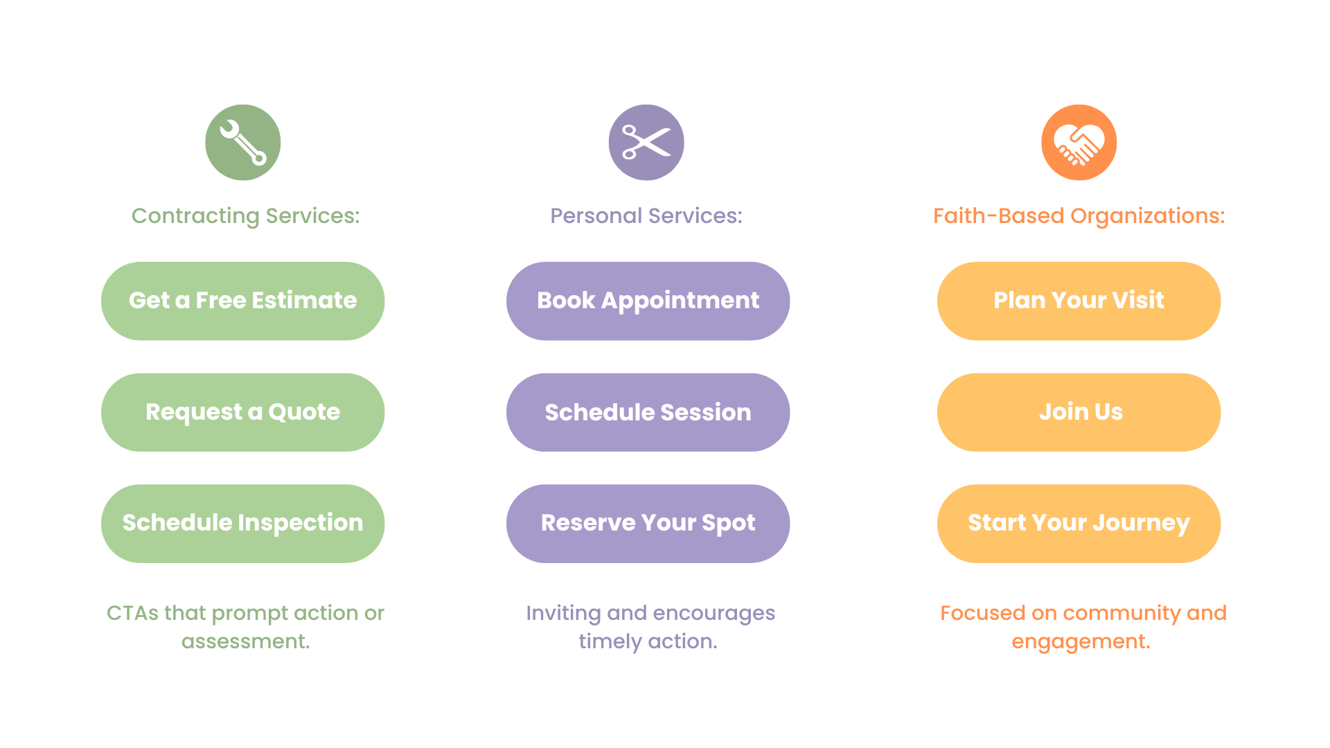
When in Doubt: Try These General CTA Buttons That Work Across Most Websites
- Get Started
- Learn More
- Contact Us
- Let’s Talk
- Start Now
- Get in Touch
- Send a Message

Joe
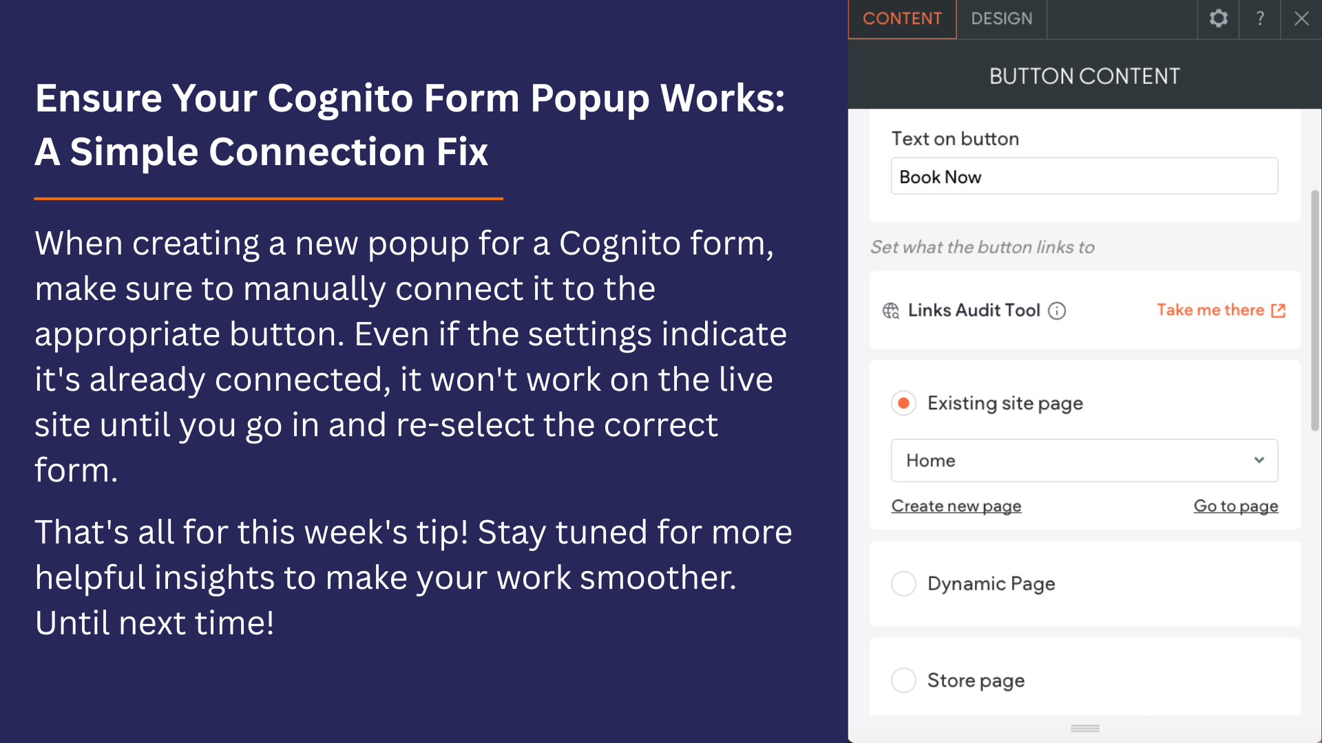
Cognito Forms has always been a part of our daily routine in website building. Check the image below to read about the popup button tip.

John
Missing the Hero Video
Lately, I’ve been seeing fewer multi-clip hero banners, and honestly, I kinda miss them. They used to bring more life to the page and made it feel more engaging right from the start.
If you're planning to do one, here’s a quick reminder on how to make it work:
- Use 3 to 4 clips that match in tone and quality
- Make sure the footage fits the brand and looks good together
- Keep the cuts smooth so it doesn’t feel choppy
- Loop it clean so it plays naturally without any sudden jumps
That said, video isn’t always a must, especially for services where stock footage is limited. A 3–4 image slider can still tell a strong story and keep things just as engaging.