

Dev Weekly Newsletter
1/17/24
Featuring
Important Announcements of the Week:
➞ TENTATIVE DEVELOPMENT DEPARTMENT MEETING:
Your Development Team Leads have been brainstorming and planning to hold a department meeting in the near future. It will potentially be a time to
recognize accomplishments, review statistics, records, and goals for our production, and go over any new policies or tools that we feel need more emphasis. Please take a couple minutes to fill out the survey below so we have a better idea of a date and time that works for the majority:
➞ NEW ELFSIGHT ACCOUNT:
Due to popular demand, a new Elfsight account was created last week. You should have this loaded into your Roboform already, but feel free to reach out to your Dev Leads if you are having issues accessing it.
➞ IMAGE LIBRARY & SEARCH TOOL:
Just a reminder that we have been compiling acceptable stock images in our Images We Own library and are always updating it, so check there first! In addition, this handy Image Search Tool can make image selection a little faster and easier, so why not give it a try?
If you need clarification or assistance with any of the above announcements, feel free to reach out to your Dev Leads.
Weekly Tips From Your Leads!
Emma
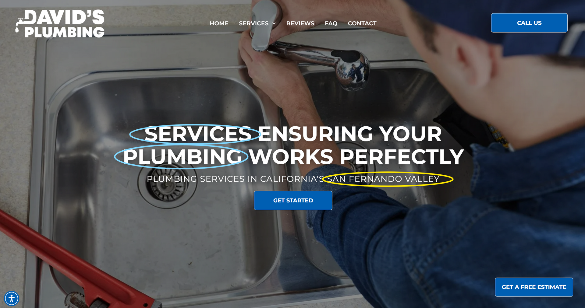
A well-designed homepage should quickly inform the viewer of the company's name, the products or services offered, and its location, enabling users to swiftly determine their interest. It's crucial for the Hero Banner Headers and Subheaders to each include at least one instance of the main keyword and location to capture user attention effectively. Please Note: For well-known locations such as Houston, there is no need to include the state abbreviation, "TX." However, if a state abbreviation is used elsewhere, remember to follow it with a comma unless it concludes the sentence or phrase. Take a look at some examples of sites that were built this week and implement the above:


Nick
Font selections can make or break the design of your site. When selected carefully, the fonts you choose can create a cohesive and well-branded site that impresses not only the client but your dev leads as well. As a general guide, there should be no more than two fonts for headings and subheadings.
Pair fonts that complement each other, ensuring they’re readable on all devices. Avoid overly decorative styles and focus on consistency to keep the design polished and professional. Sans-serif fonts are generally more widely acceptable for websites as they are screen-friendly and versatile for a wide range of design styles and website topics. Here are a few tastefully crafted examples from some of our developers!


Sophie
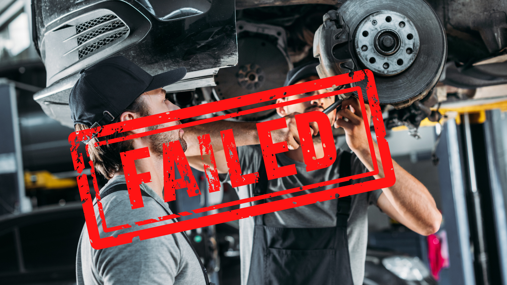
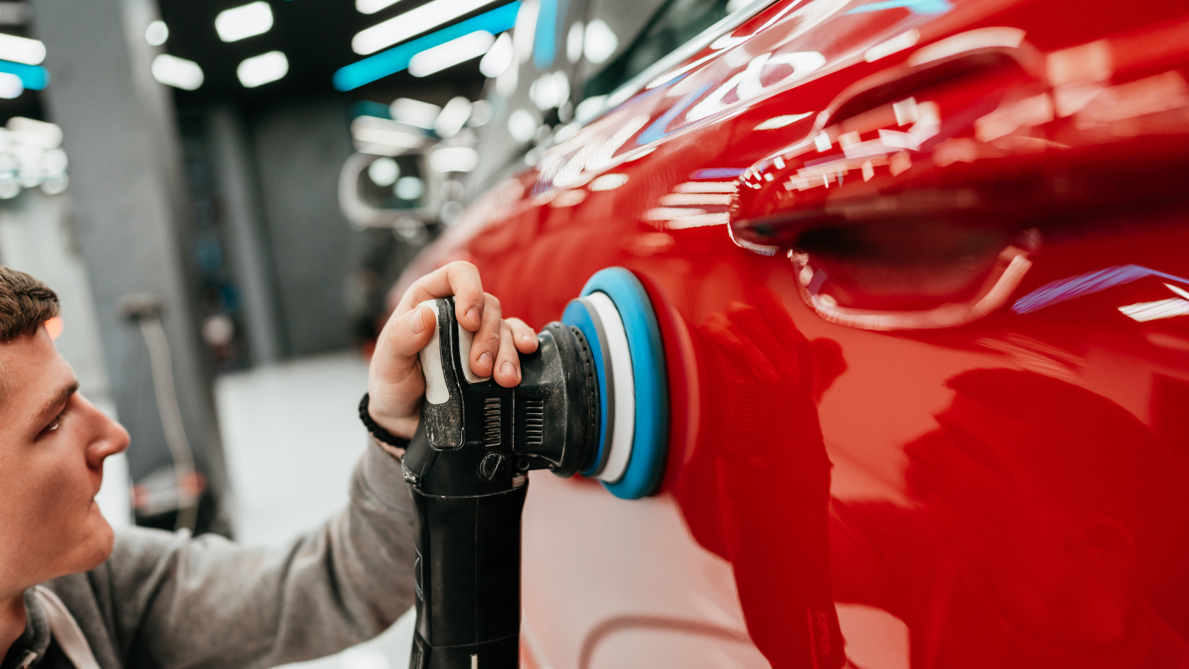
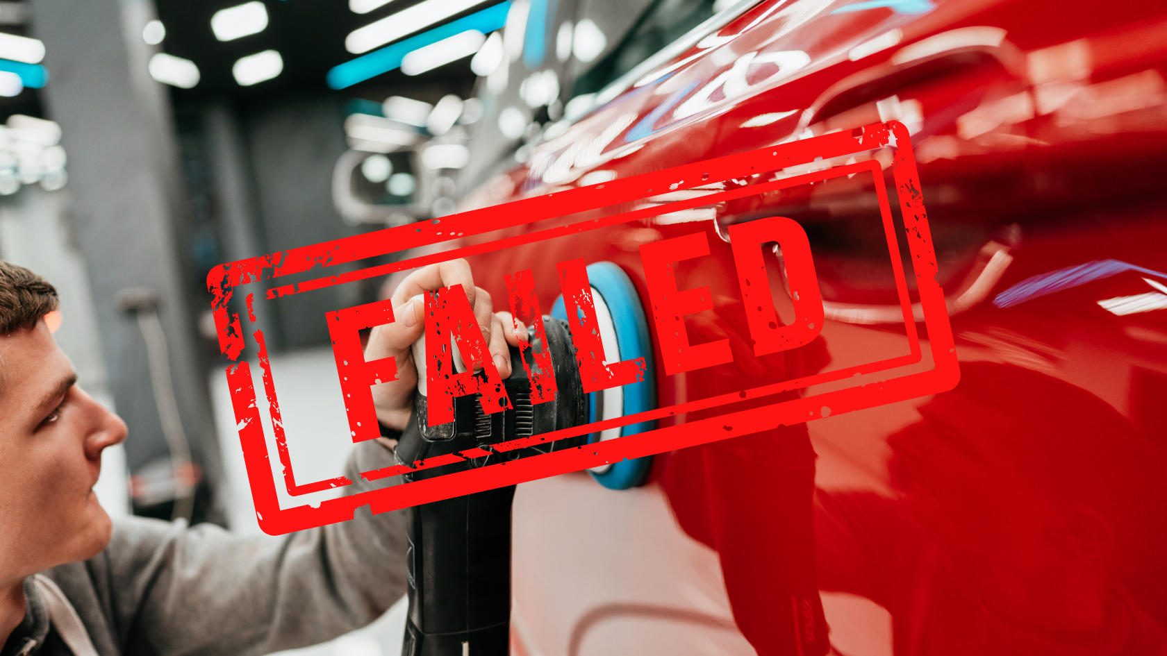
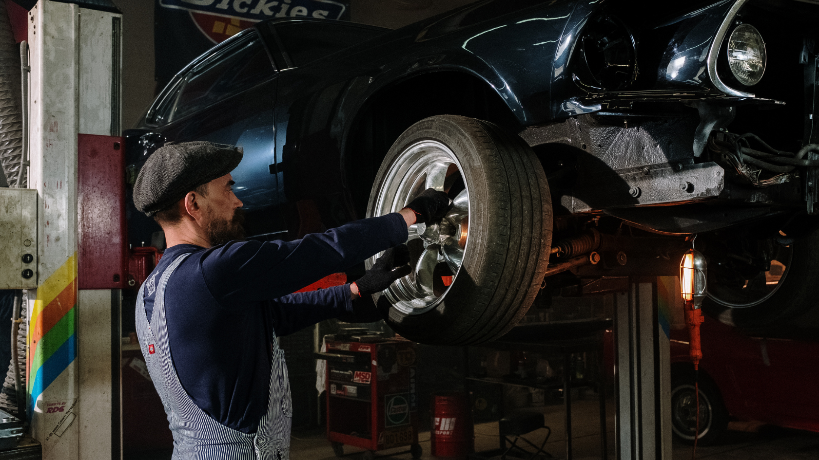
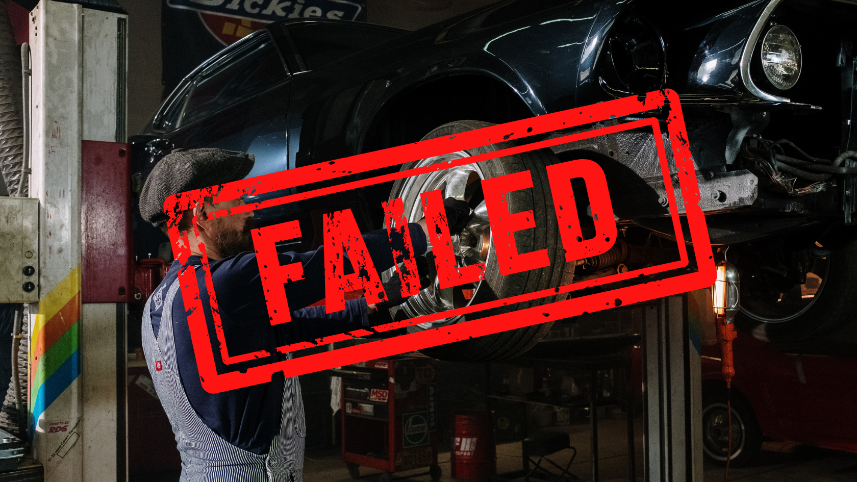
In general, we ask you to avoid using photos that "depict the client." There are some rare exceptions to this rule—for example, clients, like elder home care agencies, need these types of images to effectively showcase their services. But for most other sites, this rule is pretty straightforward.
To help clear up any confusion, I’ve put together some digital flashcards. Click through to quiz yourself on which photos would pass or fail our review process. I chose an auto repair shop as the client for this exercise—see how you do!


Carissa
Create Cohesive Green Screen Videos in 3 Easy Steps:
- Add Business Details: Add your business name and phone number to the video text. Make sure the colors and design match your website’s vibe and logo for a smooth, consistent look.
- Optimize the Thumbnail: When you upload your video to Vimeo, pick a thumbnail that shows off your business name and number, plus a clean shot of the spokesperson. This helps grab attention!
- Achieve Consistency: When the colors, design, and style all work together, your video will really help bring your website to life and keep everything looking polished.
As shown below, these developers exemplify how effective coordination of all components can create a harmonious final product.


Joe
Hey team! This week, I wanted to share a few quick reminders and best practices for working with background videos and stock footage. These tips will help us maintain consistency and professionalism across all our sites, while also ensuring that we’re representing our clients in the best possible way.
Best Practices for Background Videos and Stock Footage
Avoid Using the Template Site’s BG Video:
Even if the content seems relevant, please avoid using the template site’s background video. The template’s file name includes the site’s name, and we want to ensure there’s no trace of another company’s name, even in the source code, when delivering our site.
Be Mindful When Selecting Stock Footage:
When selecting stock footage from WeVideo for your background video, try to avoid clips that "depict the client." Our clients tend to prefer not being represented by stock footage actors.
A General Rule for Stock Media:
It’s best to steer clear of stock photos and videos that show models doing the client’s work.
For example,
hands of workers or cropped shots that hide the model’s face are fine, but we want to avoid full-face shots. Also, keep in mind that the models’ attire might not reflect our clients’ actual style.
Focus on the Final Product:
Instead of showing workers, let’s choose footage that highlights the finished product.
For instance, if working with a general contractor, opt for clips of completed kitchens or bathrooms—avoid shots of messy renovation processes.
BG Video Length and Composition:
Background videos should consist of 4-5 clips, each between 3.5 and 5 seconds. These clips should be hard-cut to each other, with no transitions.

John
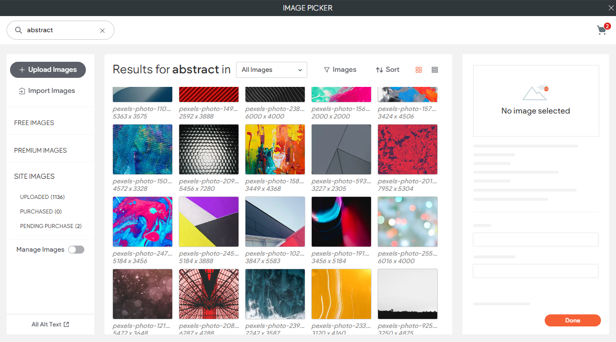
Hey team! I wanted to share a helpful tip on using
abstract backgrounds for section content. This simple trick can make your designs look better.
If you’re having trouble finding the right background or don't have enough photos, abstract options can add style without making your content look too busy. Choose simple patterns or colors that fit your scheme to keep the look clean.
You can find a lot of abstract images in Canva, but if you need something quick while you're in the Duda editor, just search in our Image Picker for "abstract," or other words like simple, white, patterns etc., and you'll find many options to choose from.
Lastly, you can add overlays. Pick a color that matches your theme to help the content stand out while keeping the look balanced.
Site of the Week Winner
Thanks So Much to All of Our Amazing Devs!
This Week's Honorable Mentions:
Congratulations, Tam Urao for:
Kingdom Builders Publications, LLC
Congratulations, Mike Mulumba for: