Dev Weekly Newsletter
May 16th, 2025
Including a brief video presentation featuring:
Important Announcements of the Week:
➞ PARTICIPATE IN THE WEB DEVELOPMENT TEAM'S SECOND QUARTERLY SURVEY:
In preparation for our
second Quarterly Presentation, your Dev Leads have created a survey to gather your thoughts and feedback. We encourage you to
actively participate and share your feedback, enabling us to continuously
enhance our processes. Once we collect enough data, we will analyze and share the results,
so stay tuned!
*** If you need clarification or assistance with any of the above announcements, feel free to reach out to your Dev Leads. ***
Weekly Tips From Your Leads
Emma
This week I bring you another Logo Design Challenge tutorial in Canva. The client in this case requested that their original logo be modernized and slightly edited. The main effects used for this redesign include the Magic Grab, Magic Eraser, and Magic Text Grab tools. Watch the video below to learn some new tricks and maybe get some inspiration for your next logo design! And as always, reach out if you have a design challenge for next week!

Nick
Are you looking for new ways to
add interactivity
to your website? Want to
maximize the functionality of a gallery widget? There is a simple solution—enabling links
on your gallery images! By toggling on one tiny button, you can turn your gallery widget into a
secondary-level navigation menu that
directs users to the services being promoted on their website. Refer to the
video tutorial below to see this tip in action!

Sophie
Did you know you can standardize row and column padding in Duda?
For seamlessly consistent row and column formatting across your entire website, check your template's global Design Settings. Adjusting these settings FROM THE START will ensure that your rows and columns are padded and spaced evenly, elevating the entire design as well as the professionalism of the website.
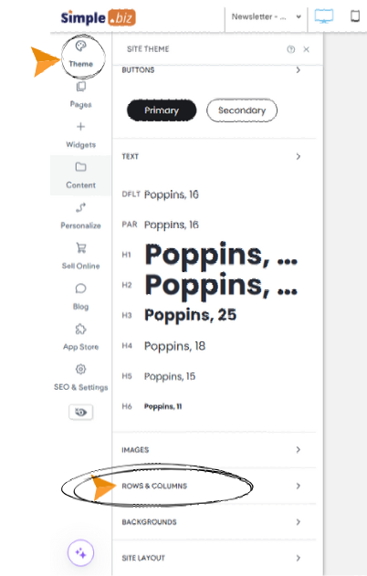
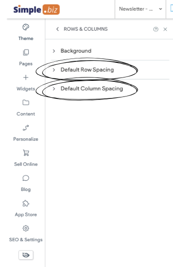
.. How to access global row/column padding settings
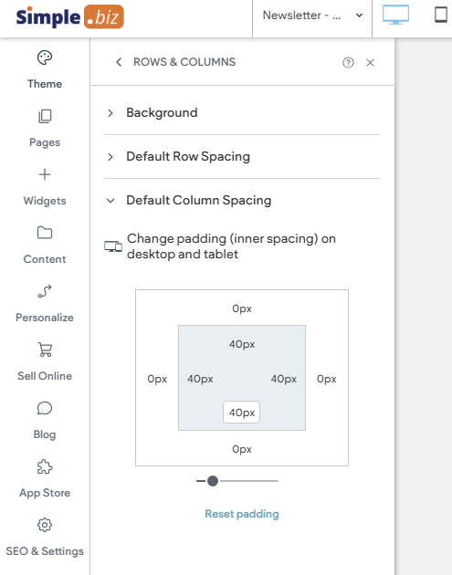
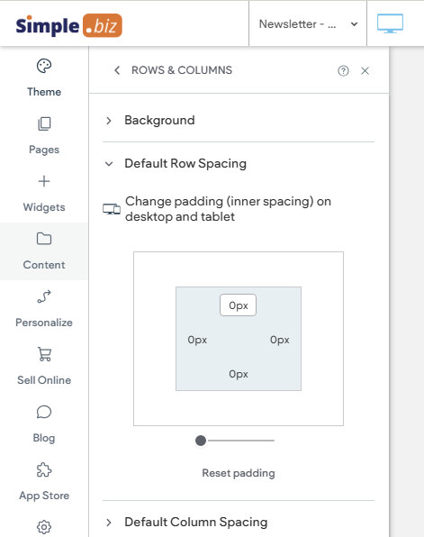
............suggested global padding for columns............. .....suggested global padding for rows

Carissa
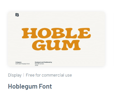
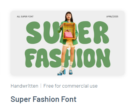
Fonts That Fit
................................... ....Font Match........................................................................................Font Clash
Why Font Harmony Between Your Logo & Titles Matters:
- Unifies Design
- Boosts Brand Identity
- Polishes Appearance
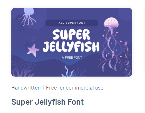
Ready to find your perfect font?
Check out Fontesk for unique, niche fonts that are free for commercial use!

Joe
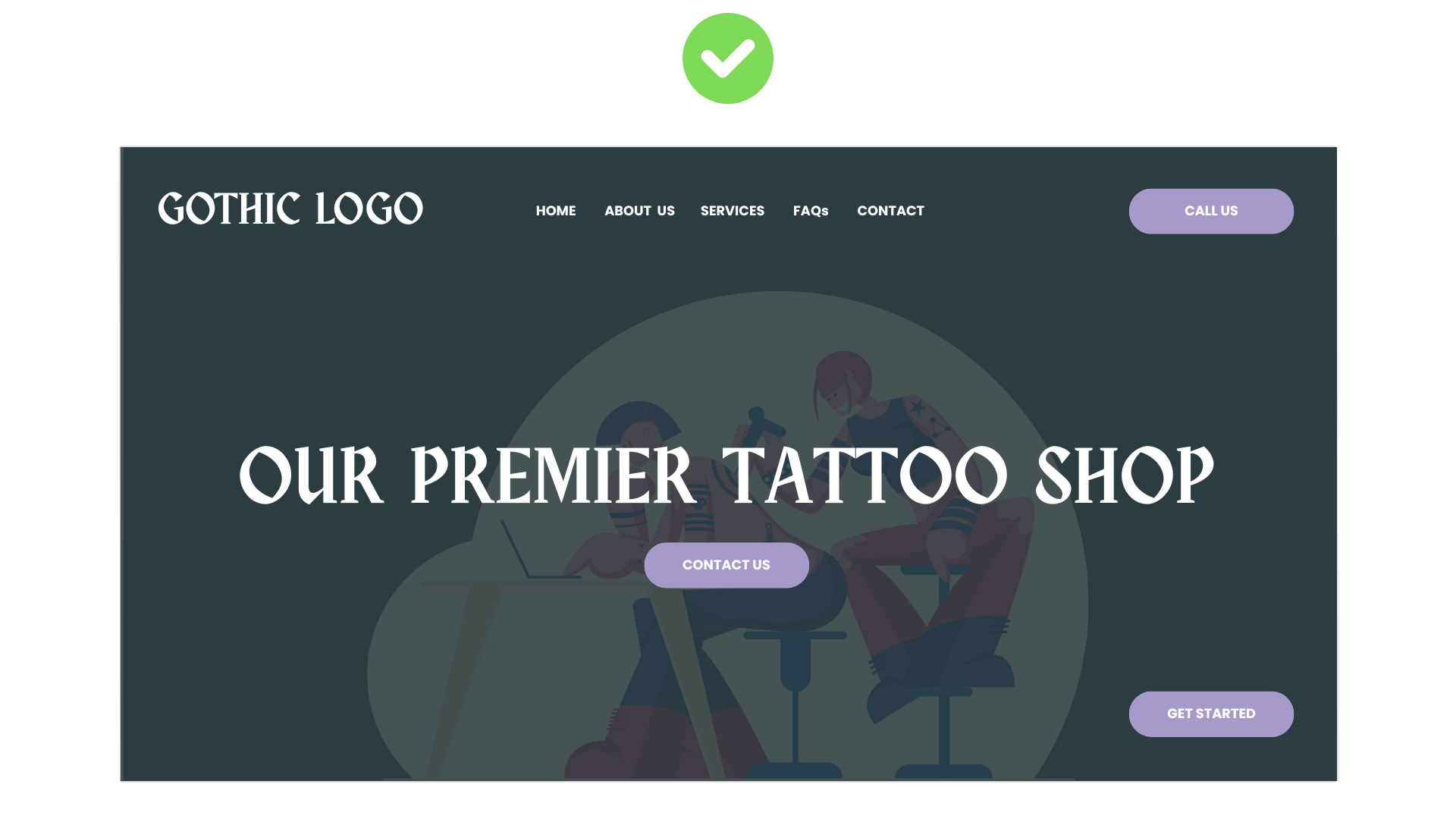
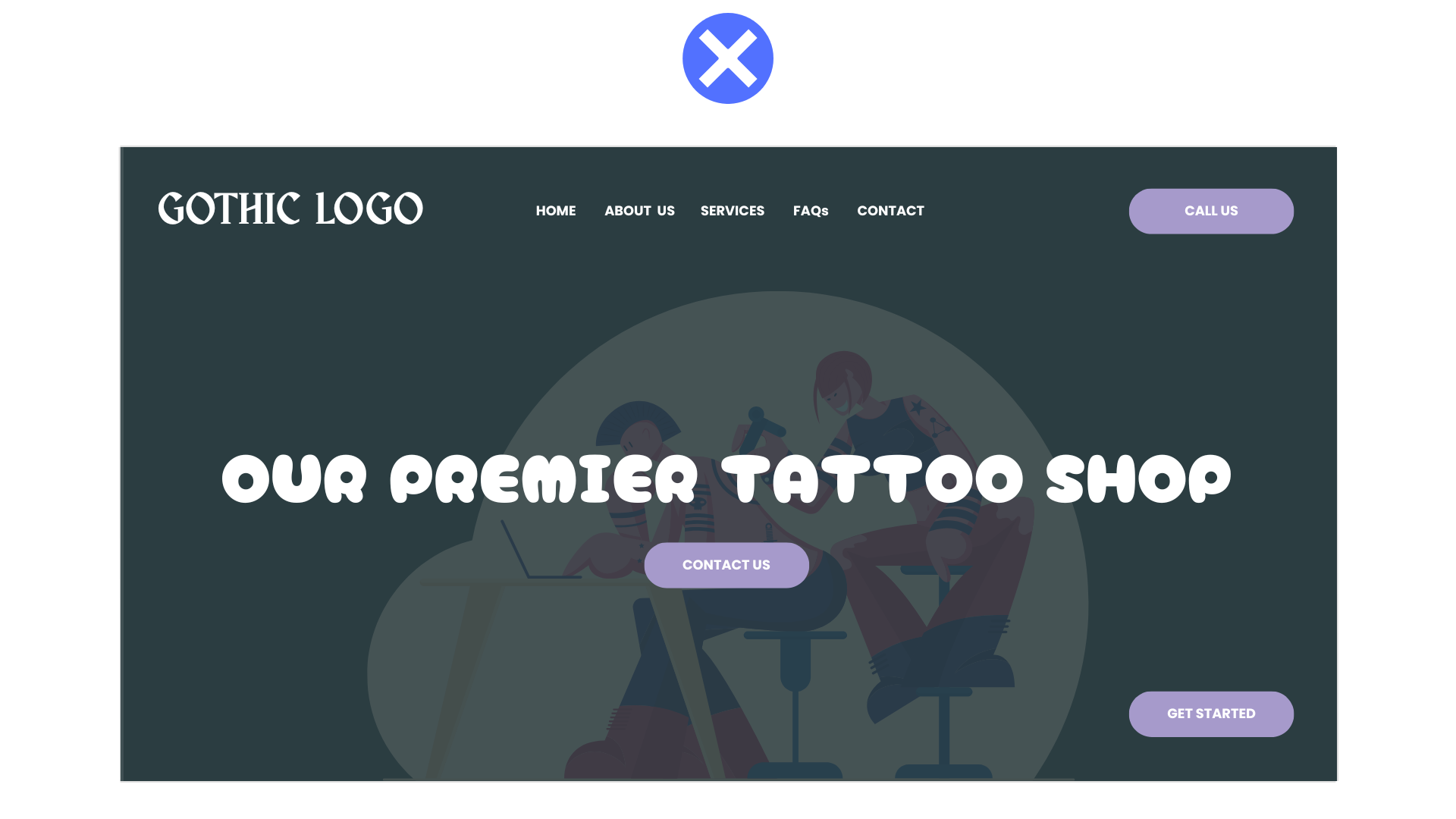
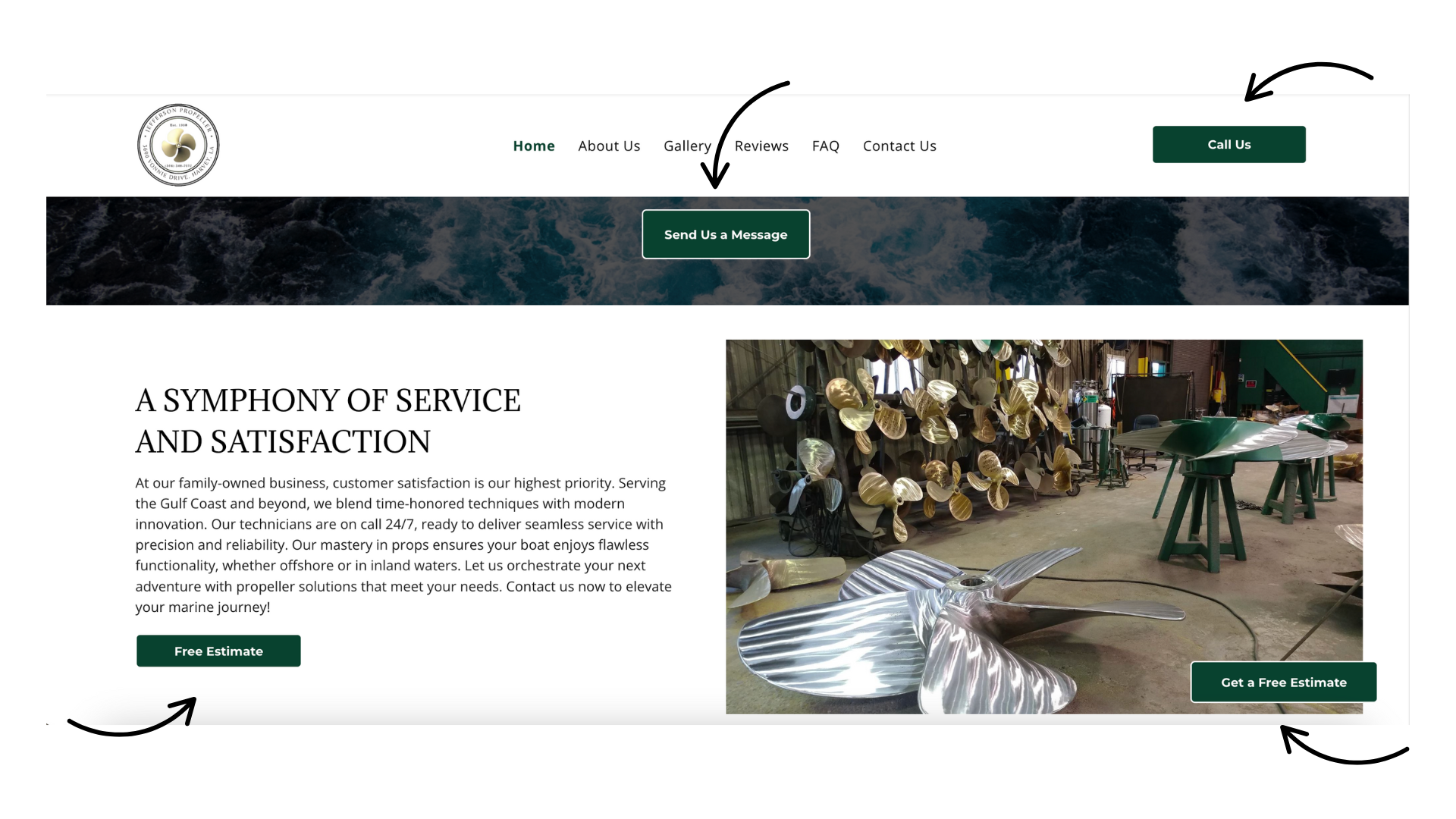
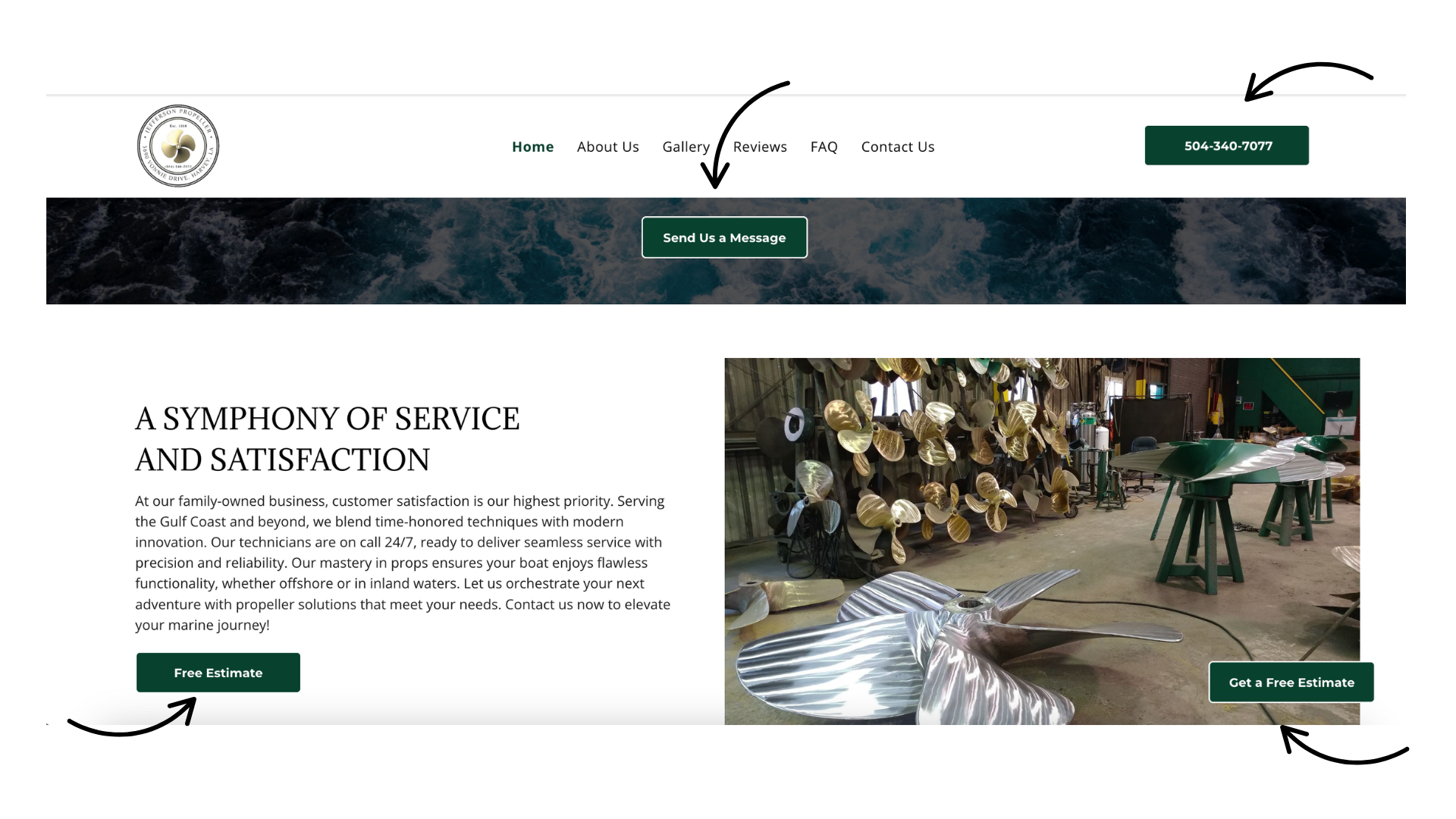
Why Standardizing Button Sizes Matters
Using buttons with the same height and width helps your website feel organized and user-friendly. It also creates a polished look, elevating professionalism and showing intention.
Making buttons uniform makes your site easier to navigate and improves the overall experience.
Remember, branded, consistent buttons with concise and varied "call-to-actions" lead to smoother user interactions and, thus, better engagement.
Refer to the
before and after example below
to see this concept in practice:

John
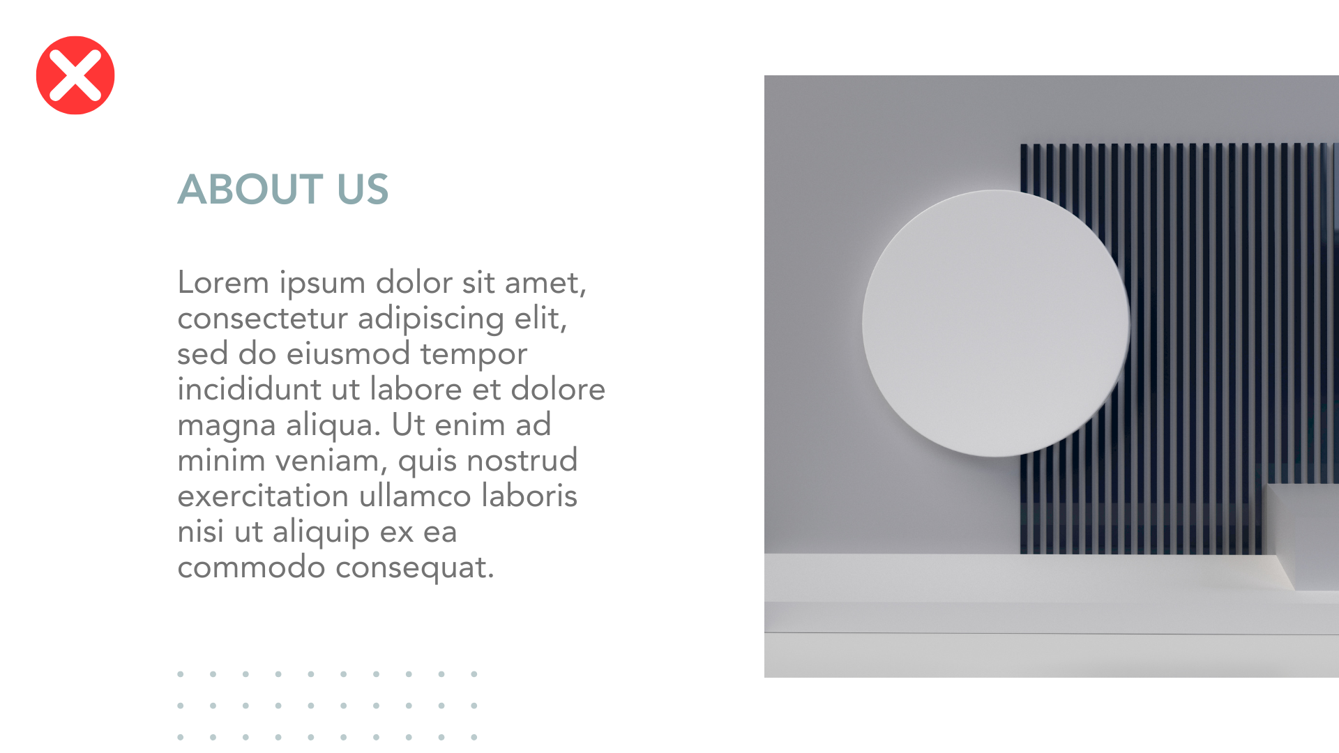
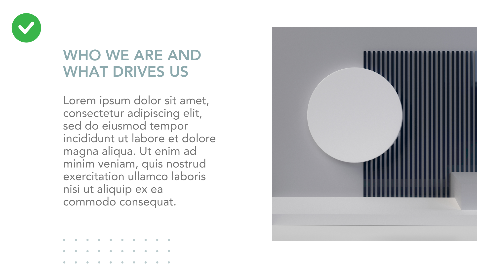
Avoid Generic Page Titles and Make Each One Count
Try not to use plain or "empty" header titles like "About Us" or "Our Services." These don’t say much about what makes your client's business special. Instead, use clear, concise, and helpful titles that tell users what they’ll find on the website and why it matters. Many visitors just scan the page, so make your titles work for you!
Better title examples:
Instead of: About Us
Try:
- Who We Are and What Drives Us
- Meet the Team Behind the Work
- Our Story of Craft and Commitment
Instead of: Our Services
Try:
- What We Do for Homeowners & Businesses
- Expert Help Where It Matters Most
- Reliable Work You Can Count On