Dev Weekly Newsletter
March 14th, 2025
Including a brief video presentation featuring:
Important Announcements of the Week:
➞ MANAGING OUR COMPANY'S SHARED CANVA ACCOUNT:
As a general reminder, please remember to save files you create for the client, such as logos and favicons, in the designated Google Drive folder for easy access. In addition, please do not delete any files in Canva that are not yours. To help prevent this, always start with a new design to avoid overlapping with someone else's work, and save in-progress and finished designs in a personal account or on your personal device for backup.
➞ AT-A-GLANCE GUIDE FOR QUESTIONS REGARDING PROJECT NOTES:
We've all faced the challenge of
unclear client notes—some too detailed, others too vague—leaving us uncertain of their true needs and expectations. To avoid
wasting time on revisions, here’s a
simple support guide to help keep your project on track. Keep it handy for quick reference!
(A special Thanks to
Carissa for creating this awesome visual!)
If you need clarification or assistance with any of the above announcements, feel free to reach out to your Dev Leads.
Weekly Tips From Your Leads
Emma
Finding relevant photos can be incredibly tricky, especially when detailed client requests or location specificity come into play. While your Dev Leads are working continuously to update our shared Image Library with SOP-aligned stock photos, I would like to share some tips that I have found make the hunt for those hard-to-find photos a little easier:
1. FINISHED PRODUCT OVER PROCESS: When searching for terms including
installation, repair, maintenance, and the like, relevant photos can be hard to find. Instead of focusing on these specific processes, take a broader view and search for stock images that display the finished product. For example, instead of trying to find photos of an actual driveway being installed, search for images of new driveways or housefront exteriors.
2. INDUSTRIES SERVED/CLOSE-UPS/SATISFIED CUSTOMERS: If you are truly struggling to find photos, consider the following strategies as a final resort: Search for industries that use your client's services and use relevant imagery. Look for abstract or close-up photos that suggest what your client does without being too specific, or find images representing satisfied customers or potential clients.
3. UTILIZE THE MAGIC STUDIO IN CANVA FOR EASY EDITS: We can all relate to the frustration of finding the perfect stock photo—perfect except for one thing. Whether it is a license plate, a billboard, or something else that makes an otherwise ideal stock image unusable or unappealing, it may be saved by the handy Magic Grab tool, as demonstrated below:

Nick
Did you know you can auto-generate collections based on keywords or locations with a click? To save time when building a double, focus collections on whichever has fewer—this reduces the number of collections and dynamic pages needed. For example, with 14 keywords and 6 locations, it's easier to create 6 location-based collections instead of 14 keyword-based ones. Fortunately, an AI tool that we have created helps with this.
When your deal moves from “Assigned to Developer” to “Under Construction,” an automated script generates a Google Sheets collection based on your keywords and locations.
However, this collection isn’t optimized for a double, so a few extra steps are required.
At the top of the collection within Google Sheets, click
* LINK EDITOR * AND * KEYWORD/LOCATION SEPARATOR *, where you'll see:
- Edit HTML FAQ Links (Select Cell First)
- Separate Keywords to New Files (Allow a Few Minutes to Run)
- Separate Locations to New Files (Allow a Few Minutes to Run)
Choose option 2 if you have fewer keywords than locations or
option 3 if the reverse is true. Let the automation run, and you'll get structured collections in your project folder.
The goal is to minimize dynamic pages as much as possible so that you have fewer to set up and edit!

Sophie
Have you ever received feedback about header styling and consistency?
This refers to your choice of font, size, boldness, color, and even line spacing,
which should be streamlined across all headers of your site.
Check out the video demo below to review Duda's
Design Settings
for text and see how it can help you accomplish this in no time!

Carissa
Design Debate: Which is Better?
Light Mode..............or...............Dark Mode
Benefits of Light Mode:
- Better Readability
- Higher Contrast for Clearer Text
- More Accessible for a Wider Range of Users
*Pro Tip: Light mode is optimal for most websites, offering better readability, accessibility, and a more welcoming, professional feel. It’s especially effective for content-heavy sites, business, and service-oriented websites.
Benefits of Dark Mode:
- Reduces Eye Strain in Low-Light
- Bold Visual Appeal
- Provides a More Immersive Feel for Some Content Types
*Pro Tip: Dark mode can be a powerful design choice when it fits the brand's aesthetic, such as for automotive or weapon-based brands. However, we find that light mode generally provides a more versatile and user-friendly experience. Unless dark mode is specifically requested by the client, we recommend sticking with light mode for the best results.

Joe
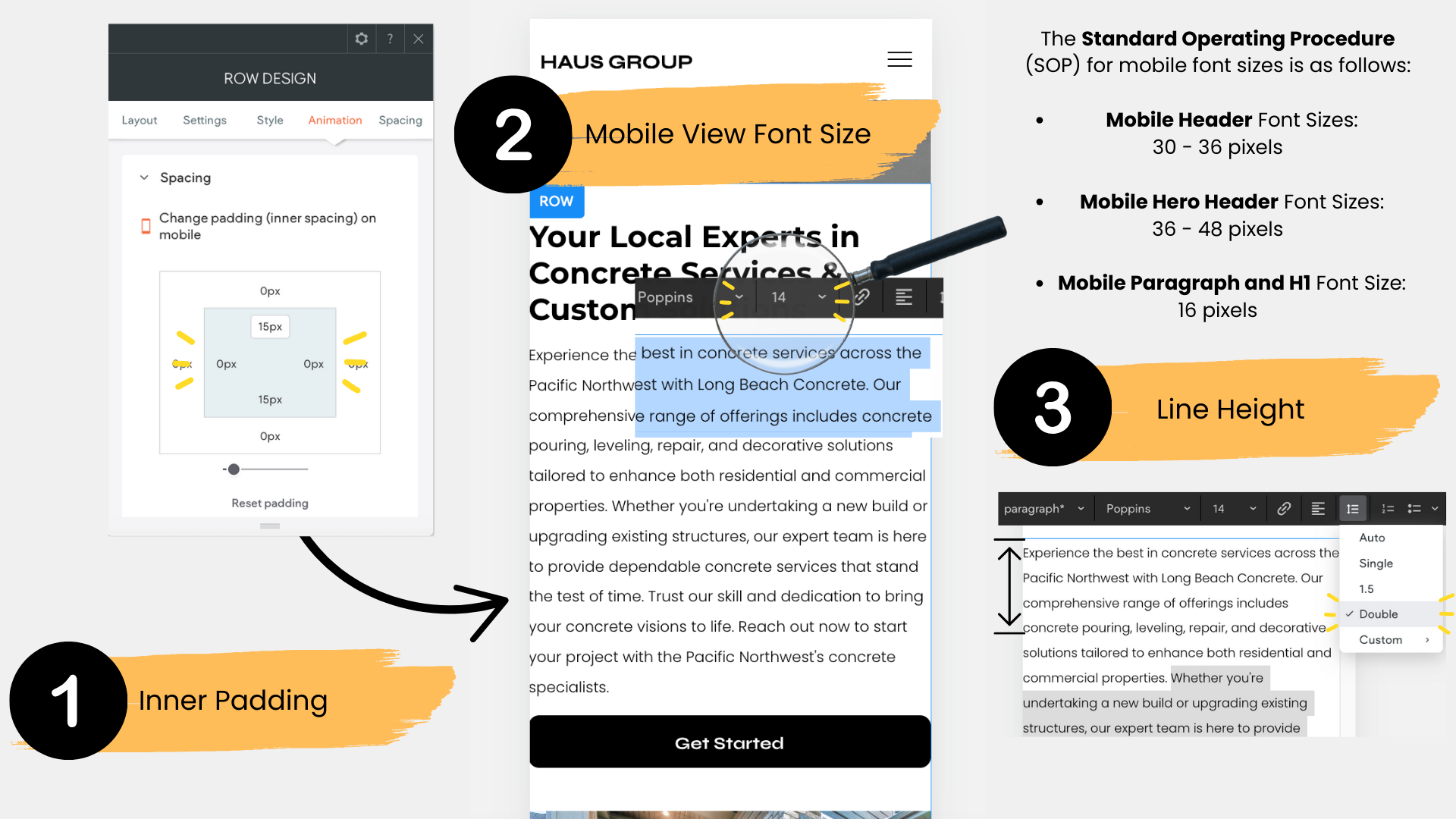
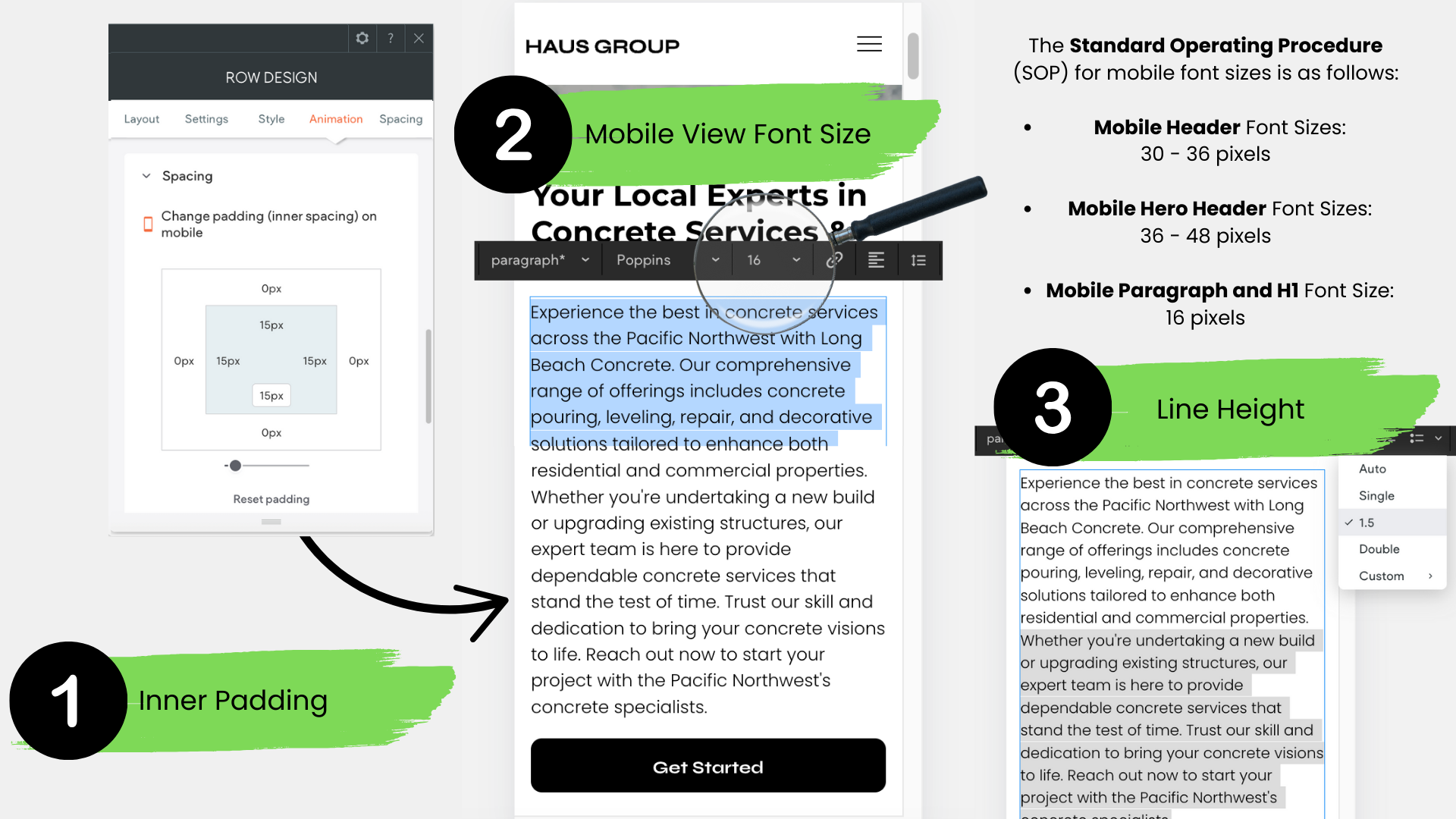
THREE COMMONLY OVERLOOKED MOBILE VIEW DESIGN DETAILS:
When reviewing a site in mobile view, it’s easy to overlook the small but impactful design details that make a big difference in the user experience. Here are three common elements that often get missed:
1. Mobile View Inner Padding:
Make sure that inner padding on mobile versions is adjusted properly. Without adequate padding, text and elements can feel cramped, leading to a cluttered and hard-to-read design. Ensuring proper spacing around content is key for a clean, legible mobile experience.
2. Paragraph Font Size:
Many sites still use font sizes smaller than the recommended
16px for body text. Keeping the font at this size ensures readability across all devices. Anything smaller can strain the reader's eyes, especially on mobile screens.
3. Line Spacing:
Proper line spacing is crucial for readability, yet it’s often overlooked. The
recommended line spacing is 1.5. Anything smaller can make the text feel cramped and harder to read, while spacing set to double can appear too loose. Consistent 1.5 line spacing strikes the perfect balance.

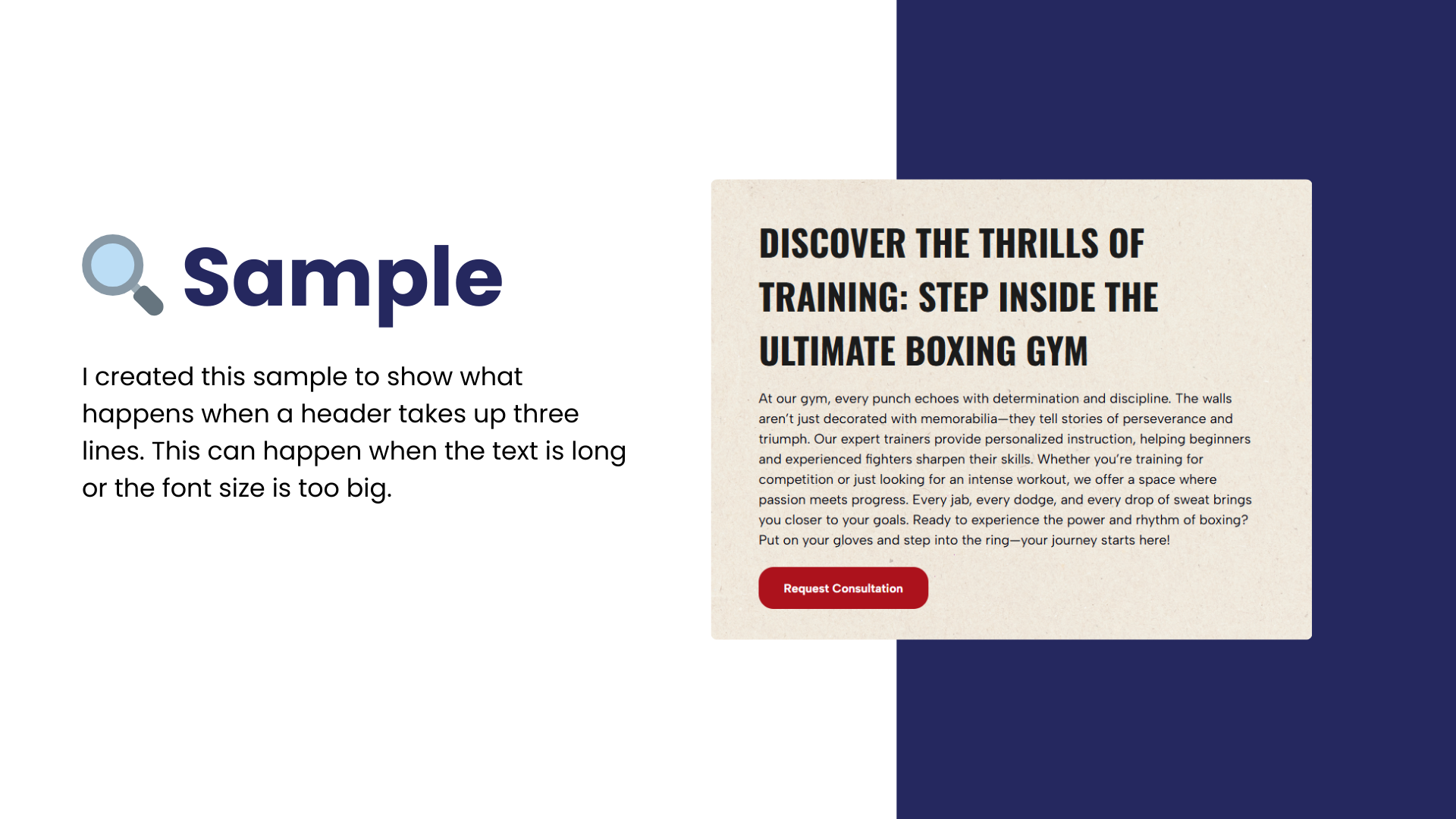
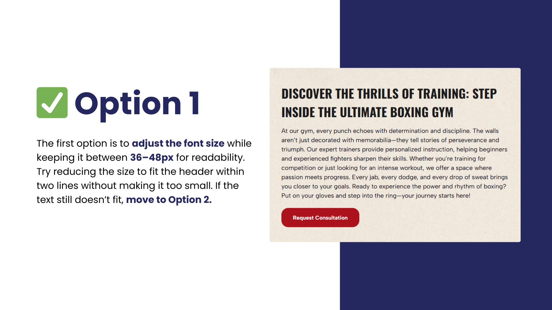
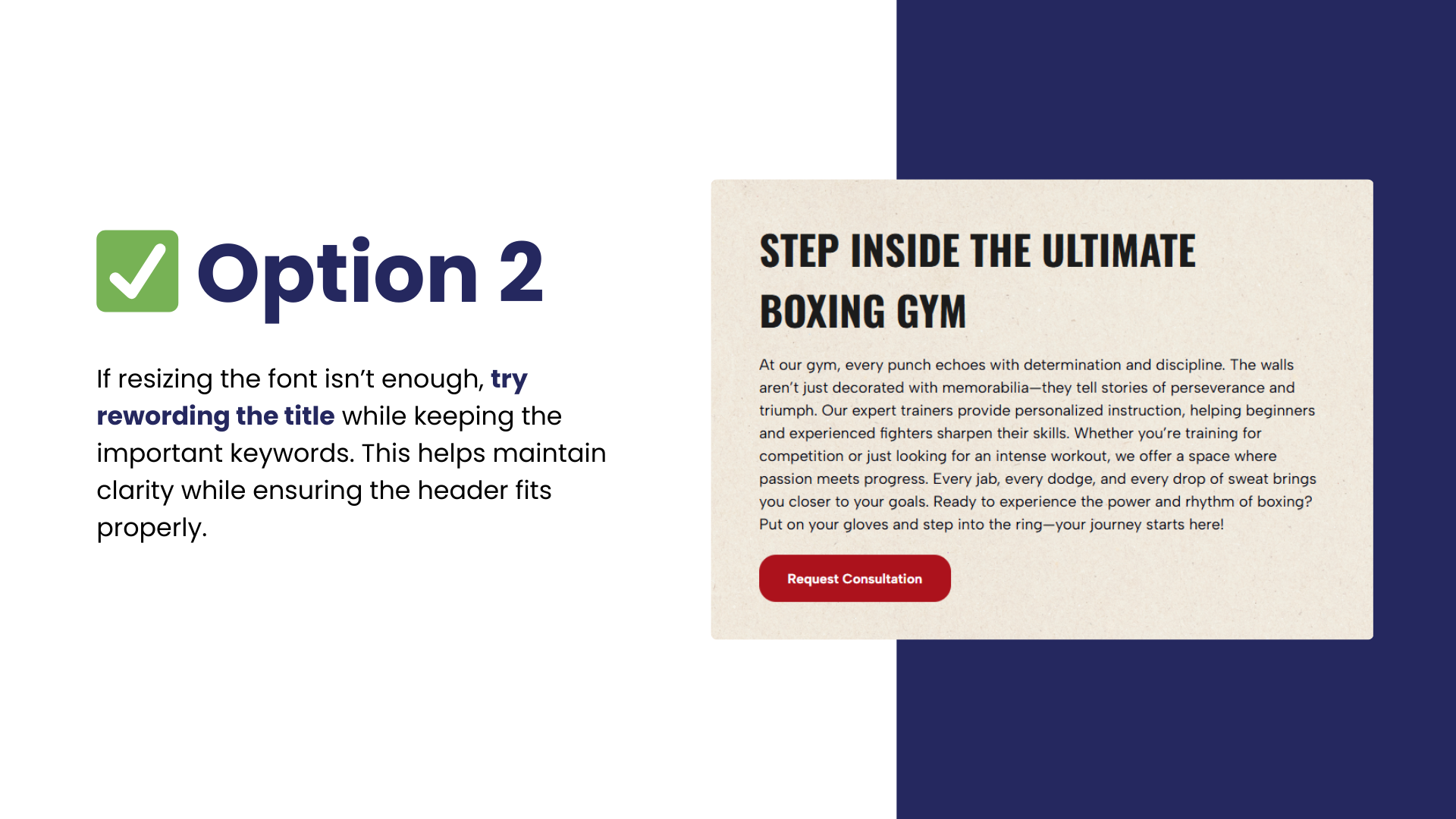
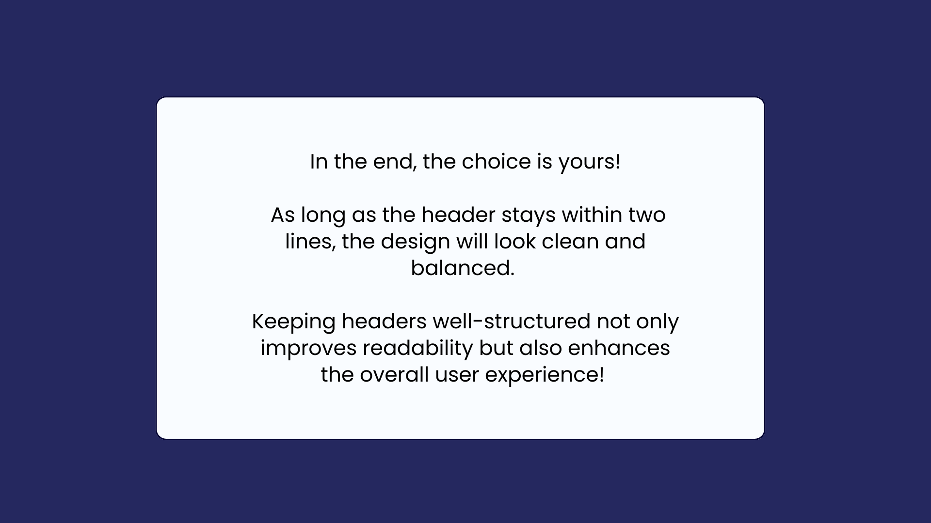
John
ELIMINATING "HANGING" WORDS/CREATING CONCISE HEADERS:
This week’s tip is about making sure headers stay within two lines, without any "hanging" words on a second or third line, for a clean and balanced design. Swipe through each slide to see examples, fixes, and best practices to make your headers look great!