

Dev Weekly Newsletter
9/20/24
Featuring

Weekly Tips From Your Leads!
Emma
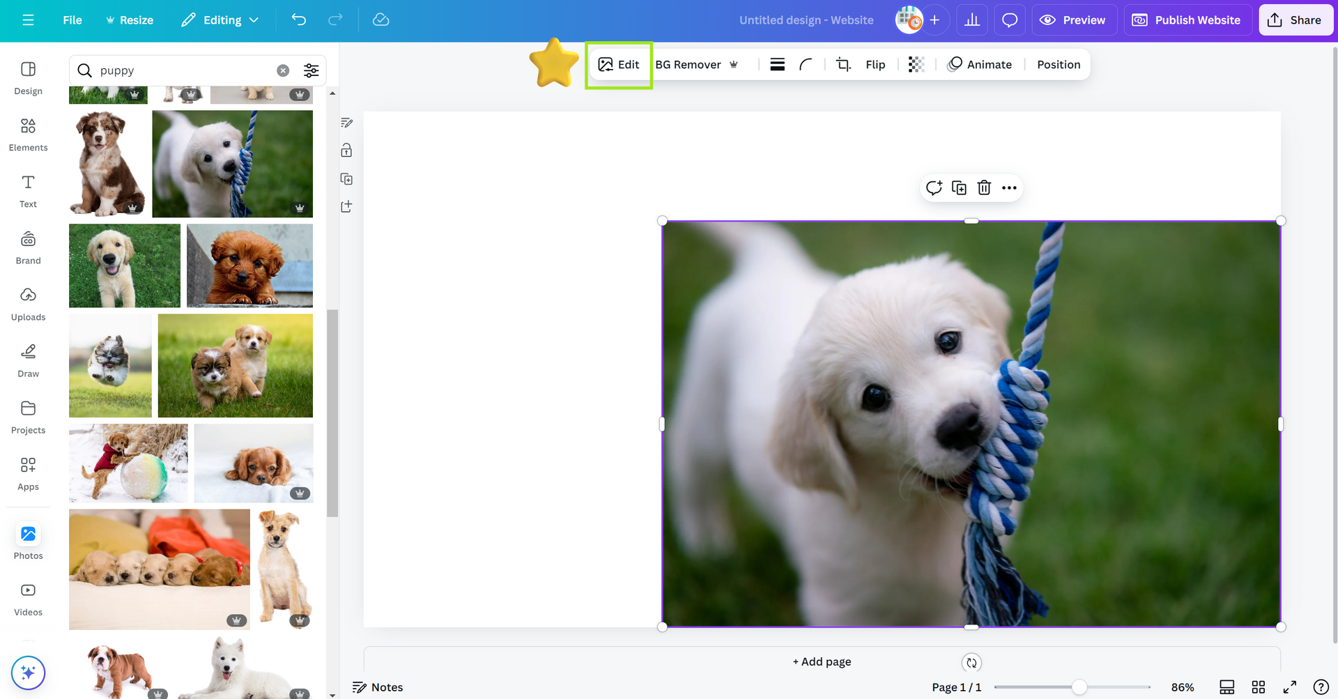
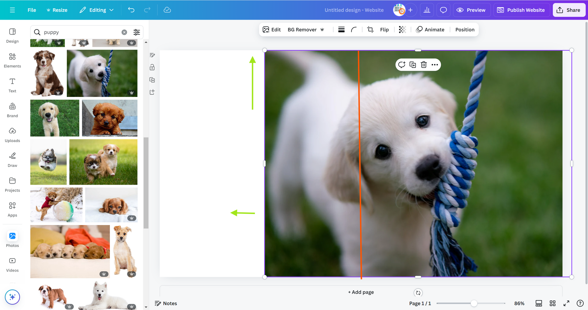
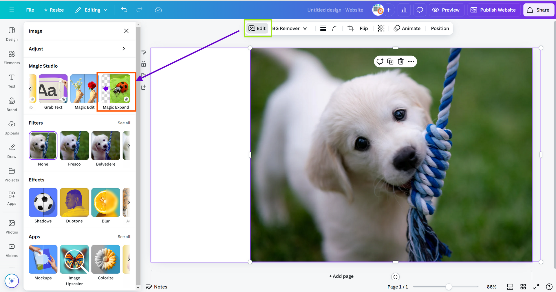
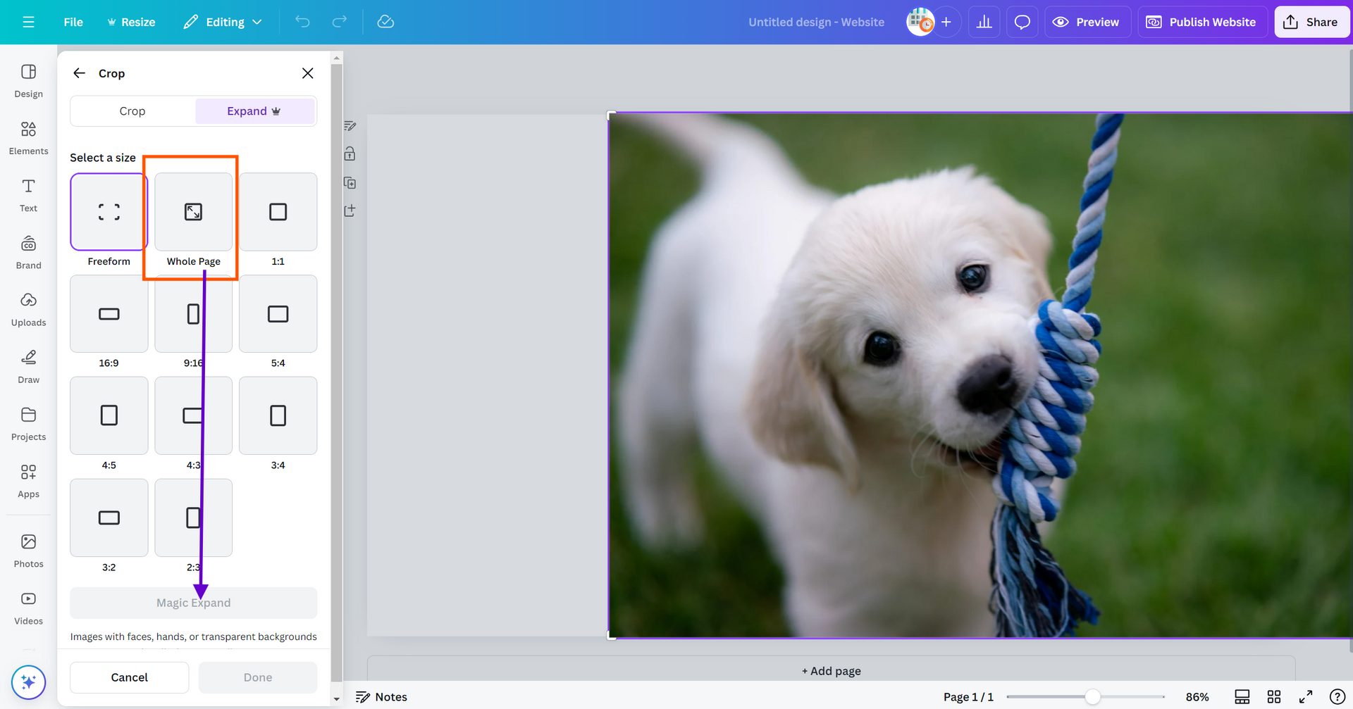
This week, let's explore Canva's "Magic Expand" feature, another innovative AI tool from the "Magic Studio." This tool is particularly useful when clients send vertically-aligned photos or when a photo's focal point needs to be centered. While it's not perfect, and is best suited for extending photo backgrounds, it can also fill in space if a photo is poorly cropped. Below, I’ll demonstrate an example of how this tool effectively expands photos in all directions, improving the overall composition on your "canvas."
Note: This works best for images that will be used as backgrounds or have overlays on them, as this helps cover any imperfections caused by the tool.

Nick
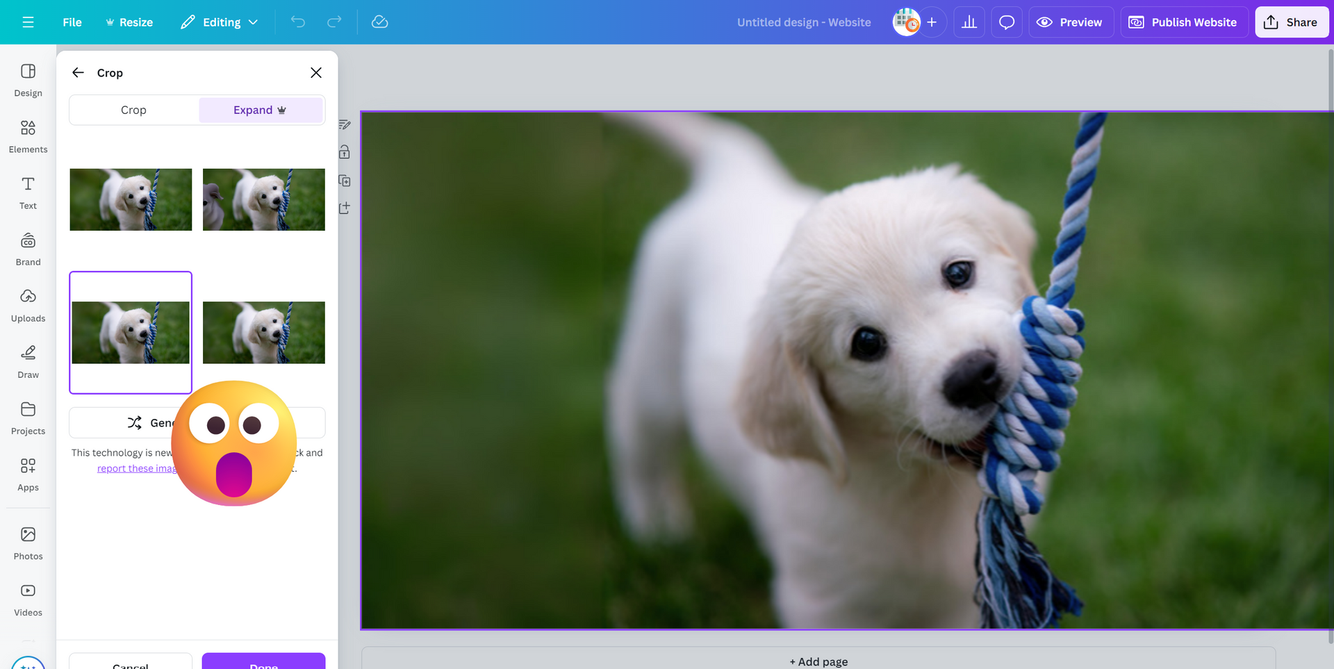
When setting your background images on columns or rows, it is important to ensure that you have chosen the correct fill option for your image. More specifically, you want to use the "Cover" option whenever possible. The cover background size scales the image while preserving its ratio to the smallest possible size to fill the entire container, meaning that there will be no empty space on your background (which is a good thing).
Please avoid using the full image, tile, and no repeat background sizes as they typically cause display issues on columns and rows and can negatively affect the appearance of your website.

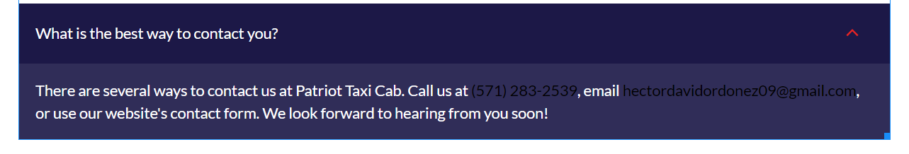
Sophie
When a visitor lands on a website, the logo is often the first element they notice. A clear, professional-looking logo can set the tone for how a brand is perceived and leave a lasting impression on prospective customers. Unfortunately, we sometimes receive low-resolution logos or images from clients that don't quite meet the visual standards we'd like. Thanks to a tip from our own Nichole Clark, we’ve found a solution! You can run these low-res assets through the
SmartImage Upscaler to significantly improve their clarity and quality. This simple step can make a world of difference in ensuring that our client’s branding shines as it should.
TIP: If your client's logo has a BG that needs to be removed before it is applied to your site, remove the BG and convert the JPEG to a PNG
before uploading the logo to the
Image Upscaler.
The Image Upscaler can now be found on the
Helpful Tools and Resources page.
Check out the example of the
Image Upscaler improving a CP image on a site that required CP images and no stock photos:

Carissa
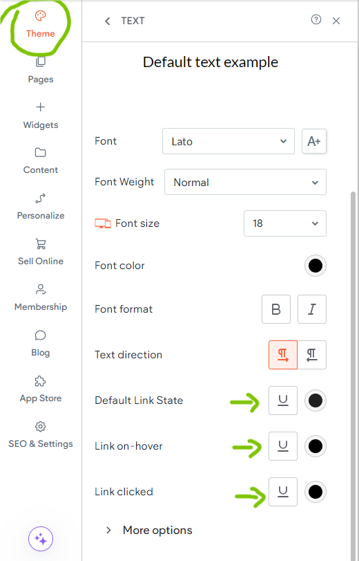
Here's a quick guide to adjust your linked text to match the font color of your text:
Go into your global "Theme" settings under the "Default text" category: In there, you can change your linked text to the correct color.
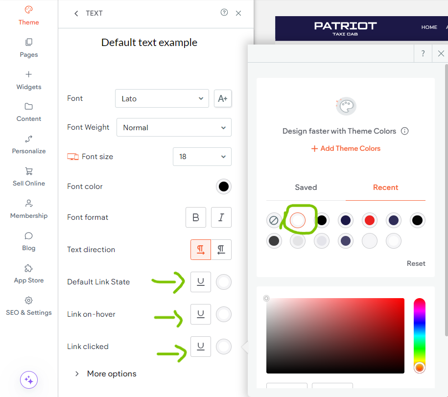
And there you have it: A cohesive text description with uniform color.

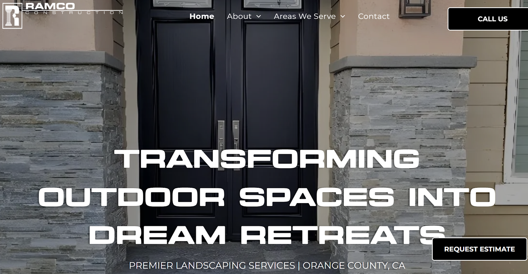
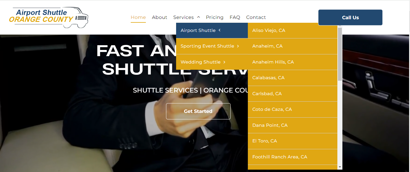
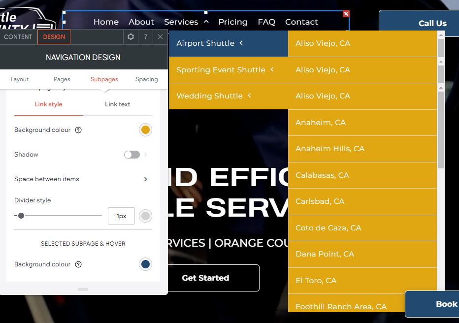
Joe
The design of the navigation links in the header plays a crucial role in setting the site's colors, tone, and overall first impression.
It leaves a lasting impact on users while effectively highlighting the logo's color scheme. The thoughtful combination of text color, hover effects, and dividers creates a visually engaging experience.
Take a moment to explore the design of this header navigation below:
Site of the Week Winner
Thanks So Much to All of Our Amazing Devs!
This Week's Honorable Mentions:
Congratulations, Loraine Ostan, for:
GBS Insurance Group
Congratulations, Nathan Wietecha, for: