

Dev Weekly Newsletter
11/15/24
Featuring

Weekly Tips From Your Leads!

Emma
As your Dev. Leads have mentioned previously, selecting the right images is crucial for making a website both relevant and visually appealing. To keep content fresh and engaging, it is important to remember to use a variety of harmonious images that accurately represent the client’s products or services.
So, the main takeaway for this week is: avoid repeating any image on a single landing page. From Hero Banners to Gallery Sections, ensure each image you select is unique. This also applies to Collections— the Dynamic Sections on each landing page should feature new images not already used on the Home Page.
If client-provided (CP) images are unavailable or the client has no online presence, opt for high-quality stock photos from our Image Library or find your own on Canva.

Nick
Photo gallery widgets are a great way to showcase a client’s services in a visually appealing manner. However, I often find that these sections don’t reach their full potential because a small but impactful feature is frequently overlooked—enabling links on images.
By adding links to images within a photo gallery, you can transform a static showcase into an interactive and functional experience that guides users seamlessly to corresponding dynamic pages for the displayed services. This is a simple yet effective way to improve usability, drive engagement, and create a richer experience for visitors as they interact with the site’s content.
To enable this on a photo gallery widget, click on the widget, and you’ll see a toggle at the top for enabling links on gallery images. Toggle it on, select the image you want to link, and then choose the corresponding source. Voilà! Save this tip for the next time you add one of these sections to your site!

Sophie
When utilizing and finalizing Duda's video widgets, check how they appear in mobile view and make any necessary adjustments. Duda often adds unneeded extra space above and below video widgets on mobile.
To fix this: Switch to mobile view and select the video widget. Then, click and drag the bottom right corner upward to remove the excess space. This quick fix will give your site a cleaner, more polished look.
For a more detailed visual guide, watch the step-by-step video tutorial below:

Carissa
There are so many creative ways to design engaging and lively sections for a site. One of my favorite ways in particular is to add a subheader to my section. With more content to work with, it gives you the freedom to play around with the design and integrate more elements that further enhance the company's brand. With the sub-header, you are able to introduce an additional font style, maybe a pop of color, and more substance that enriches the site's overall appeal. The trick to making the sub-header work to your advantage is to choose a style, font, or color that will build upon the design that you've already created.
Special thanks to the developers that inspired me for this week's tip. There were so many examples I wish I could include, but please explore and enjoy the designs featured below:


Joe
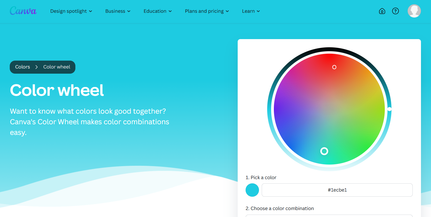
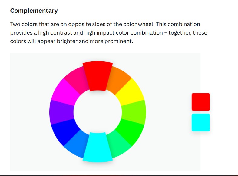
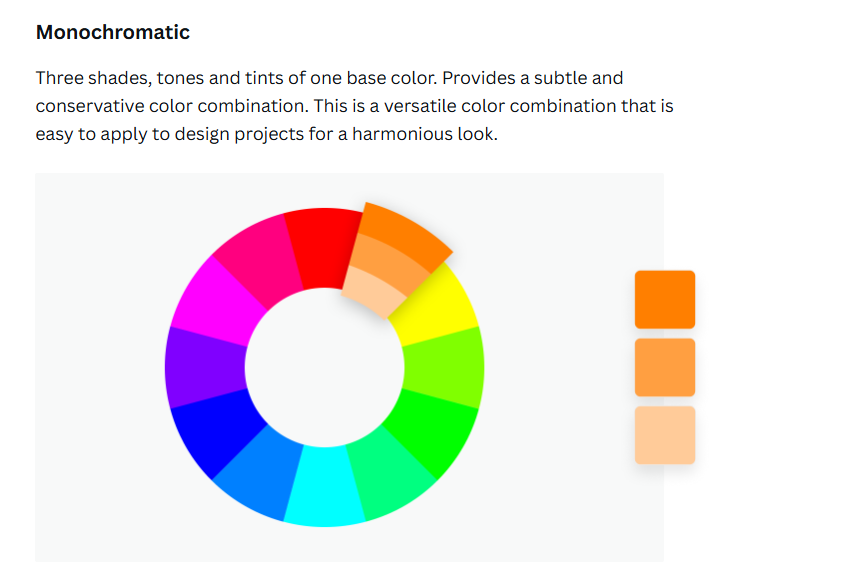
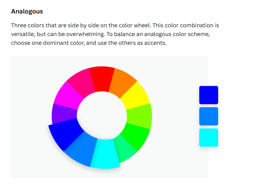
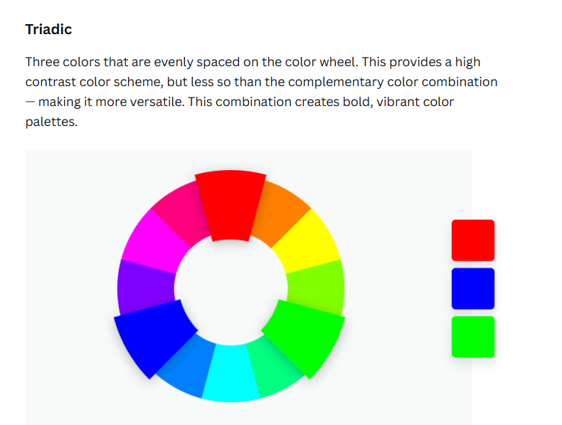
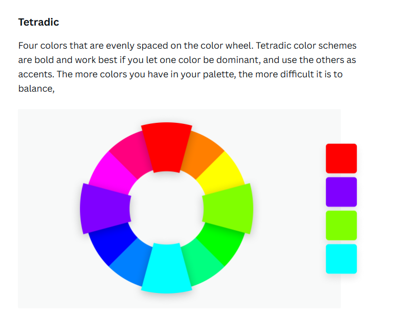
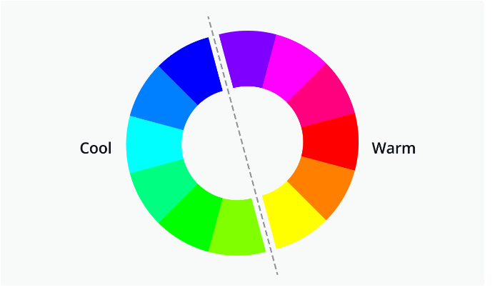
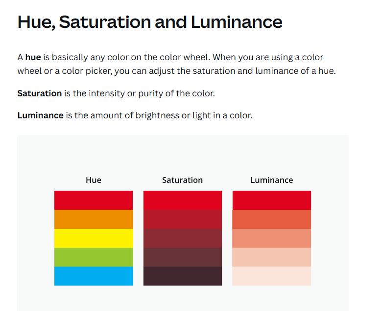
Ever find yourself stuck choosing the right colors for your design? When creating the color palette for branding your site, try using Canva's Color Wheel to explore different color schemes. You can experiment with:
- Complementary colors (opposites on the wheel) for bold contrast.
- Analogous colors (next to each other) for a harmonious look.
- Triadic colors (evenly spaced) for balance and variety.
- Monochromatic
colors
(different shades of the same hue)
for a more subtle, unified feel.
Starting with
a well-thought-out color palette is key to creating visually appealing designs
and ensures your overall composition is cohesive.
Check out the graphic below for a more visual explanation to help guide your color choices!
Site of the Week Winner
Thanks So Much to All of Our Amazing Devs!
This Week's Honorable Mentions:
Congratulations, Nicole Saunders for:
MBA Tax Services
Congratulations, Jaxson W, for: