

Dev Weekly Newsletter
11/01/24
Featuring

Weekly Tips From Your Leads!

Emma
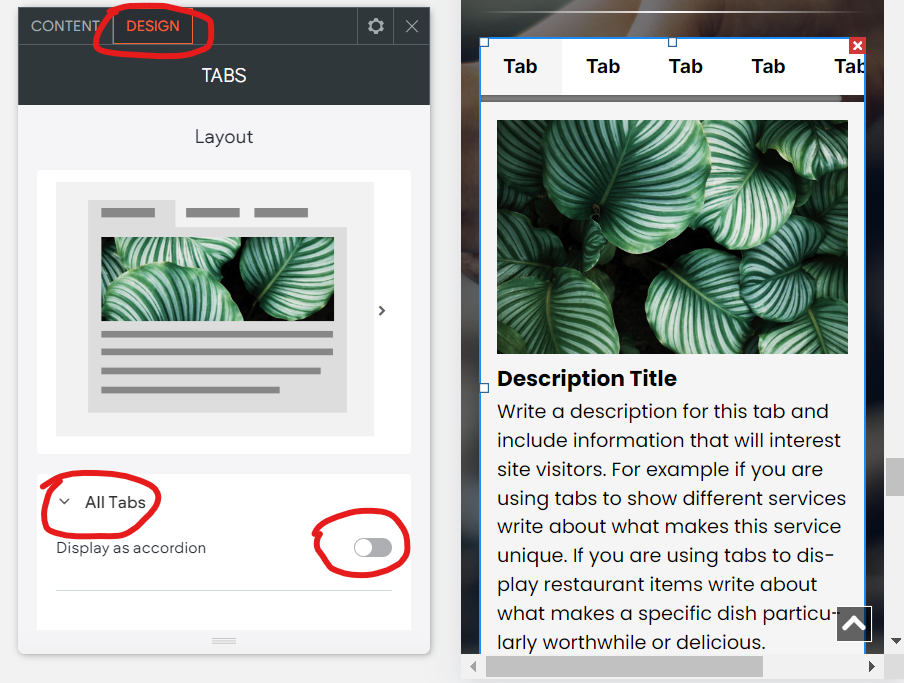
The Tabs widget in Duda is perfect for organizing information, especially longer text. While it may look fantastic on your desktop, it doesn’t always translate well on smaller screens. Thankfully, there’s a quick fix to improve its mobile display—essential now that most people browse websites from their phones.
To optimize your Tabs widget for mobile, switch to Mobile View, select your existing Tabs widget, go to the Design tab, click "All Tabs," and toggle on "Display as accordion." This adjustment will give your content a cleaner look on mobile while keeping the original desktop view intact, making your information easier to read and enhancing the user experience.


Nick
Utilizing the theme settings to your advantage is something that I have touched on before in prior newsletters; however, this week, I want to focus on one key element that can save you, and us leads, lots of time.
If you didn't know, the theme settings for text differ from the desktop version to the mobile version. This is important to be aware of because that means, often times, your text settings will not be the same across all devices, causing titles to often be larger or smaller than originally designed on the desktop version. This becomes an issue, particularly for H1 tags, which are often set to be a larger font size than they need to be on the mobile version.
The next time you are building your site and optimizing the mobile version, check the theme text settings, particularly for H1 tags, to ensure that they follow the standardized font size settings, which can be found here.

Sophie
Although this week’s tip is brief, it is vital! When adding contact details to client websites, be mindful about protecting their privacy. If “mobile” is listed in the phone number(s) in Bitrix, please don’t publish it anywhere on the site—this includes in the business info page on the back end, the contact section, FAQs, or footer, or anywhere else you can think of to include it.
If labeled, only add the numbers for "work" or "office" to the website to keep the clients’ personal information private and secure. If you are unsure of what number to utilize, try doing some Google investigating and/or checking the legacy site, if it exists. If all else fails, feel free to reach out to the PM for confirmation or to your dev. leads for assistance.


Carissa
When you are working on the mobile view, sometimes you might run into a "Find Us" button in place of a map box. Since we want to have the map box displayed across all devices, a great short cut to know is how to switch the "Find Us" button to a map box widget. In three simple steps, see how it's done below:
STEP 1:
Right-click on the '"Find Us" button to edit the design.
STEP 2:
Once you are in the "Map Content" navigation box, look to the right of the words "Use button on," and you will see a highlighted phone icon.
STEP 3:
Click on the phone icon to unhighlight it. After that, the map box will appear in place of the button.


Joe
To keep our clients' websites engaging, it is key to use a variety of section designs instead of falling into a repetitive, monotonous, "checkerboard" layout. Experiment with different styles for each section—your leads highly recommend trying some of the section templates available in Duda to add variety to your site's design. This approach not only keeps the content feeling fresh but also captures users' attention and keeps it.
REMINDER:
Ensure typography is consistent across overlines, titles, and paragraphs.
Standardize font sizes, styles, colors, and letter spacing for better readability and a clear visual hierarchy. Consistent typography strengthens brand identity and unifies each section, even with varied designs,
giving the site a polished, professional look.
Below is a site that does a great job of hitting the above criteria, Carpet Pro Carpet Cleaning by Nichole C.:
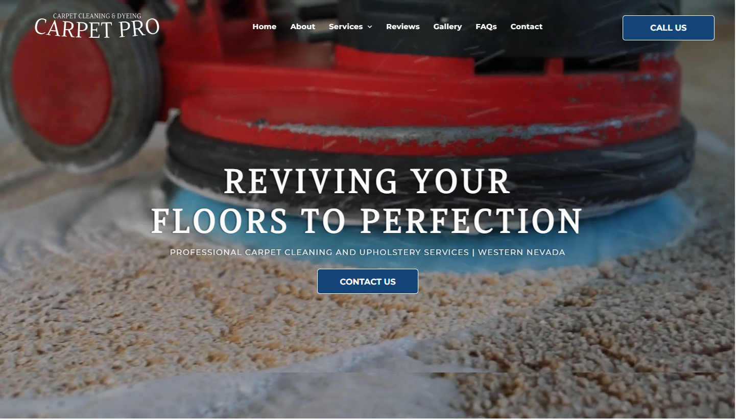
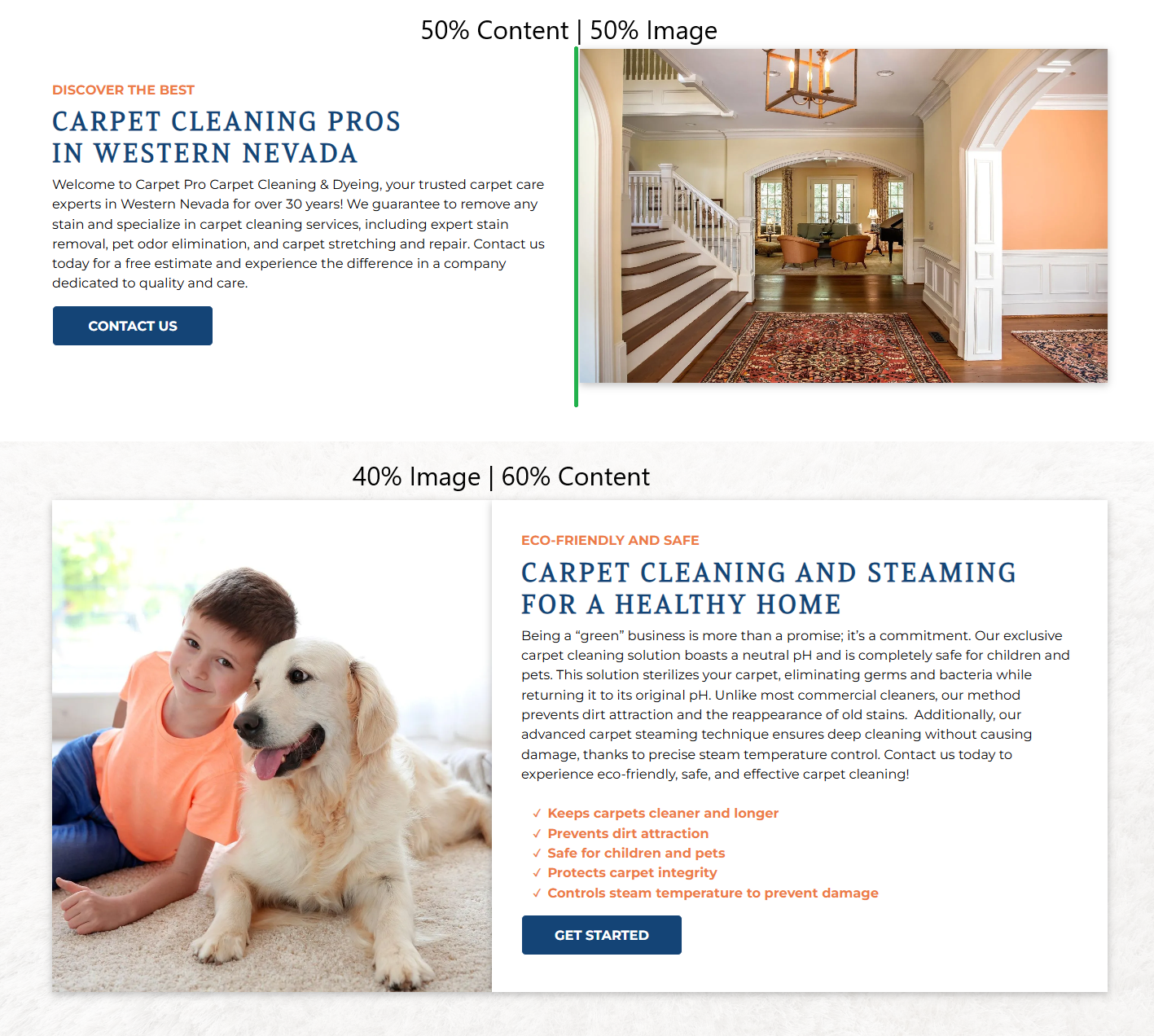
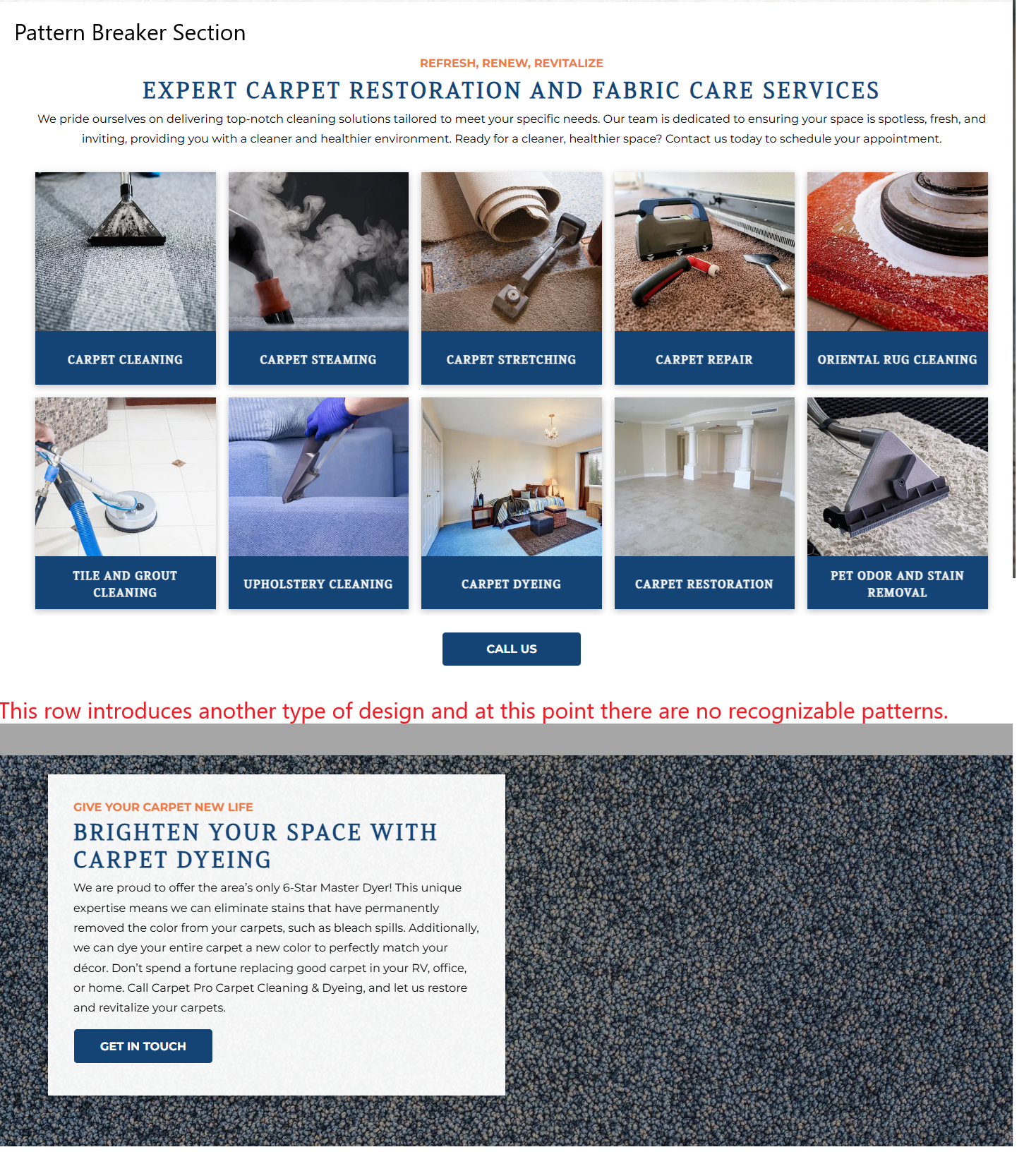
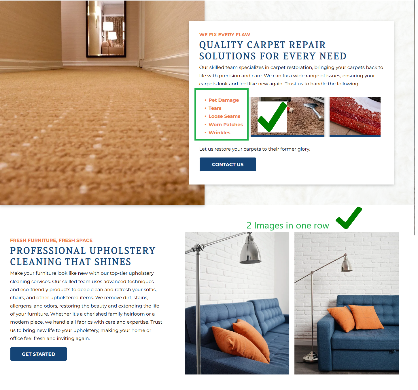
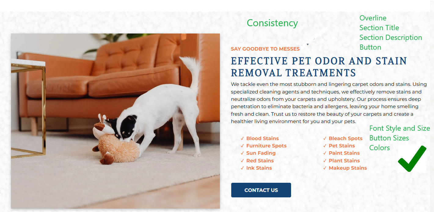
Site of the Week Winner
Thanks So Much to All of Our Amazing Devs!
This Week's Honorable Mentions:
Congratulations, Marlon D, for:
A Marten Roofs
Congratulations, Ryan M, for: