

Dev Weekly Newsletter
10/25/24
Featuring
Weekly Tips From Your Leads!

Emma
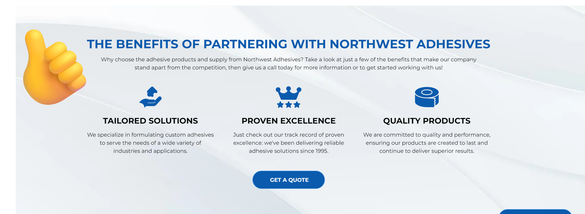
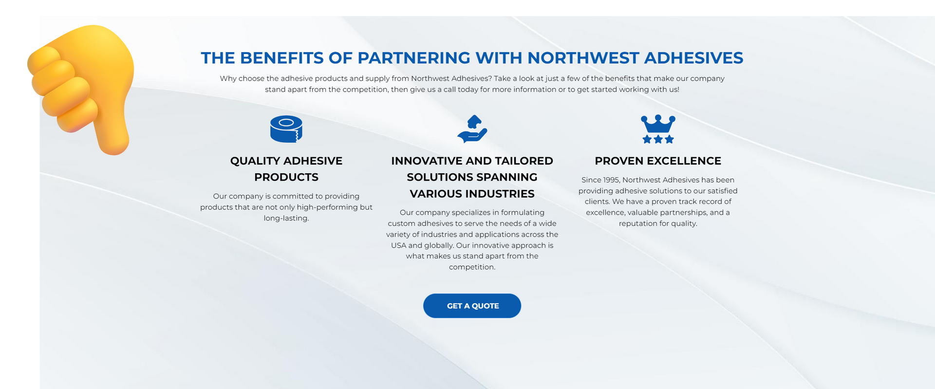
When creating a section on your website with multiple short text 'blurbs,' like a service gallery or feature highlights, a clean design makes a big impact. To optimize the look of this section, focus on keeping the text uniform. Aim for concise blurbs (about 2-3 lines each), and try to keep them as similar in length (word count) as possible. This approach creates a consistent, organized layout that’s easy for users to read and is more likely to leave them with a positive impression of the business and its services. If you are incorporating client-provided or legacy content into your site and it is not uniform enough, ChatGPT is a great tool for rewriting the text to fit within your desired parameters.

Nick
When building doubles, it is important to order your collections for both services and locations in alphabetical order. This creates a well-polished navigation menu that is not only easy to navigate but also enhances the credibility and legitimacy of the website itself. Another consideration is that when each collection follows the same item order, it makes it easier for you and your dev leads to check and make edits to the collections if they are needed.
The next time you are working on a double, please ensure that the items are alphabetized throughout each collection.
In the above, you can see that when I hover over each service, the location order varies from collection to collection. This is what we want to avoid doing.

Sophie
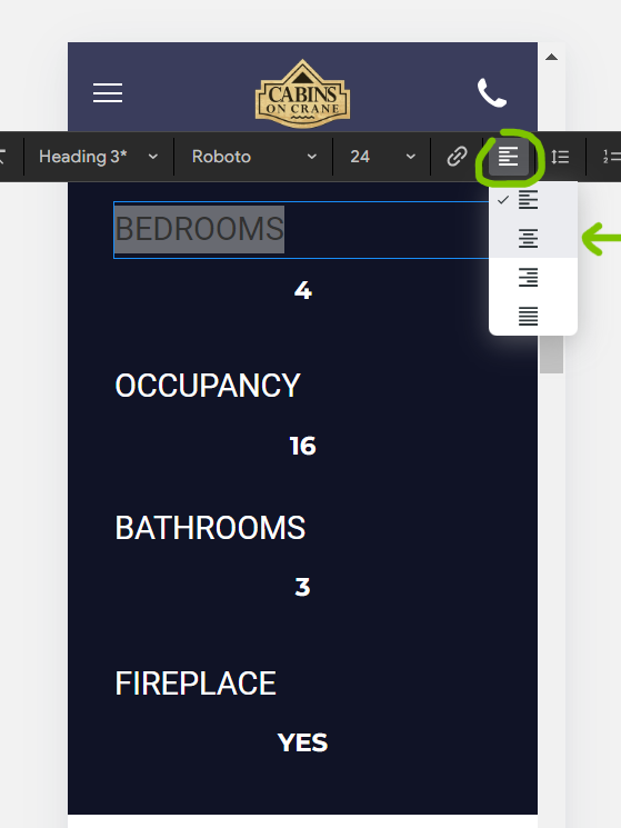
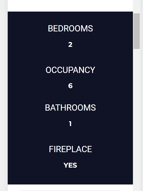
When setting the global text settings for your site, keep in mind standardizing header and paragraph font sizes, as well as line spacing, will help ensure that our sites are uniform in design and structure. We want to avoid section headers differing in size from section to section.
Desktop View text sizing standards:
Hero header text: 60-72px.
All other headers: 30-48px.
Paragraph text: 16-18px & 1.5 vertical spacing
Another critical point to remember is to never use font sizes smaller than 16px, even on mobile. Anything below this violates the Americans with Disabilities Act (ADA) guidelines, making our sites less accessible. Ensuring our designs are readable for all users is essential to providing an inclusive and user-friendly experience.
Refer to this font sizing dev resource anytime you need a reminder.

Carissa
Text alignment is crucial for a website’s mobile view, as it directly impacts content readability. Even if the text is well-aligned on the desktop version, this doesn’t guarantee it will align correctly on mobile. Misaligned or cramped text on mobile can make content difficult to read, disrupting the design and the user experience. Ensuring proper alignment on mobile keeps the layout clean and readable, providing users with a smoother experience, no matter what kind of device they are on.

Joe
For this week’s tip, here are some
basic technical checks to perform on your existing template site before starting a new build for a cleaner setup.
Donor/Template Site Trace Removal:
- Use F12 or right-click to inspect elements.
- Search for the template site name (e.g., "Danny's Painting / Danny").
Home Page SEO Settings:
- Check the Meta Title and Meta Description.
- Verify Open Graph Image and page keywords.
Pop-Up: Review settings.
Content Settings:
- Clean up business info.
- Click every social icon to remove template URLs.
- Check Business Text and Business Images for template images.
- Proceed to collections.
Personalize Settings: Ensure it is clean.
Blog Settings:
- Check for template blogs; this area should also be clean.
SEO & Settings:
- Update Favicon, Open Graph, and mobile device icons.
- The multiscreensite should reflect the business name.
SEO Tab:
- Ensure that the Google Tools and Head HTML are clean.
Site Languages: Should only be English unless otherwise requested.
By following these checks, you’ll set a solid foundation for your new build, ensuring that your site not only looks professional but also performs well.
Taking the time to clean up these elements can greatly enhance the user experience and improve your SEO efforts. Happy building!
Site of the Week Winner
Thanks So Much to All of Our Amazing Devs!
This Week's Honorable Mentions:
Congratulations, Ryan McDermott, for:
Tat Tattoo
Congratulations, MM Estilloso, for: